- Home
- /
- Programming
- /
- Graphics
- /
- Custom Scatter Plot
- RSS Feed
- Mark Topic as New
- Mark Topic as Read
- Float this Topic for Current User
- Bookmark
- Subscribe
- Mute
- Printer Friendly Page
- Mark as New
- Bookmark
- Subscribe
- Mute
- RSS Feed
- Permalink
- Report Inappropriate Content
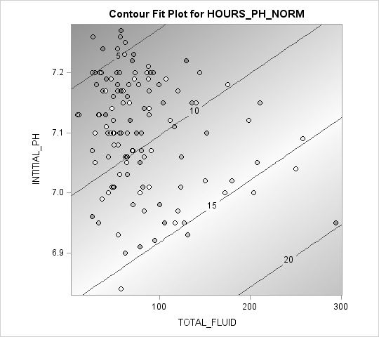
I have run a proc glm model (Outcome = continuous with two continous predictors). With the Ods Graphics and Plots active it provided the below contour plot. I love components of this plot for explaining the project.
However, my final model has 3 continuous predictors, so SAS does not generate the plot. I would like to reproduce the plot without the color contouring and I would like the dots to be color coded based on the quartiles of the third predictor. Which this seems achievable, but i have no idea how to put on the diagonal lines that represent the dependent variable into a graph.
So dataset would contain
Y: continous variable
X1: continuous variable
X2: continuous variable
X3: continuous variable, categorized into quartile and used to shade observations on the plot.
- Mark as New
- Bookmark
- Subscribe
- Mute
- RSS Feed
- Permalink
- Report Inappropriate Content
Original Plot


- Mark as New
- Bookmark
- Subscribe
- Mute
- RSS Feed
- Permalink
- Report Inappropriate Content
What version of SAS are you running?
- Mark as New
- Bookmark
- Subscribe
- Mute
- RSS Feed
- Permalink
- Report Inappropriate Content
9.4
Probably original release.
- Mark as New
- Bookmark
- Subscribe
- Mute
- RSS Feed
- Permalink
- Report Inappropriate Content
ods graphics on  ;
proc glm data=dka_please 	PLOTS=all;
	model HOURS_PH_NORM =
		total_fluid
		INTITIAL_PH;
run;
ods graphics off;
Code is above for 2 IV model. In the final graph I would like to use labels to get rid of "_" and add units to variable names.
Side note, your Sim book was great Rick.
Catch up on SAS Innovate 2026
Dive into keynotes, announcements and breakthroughs on demand.
Explore Now →Learn how use the CAT functions in SAS to join values from multiple variables into a single value.
Find more tutorials on the SAS Users YouTube channel.
SAS Training: Just a Click Away
Ready to level-up your skills? Choose your own adventure.


