- Home
- /
- Programming
- /
- Graphics
- /
- Create histogram for values upto 10 decimal points
- RSS Feed
- Mark Topic as New
- Mark Topic as Read
- Float this Topic for Current User
- Bookmark
- Subscribe
- Mute
- Printer Friendly Page

- Mark as New
- Bookmark
- Subscribe
- Mute
- RSS Feed
- Permalink
- Report Inappropriate Content
Hi All,
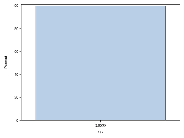
I created a histogram which has values for variable 'xyz' up to the 9th or 10th decimal point. I have copied the code below. The x-axis shows values up to the 4th decimal point (which is what I want in the display as it looks presentable). But, I think the code also approximates the values to the 4th decimal point to create the bars. In certain examples , the values of 'xyz' are so similar to the 4th decimal point that it just gives me a single bar. I am new to SAS/GRAPH. Could you suggest what options I could use to create graphs for values upto the 10th decimal point but display them on x-axis upto the 4th decimal point. Please advice. Thanks !
This is my code :
It's a generic code that seeks the minimum and maximum value of the field field i.e for xyz, the minimum value is represented my the macro &xyzmin and the maximum value by &xyzmax
ods graphics on / reset=index imagename = "image_histogram.”;
proc sgplot data=outcome;
histogram estxyz/binstart=&xyzmin.
binwidth=0.5;
xaxis values=(&xyzmin. to &xyzmax. by 2)
valueshint;
run;
Here is the data for 'xyz' that displays a single bar in the histogram. Please ignore the observation numbers in the table below. Also I have 10,000 such observations.
xyz |
|
Here is the graph I get based on the present code

- Mark as New
- Bookmark
- Subscribe
- Mute
- RSS Feed
- Permalink
- Report Inappropriate Content
I think your setting of BINWIDTH is involved. Setting it to .5 says the largest-smallest value within a bin will be .5. ALL of the data you show are within .5.
Try using NBINS to specify the number of bins to create. I would also wait to add the XAXIS statement until after I get a workable graph.

- Mark as New
- Bookmark
- Subscribe
- Mute
- RSS Feed
- Permalink
- Report Inappropriate Content
BallardDW is right. This may have to do with your settings. Using SAS 9.4M2, here is what I get with just the "histogram xyz" statement. Note - You will get an interval x-axis by default, not a bin axis.
proc sgplot data=hist;
histogram xyz;
run;
- Mark as New
- Bookmark
- Subscribe
- Mute
- RSS Feed
- Permalink
- Report Inappropriate Content
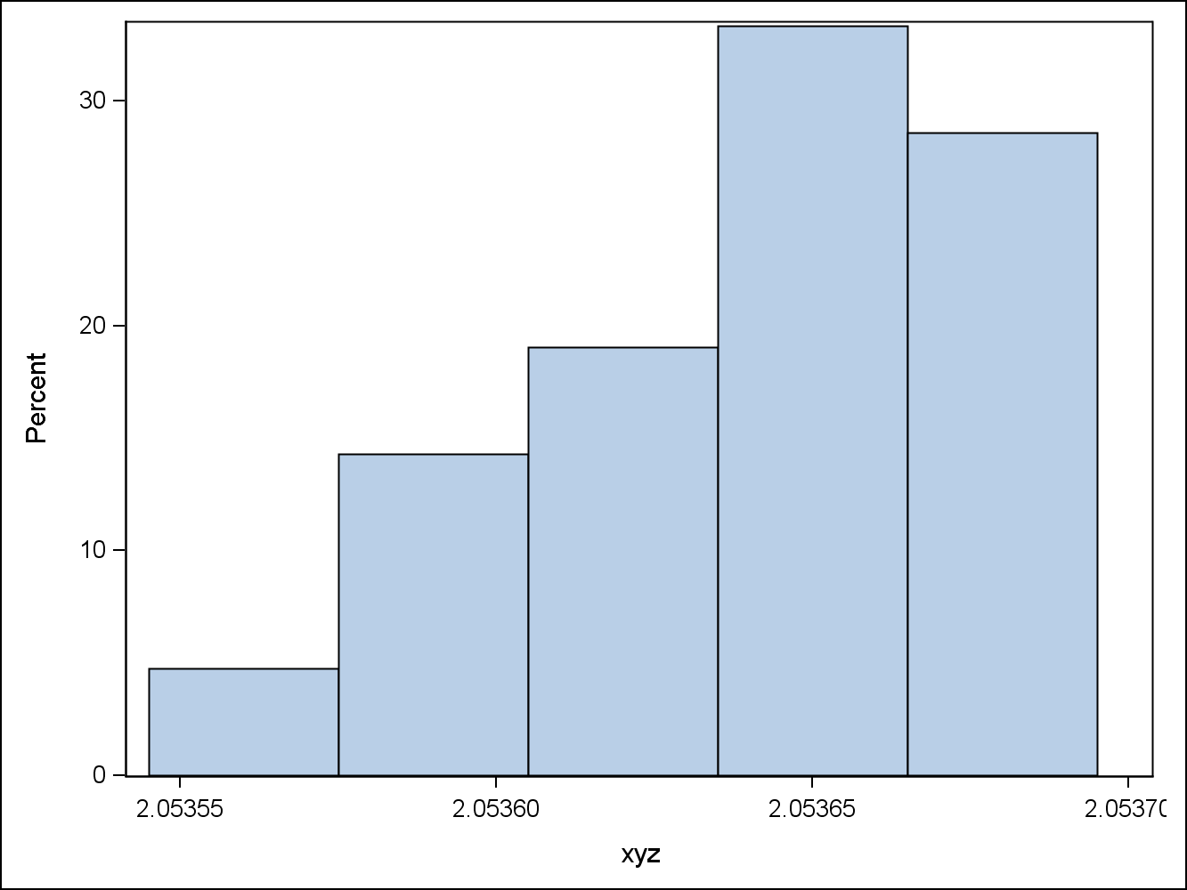
Thanks for your replies. @ballardw, you are right, the bin width specification does affect the display. So I took it out and just like you @Sanjay@SAS I got a graph that's better then the first. I have pasted it below. However, I think its pretty broad and although it gives information on the distribution , could it get more detailed i.e more number of bins? I think thats the reason I had chosen to specify the bin width before. Also, how is it @Sanja@SAS I am not getting the x-axis display such as yours ? Could you please suggest based on my initital code where I wrote . As you know , I need to have a generic code. Thanks.
xaxis values=(&xyzmin. to &xyzmax. by 2)
valueshint;

- Mark as New
- Bookmark
- Subscribe
- Mute
- RSS Feed
- Permalink
- Report Inappropriate Content
I missed your comment on the defualt x-axis. Let me remove the
xaxis values=(&xyzmin. to &xyzmax. by 2) valueshint ; and see what I get. Nevertheless, i still would like the graph to more bin detailed without compromising on the values. That obviously means I have to specify the 'bin number' and since the input data changes I will need to have something generic. Any suggestions on it would be very helpful !
- Mark as New
- Bookmark
- Subscribe
- Mute
- RSS Feed
- Permalink
- Report Inappropriate Content
All right. I do get a better display on the x-axis after removing the specifications on the x-axis on the code. For now this works. Thanks much !

- Mark as New
- Bookmark
- Subscribe
- Mute
- RSS Feed
- Permalink
- Report Inappropriate Content
My browser is not showing me the buttons to mark the answers as correct or helpful. I will definitely get back to it later.
- Mark as New
- Bookmark
- Subscribe
- Mute
- RSS Feed
- Permalink
- Report Inappropriate Content
The original post was not created as a question and discussions don't show the mark buttons. No problem, we'll consider them marked.
- Mark as New
- Bookmark
- Subscribe
- Mute
- RSS Feed
- Permalink
- Report Inappropriate Content
Thanks !
- Mark as New
- Bookmark
- Subscribe
- Mute
- RSS Feed
- Permalink
- Report Inappropriate Content
@ballardw and @Sanjay. I have one lingering question. After I removed the x-axis specifications , although I get values on the x-axis it doesn't display the minimum and maximum value. Is it possible to display that ? Thanks.

- Mark as New
- Bookmark
- Subscribe
- Mute
- RSS Feed
- Permalink
- Report Inappropriate Content
Set THRESHOLDMIN=1 and THRESHOLDMAX=1 on the XAXIS statement.
- Mark as New
- Bookmark
- Subscribe
- Mute
- RSS Feed
- Permalink
- Report Inappropriate Content
THRESHOLDMIN and MAX will show you the outer tick, but not the max or min value of your data. You have a couple of options. Add a fringe plot. This will show you all the observations.:
ods graphics / reset imagename='Histogram';
proc sgplot data=hist;
histogram xyz;
fringe xyz;
run;

Now, if you want the lowest and highest value labeled, you could copy the lowest and highest values to another column called Extreme, with other rows missing. Then, use a drop line to plot the extreme column with data label.
- Mark as New
- Bookmark
- Subscribe
- Mute
- RSS Feed
- Permalink
- Report Inappropriate Content
Thanks DanH@sas and Sanjay@SAS. I am going to try both the suggestions and see what I get. Also, Sanjay@SAS I am not sure why you are getting multiple tick marks within the bars . I am guessing its because of the data ? Is there any particular significance for it ?
- Mark as New
- Bookmark
- Subscribe
- Mute
- RSS Feed
- Permalink
- Report Inappropriate Content
The FRINGE plot shows the location of each observation in the data. Many users like to see the shape of the histogram and also the locations of each observation. Now, there are ways to place labels of the min and max observations to show their value, but it takes some extra work, and I am not sure how much trouble you are willing to go to get this. Note: I increased the format size for the extreme labels.
- Mark as New
- Bookmark
- Subscribe
- Mute
- RSS Feed
- Permalink
- Report Inappropriate Content
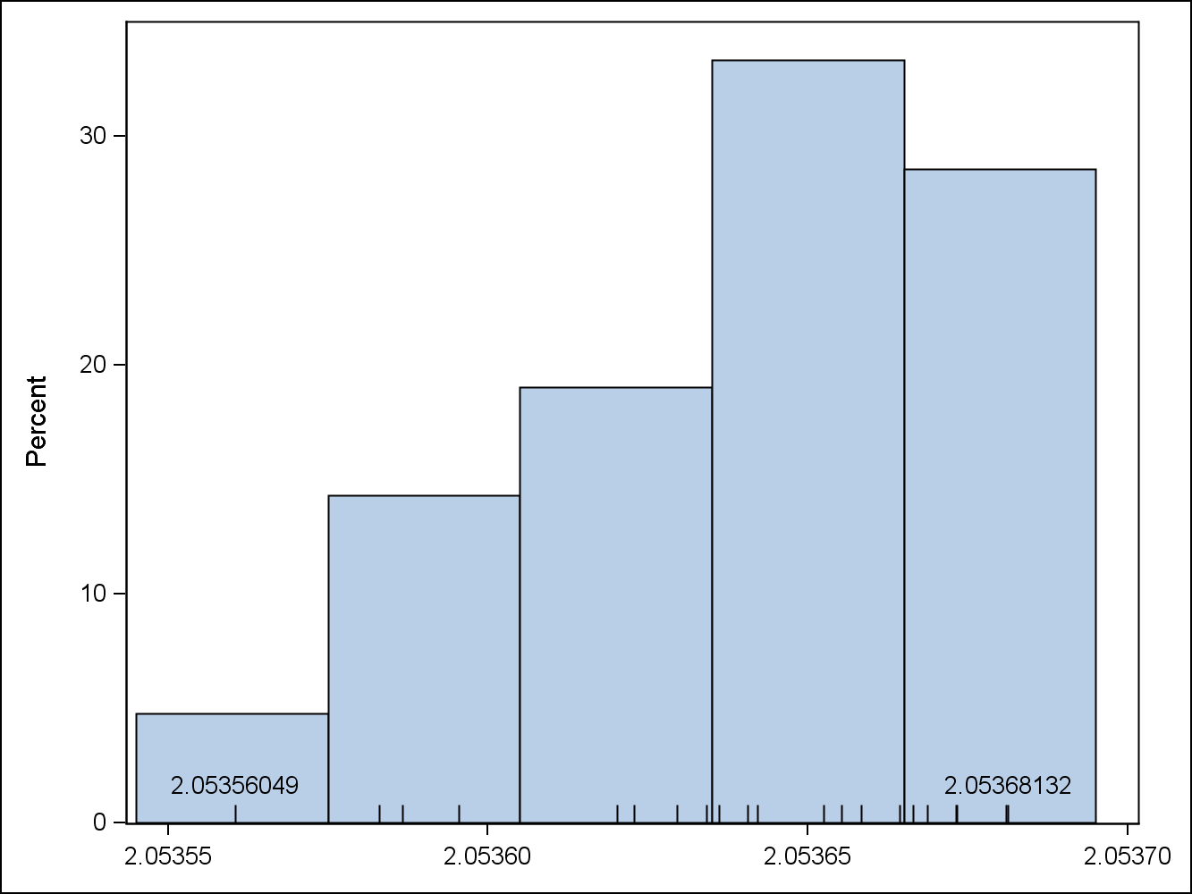
Hi I tried the x-axis options for the display of min and max values and I do get a graph (copy-pasted below)
However, a .exe window opens with a message i.e.
‘-axis’ is not recognized as an internal or external command, operable program or batch file
I think there is an error in my syntax. Please advice. I want to avoid the .exe window.
proc sgplot data=outcome;
histogram xyz;
x-axis thresholdmin=1 and thresholdmax=1;
run;
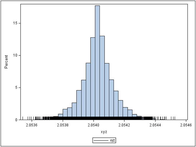
@ I really liked the 'fringe' functionality and tried it. Since I have about 10,000 records with values close to each other, I get a x-axis which gets very crowded with tick marks. That doesn't make it a very informative graph for me (copy-pasted below). Also, I am eager to know how to place labels for the min and max value
Graph using thresholdmin and thresholdmax options :

Graph using fringe statement:
.jpg")
Catch up on SAS Innovate 2026
Nearly 200 sessions are now available on demand in the Innovate Hub.
Watch Now →Learn how use the CAT functions in SAS to join values from multiple variables into a single value.

Find more tutorials on the SAS Users YouTube channel.
SAS Training: Just a Click Away
Ready to level-up your skills? Choose your own adventure.
-
16 replies
-
06-01-2015 01:35 PM
-
9661 views
-
3 likes
-
4 in conversation
-
