- Home
- /
- Programming
- /
- Graphics
- /
- Create Graphic with GPLOT
- RSS Feed
- Mark Topic as New
- Mark Topic as Read
- Float this Topic for Current User
- Bookmark
- Subscribe
- Mute
- Printer Friendly Page
- Mark as New
- Bookmark
- Subscribe
- Mute
- RSS Feed
- Permalink
- Report Inappropriate Content
Hello all,
though my other problem isn’t solved yet I have also another problem that I am working on:
I have a dataset with the following columns:
Server – Date – Hour – Utilisation - Configuration.
The dataset contains data for several servers for 7 days. I want to create a "utilisiation graphic" with GPLOT for every server that contains all the data (this means only one graphic per server).
(A graphic with GBARLINE that contains the utilisation and the config would also be nice)
Is there a simple solution available or am I thinking to complicated? My solutions that I tried are not working....
Thanks in advance for any help.
Best regards
Christobal
Accepted Solutions
- Mark as New
- Bookmark
- Subscribe
- Mute
- RSS Feed
- Permalink
- Report Inappropriate Content
With gbarline, you're still going to be confined to a horizontal axis that's meant for bar charts.
You can plot multiple lines (including needle lines and regular lines) on the same plot using gplot, either with a plot & plot2 (if you need a 2nd/right-hand axis like gbarline), or simply using the 'overlay' option (if you don't need the right-hand axis).
Here's an example:
data foo;
format timestamp datetime.;
timestamp='01jan2013:23:00:00'DT; proc_usage_virt=5; conf_usage_virt=3; output;
timestamp='02jan2013:23:00:00'DT; proc_usage_virt=4; conf_usage_virt=2; output;
timestamp='04jan2013:23:00:00'DT; proc_usage_virt=3; conf_usage_virt=1; output;
run;
axis1 order=(0 to 6 by 1) offset=(0,0);
axis3 label=none value=(angle=-90) minor=(number=1)
order=('31dec2012:00:01:00'DT to '06jan2013:00:01:00'DT by 86400);
symbol1 value=none interpol=needle color=black;
symbol2 value=none interpol=join color=red;
proc gplot data=foo;
plot proc_usage_virt*timestamp=1 / vaxis=axis1 haxis=axis3;
plot2 conf_usage_virt*timestamp=2 / vaxis=axis1;
run;
- Mark as New
- Bookmark
- Subscribe
- Mute
- RSS Feed
- Permalink
- Report Inappropriate Content
Do you have a certain type or look for the graph you're interested in?
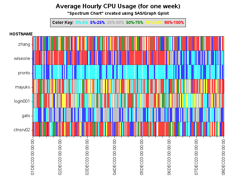
I've plotted cpu performance data in several ways in the past - I'm including links to 3 examples, and attaching the image from my favorite of the 3:
http://robslink.com/SAS/democd12/cpu.htm
http://robslink.com/SAS/democd12/cpu_info.htm
High-density SAS/Graph gplot micro-bar chart
http://robslink.com/SAS/democd12/microbar_info.htm
1-Month CPU Usage - SAS/Graph gplot
http://robslink.com/SAS/democd12/barcpu_info.htm

- Mark as New
- Bookmark
- Subscribe
- Mute
- RSS Feed
- Permalink
- Report Inappropriate Content
Hello Robert,
thank you very much for your answer. At this moment there is no special type needed, so I think, that I will find something in your examples that I can try to use. Thanks again!
Best regards
Christobal
- Mark as New
- Bookmark
- Subscribe
- Mute
- RSS Feed
- Permalink
- Report Inappropriate Content
Hello Robert,
now I created my graphic as requested, but I have the problem that the legend of my horizontal axis contains lots of data and is not readable (for 7 days for every hour = 168 entries). My wish is to show all the data in the graph, but the legend of the axis should only contain the values for one date for one hour, for example (31.12.2012 00:00 01.01.2013 00:00 02.01.2013 00:00 and so on).
I tried the following in the axis statement, but then my graph only contains data for this datepoints, too:
axis3 label=none value=(angle=-90)
order=('31dec2012:00:01:00'DT to '06jan2013:23:00:00'DT by 86400);
Is it even possible what I am trying to do?
Best regards
Christobal
- Mark as New
- Bookmark
- Subscribe
- Mute
- RSS Feed
- Permalink
- Report Inappropriate Content
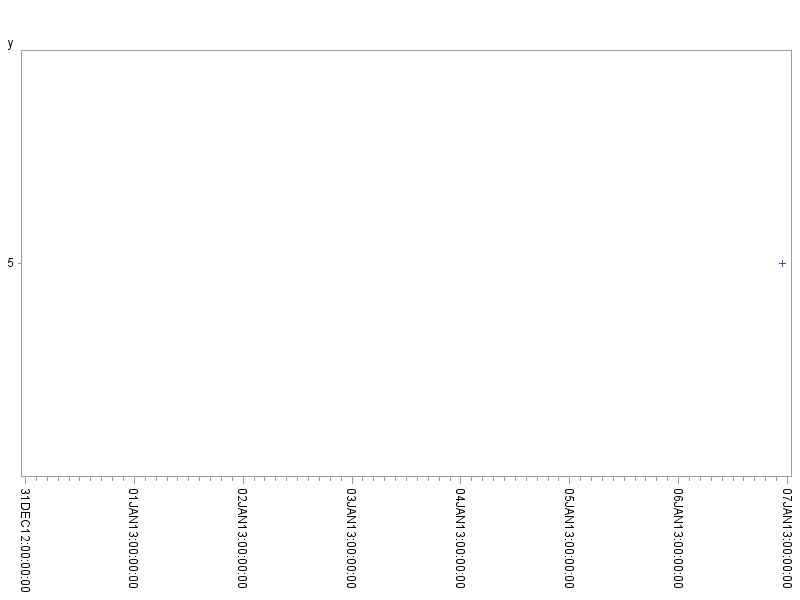
For SAS/Graph axes to pick good dates for the axis tickmarks, you'll need to start & stop them on values that are even numbers of the 'by' increment. 86400 is the number of seconds in a day, so you'll want your from & to values to be the same time on each of those days.
Here's an example:
data foo;
format x datetime.;
x='06jan2013:23:00:00'DT; y=5; output;
run;
axis3 label=none value=(angle=-90)
order=('31dec2012:00:00:00'DT to '07jan2013:00:00:00'DT by 86400);
proc gplot data=foo;
plot y*x / haxis=axis3;
run;

- Mark as New
- Bookmark
- Subscribe
- Mute
- RSS Feed
- Permalink
- Report Inappropriate Content
Hello Robert,
thanks again for your answer. I am a bit confused now, because I think that I am doing exactly the same. My axis statement looks like this:
axis3 label=none value=(angle=-90)
order=('31dec12:00:01:00'DT to '06jan13:00:01:00'DT by 86400);
But when I use this, my graph contains only data for those 7 days ?
Actually I don't know what I am doing wrong...
Best regards
- Mark as New
- Bookmark
- Subscribe
- Mute
- RSS Feed
- Permalink
- Report Inappropriate Content
When you say your graph contains only data for those 7 days ... that's the expected results, right? The graph will only display data points that appear within the specified axis endpoints. In the special case where you're drawing lines, and you want the lines to be influenced by and connect up with points that are not displayed within the axes, you can use the "mode=include" option on the symbol statement (... but I'm not sure that's the problem you're describing).
Give some more details of the problem you're seeing, and the results you're wanting ...
- Mark as New
- Bookmark
- Subscribe
- Mute
- RSS Feed
- Permalink
- Report Inappropriate Content
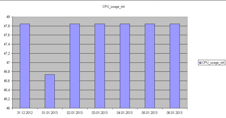
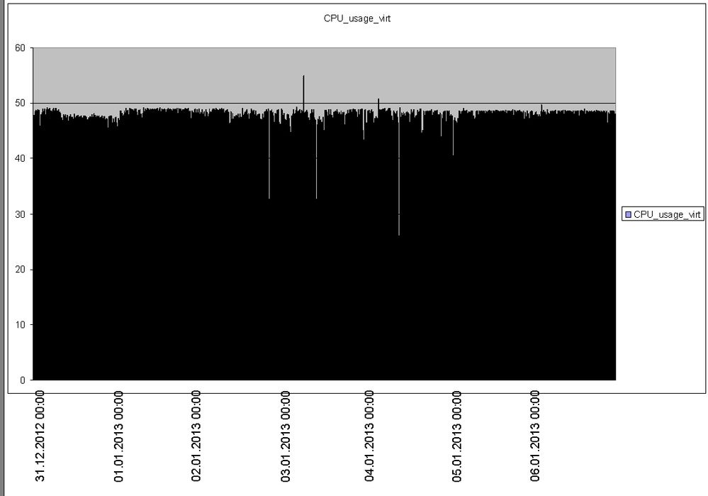
No, this is not my esxpected result. I have more than 160 data points in my table that I want to display ALL in my graph (data for 31.12.2012 00:00, 31.12.2012 00:15, 31.12.2012 00:45, 31.12.2012 01:00 ....), but in the legend under the graph, I only want to see "reference points" so that there is only a value for every day (like the attached example Example.jpg -> this is what I want).
Example2 is what I currently get and what I don't want to have:


- Mark as New
- Bookmark
- Subscribe
- Mute
- RSS Feed
- Permalink
- Report Inappropriate Content
Ahh - example2 is a bar chart, which summarized the data into a histogram (or some such), unless you specify the 'discrete' option ... and the discrete option would try to place a label under each bar (which would be too crowded).
What you want is a scatter plot that "looks" like a bar chart (of micro-bars), but has an axis like a scatter plot (with tickmarks only at the reference dates you want).
Something like this:
data foo;
format timestamp datetime.;
timestamp='01jan2013:23:00:00'DT; cpu_usage=5; output;
timestamp='02jan2013:23:00:00'DT; cpu_usage=4; output;
timestamp='04jan2013:23:00:00'DT; cpu_usage=3; output;
run;
axis3 label=none value=(angle=-90)
order=('31dec2012:00:01:00'DT to '06jan2013:00:01:00'DT by 86400);
symbol1 value=none interpol=needle color=black;
proc gplot data=foo;
plot cpu_usage*timestamp=1 / haxis=axis3 vzero;
run;
- Mark as New
- Bookmark
- Subscribe
- Mute
- RSS Feed
- Permalink
- Report Inappropriate Content
Hello Robert,
thanks. This is nearly the solution that I need. But I am using the PROC GBARLINE statement, to show CPU usage and configured CPUs.
This is my code:
axis1 order=(0 to &CPU by 1)
color=black
label=(a=90 f='Times New Roman' 'CPU_Used_virt');
axis2 order=(0 to &CPU by 1)
color=black
label=(a=90 f='Times New Roman' 'CPU_Conf_virt');
axis3 label=none value=(angle=-90)
order=('31dec12:00:01:00'DT to '07jan13:00:01:00'DT by 86400);
axis4 value=none label=none;
legend1 label=none value=none frame;
SYMBOL1 v = none I=j ci=red w=5;
SYMBOL2 v = none I=j ci=blue w=5;
SYMBOL3 value=none interpol=needle ci=red w=5;
options nobyline;
proc gbarline data=work.cpu_output;
by partition_name ;
bar datetime1 / levels=38400 sumvar=proc_usage_virt
maxis=axis3
raxis=axis1 discrete;
plot / sumvar=CPU_Conf_virt raxis=axis2;
title3 f='Times New Roman' h=3 pct "Installed vs Used Processors for #BYVAL1 from &start-&ende ";
run;
quit;
Where can I say, that there should be used "Symbol3" for this graph?
- Mark as New
- Bookmark
- Subscribe
- Mute
- RSS Feed
- Permalink
- Report Inappropriate Content
With gbarline, you're still going to be confined to a horizontal axis that's meant for bar charts.
You can plot multiple lines (including needle lines and regular lines) on the same plot using gplot, either with a plot & plot2 (if you need a 2nd/right-hand axis like gbarline), or simply using the 'overlay' option (if you don't need the right-hand axis).
Here's an example:
data foo;
format timestamp datetime.;
timestamp='01jan2013:23:00:00'DT; proc_usage_virt=5; conf_usage_virt=3; output;
timestamp='02jan2013:23:00:00'DT; proc_usage_virt=4; conf_usage_virt=2; output;
timestamp='04jan2013:23:00:00'DT; proc_usage_virt=3; conf_usage_virt=1; output;
run;
axis1 order=(0 to 6 by 1) offset=(0,0);
axis3 label=none value=(angle=-90) minor=(number=1)
order=('31dec2012:00:01:00'DT to '06jan2013:00:01:00'DT by 86400);
symbol1 value=none interpol=needle color=black;
symbol2 value=none interpol=join color=red;
proc gplot data=foo;
plot proc_usage_virt*timestamp=1 / vaxis=axis1 haxis=axis3;
plot2 conf_usage_virt*timestamp=2 / vaxis=axis1;
run;
- Mark as New
- Bookmark
- Subscribe
- Mute
- RSS Feed
- Permalink
- Report Inappropriate Content
Hello Robert,
perfect!!!!! Thank you, this is what I am looking for. I thought too complicated 😞
Thanks again for your help and your assistance!
Best regards
Christobal
- Mark as New
- Bookmark
- Subscribe
- Mute
- RSS Feed
- Permalink
- Report Inappropriate Content
Hello Robert,
unfortunately I still have one additional question. I want to create the axis definition variable, so I tried the following:
Data _null_;
Call Symput('startdt', PUT(dhms(today()-6,0,1,0), DATETIME16.));
Call Symput('endedt', PUT(dhms(today(),0,0,0), DATETIME16.));
run;
axis3 label=(f='Times New Roman' 'Date') value=(angle=90)
order=(&startdt to &endedt by 86400);
But then I get the following error message:
1743 axis3 label=(f='Times New Roman' 'Date') value=(angle=90)
1744 order=(&startdt to &endedt by 86400);
HINWEIS: Zeile durch aufgerufene Makrovariable "STARTDT" erzeugt.
1 03JAN13:00:01:00
-----
22
76
FEHLER 22-322: Syntaxfehler, erwartet wird eines der folgenden: eine numerische Konstante, eine Datetime-Konstante, ), ',', TO.
FEHLER 76-322: Syntaxfehler, Anweisung wird ignoriert.
*********************************************************************************************************
*********************************************************************************************************
The above message can be ignored. I solved it this way:
data work.datetimevalues;
startdt1 = "'" || PUT(dhms(today()-6,0,1,0), DATETIME16.) || "'DT";
endedt1 = "'" || PUT(dhms(today(),0,1,0), DATETIME16.) || "'DT";
run;
Data _null_;
set work.datetimevalues;
Call Symput('startdt', startdt1);
Call Symput('endedt', endedt1);
run;
%PUT &startdt;
%PUT &endedt;
- Mark as New
- Bookmark
- Subscribe
- Mute
- RSS Feed
- Permalink
- Report Inappropriate Content
Try the following...
axis3 label=(f='Times New Roman' 'Date') value=(angle=90)
order=("&startdt"dt to "&endedt"dt by 86400);
When you create a macro variable with the formatted datetime. value in it, it's just a string.
If you later want to use it as a datetime, then you have to put it in double-quotes, and follow it with dt
- Mark as New
- Bookmark
- Subscribe
- Mute
- RSS Feed
- Permalink
- Report Inappropriate Content
Hello Robert,
sry for not answering earlier.
Thanks for your help. I can close this thread now 🙂
Catch up on SAS Innovate 2026
Nearly 200 sessions are now available on demand with the SAS Innovate Digital Pass.
Explore Now →Learn how use the CAT functions in SAS to join values from multiple variables into a single value.
Find more tutorials on the SAS Users YouTube channel.
SAS Training: Just a Click Away
Ready to level-up your skills? Choose your own adventure.


