- Home
- /
- Programming
- /
- Graphics
- /
- Correlation Visualization
- RSS Feed
- Mark Topic as New
- Mark Topic as Read
- Float this Topic for Current User
- Bookmark
- Subscribe
- Mute
- Printer Friendly Page
- Mark as New
- Bookmark
- Subscribe
- Mute
- RSS Feed
- Permalink
- Report Inappropriate Content
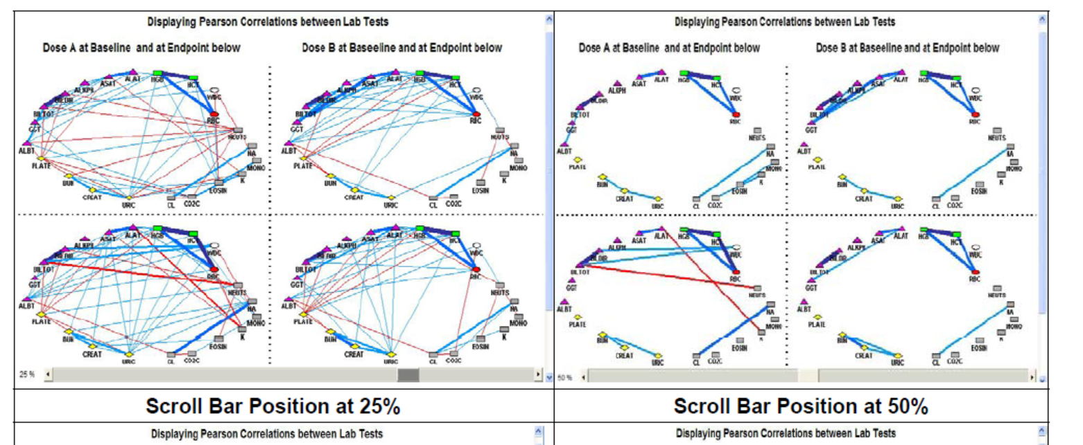
How could I produce below corelation graph. Here,the display panel is divided into four sub-panels. Each sub-panel contains one matrix display. The clinical laboratory test parameters are the nodes, and the correlation coefficients are the links, in the constellation representation. The colors of the link lines represent the directions of the correlation - blue for positive and red for negative. The thickness of the line indicates the magnitude of the association. The interactive features in this application are data tips and an embedded scroll bar for subsetting nodes and links.
Also attaching the paper from which I have taken this graph, I have been looking for a while to produce this.
Accepted Solutions
- Mark as New
- Bookmark
- Subscribe
- Mute
- RSS Feed
- Permalink
- Report Inappropriate Content
The end of Yeh's paper shows his references, including several other papers that discuss the constellation applet and the DS2CONST macros:
http://www2.sas.com/proceedings/sugi31/181-31.pdf
http://www.lexjansen.com/nesug/nesug05/pos/pos8.pdf
http://www2.sas.com/proceedings/forum2007/164-2007.pdf
Catch up on SAS Innovate 2026
Dive into keynotes, announcements and breakthroughs on demand.
Explore Now →Learn how use the CAT functions in SAS to join values from multiple variables into a single value.
Find more tutorials on the SAS Users YouTube channel.
SAS Training: Just a Click Away
Ready to level-up your skills? Choose your own adventure.


