- Home
- /
- Programming
- /
- Graphics
- /
- Re: Cook's Distance Plot: Label and Lines are not aligned
- RSS Feed
- Mark Topic as New
- Mark Topic as Read
- Float this Topic for Current User
- Bookmark
- Subscribe
- Mute
- Printer Friendly Page
- Mark as New
- Bookmark
- Subscribe
- Mute
- RSS Feed
- Permalink
- Report Inappropriate Content
Hi all,
I have this code:
proc reg data=eingabe3 plots(label)=(CooksD);
id serialno;
model sdnn_ms=age age2;
run;
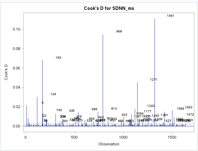
producing the attached graphic.
I want to know how to align the labels to the data spikes. Now they are shifted to right.
Thank you.
Regards
Frank

Accepted Solutions
- Mark as New
- Bookmark
- Subscribe
- Mute
- RSS Feed
- Permalink
- Report Inappropriate Content
Try adding:
format serialno 4.;
as the first line of the procedure. I assume that the ID variable is numeric and has a format with a large width field (maybe 12?).
- Mark as New
- Bookmark
- Subscribe
- Mute
- RSS Feed
- Permalink
- Report Inappropriate Content
Try adding:
format serialno 4.;
as the first line of the procedure. I assume that the ID variable is numeric and has a format with a large width field (maybe 12?).
- Mark as New
- Bookmark
- Subscribe
- Mute
- RSS Feed
- Permalink
- Report Inappropriate Content
Hi Rick,
yes, this was the idea! I had "serialno 5." - this is quiet a difference.
Is there a chance to avoid the labels in the lower part of the diagram?
Thanks
Frank
- Mark as New
- Bookmark
- Subscribe
- Mute
- RSS Feed
- Permalink
- Report Inappropriate Content
The cutoff value is (I think) 4/n where n is the number of nonmissing obs. Points with Cook's D greater than that value are labeled.
Probably the easiest way control the labeling is to output the Cook's D statistic in the OUTPUT statement and then use PROC SGPLOT to create the plot manually.
ods select CooksDPlot;
proc reg data = sashelp.cars plots(label)=(CooksD);
  model mpg_city = weight wheelbase;
  output out=RegOut cookd=cookd;
quit;
%let cutoff = 0.05;  /* create new cutoff value */
data RegOut;
format MyLabel $8.;
set RegOut;
ObsNum = _N_;
if cookD > &cutoff then
   MyLabel = Model;
else
   MyLabel = " ";
run;

proc sgplot data=RegOut;
  needle x=ObsNum y=CookD / datalabel = MyLabel;
  refline &cutoff / axis=y;
run;
- Mark as New
- Bookmark
- Subscribe
- Mute
- RSS Feed
- Permalink
- Report Inappropriate Content
Thank you very much. That works very fine ![]()
Catch up on SAS Innovate 2026
Dive into keynotes, announcements and breakthroughs on demand.
Explore Now →Learn how use the CAT functions in SAS to join values from multiple variables into a single value.
Find more tutorials on the SAS Users YouTube channel.
SAS Training: Just a Click Away
Ready to level-up your skills? Choose your own adventure.


