- Home
- /
- Programming
- /
- Graphics
- /
- Re: Controlling time intervals in the x axis
- RSS Feed
- Mark Topic as New
- Mark Topic as Read
- Float this Topic for Current User
- Bookmark
- Subscribe
- Mute
- Printer Friendly Page
- Mark as New
- Bookmark
- Subscribe
- Mute
- RSS Feed
- Permalink
- Report Inappropriate Content
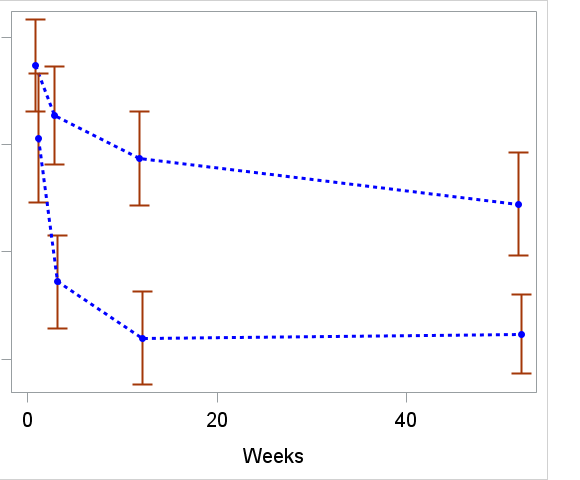
I am trying to make a plot where the x-axis has values from 1 to 52 weeks, but I want to illustrate what the measurement times were:
xaxis label='Weeks'
values=("1" "3" "12" "52")
valuesdisplay=("1" "3" "12" "52")
LABELATTRS=(size=14) valueattrs=(size=14);
does not give me the expected axis, but rather:
'
Any suggestion ?
Accepted Solutions
- Mark as New
- Bookmark
- Subscribe
- Mute
- RSS Feed
- Permalink
- Report Inappropriate Content
values=(1 3 12 52)
- Mark as New
- Bookmark
- Subscribe
- Mute
- RSS Feed
- Permalink
- Report Inappropriate Content
values=(1 3 12 52)
- Mark as New
- Bookmark
- Subscribe
- Mute
- RSS Feed
- Permalink
- Report Inappropriate Content
Try the refline option on the x axis at 1,3,12, and 52. Not sure if it's what you're looking for aesthetically, but it's one option to highlight where those points falls on the x axis. Eg below.
data work.sampledata;
  do _n_=1 to 52;
    week+1;
    value=ranuni(1234);
    output;
  end;
keep week value;
run;

proc sgplot data=work.sampledata;
series x=week y=value;
xaxis values=(0 to 52);
refline 1 3 12 52 /axis=x transparency=0.85 lineattrs=(color=gray pattern=shortdash);
run;- Mark as New
- Bookmark
- Subscribe
- Mute
- RSS Feed
- Permalink
- Report Inappropriate Content
Not what I am looking for. I want an x-avis with the numbers 1 3 12 52
- Mark as New
- Bookmark
- Subscribe
- Mute
- RSS Feed
- Permalink
- Report Inappropriate Content
Ksharp had the correct answer, but you might also want to add VALUESHINT so that the min/max values of the list do not constrain the data shown:
xaxis values=(1 3 12 52) valueshint;
Hope this helps!
Dan
- Mark as New
- Bookmark
- Subscribe
- Mute
- RSS Feed
- Permalink
- Report Inappropriate Content
Learn how use the CAT functions in SAS to join values from multiple variables into a single value.
Find more tutorials on the SAS Users YouTube channel.
SAS Training: Just a Click Away
Ready to level-up your skills? Choose your own adventure.


