- Home
- /
- Programming
- /
- Graphics
- /
- Re: Color difference between two variables PROC SGPLOT
- RSS Feed
- Mark Topic as New
- Mark Topic as Read
- Float this Topic for Current User
- Bookmark
- Subscribe
- Mute
- Printer Friendly Page
- Mark as New
- Bookmark
- Subscribe
- Mute
- RSS Feed
- Permalink
- Report Inappropriate Content
Dear community,
I'm trying to color the gap between two series charts depending on which of the two y-values is greater.
I colored an example plot in MS Paint, to visualize the idea.
So far I've tried various options in the band statement, but failed. My hope was that the band plot would vanish when the lower values is greater than the upper value. Then I could use two band plots, each with a different filling color. But also that does not work.
Do you have any idea how I could get such a chart in SAS?
Thanks a lot,
Paul
data temp;
input x y1 y2;
datalines;
1 50 70
2 60 65
3 70 50
4 60 100
;;
run;
proc sgplot data=temp;
series x=x y=y1;
series x=x y=y2;
run;
- Mark as New
- Bookmark
- Subscribe
- Mute
- RSS Feed
- Permalink
- Report Inappropriate Content
Hi,
I would probably go down the route of a polygon plot:
http://blogs.sas.com/content/graphicallyspeaking/?s=polygon
You can draw each polygon with its own color.
- Mark as New
- Bookmark
- Subscribe
- Mute
- RSS Feed
- Permalink
- Report Inappropriate Content
I've actually done something like this before. In my paper, "Secrets of the SG Procedures", I did this plot of a sine wave:
%let THRESHOLD = 0;
data wave;
do x=-6 to 6 by .05;
y=sin(x);
if (y >= &THRESHOLD) then do;
positive = y;
negative = &THRESHOLD;
end;
else do;
positive = &THRESHOLD;
negative = y;
end;
output;
end;
run;
proc sgplot data=wave noautolegend;
yaxis grid label="y";
xaxis grid;
band x=x lower=&THRESHOLD
upper=positive / transparency=0.5;
band x=x lower=negative
upper=&THRESHOLD /
transparency=0.5;
run;
The key to this example is the data manipulation. In a BAND plot, if the upper and lower values are the same, then NOTHING is drawn in that segment. What's trickier about your example is that the y1/y2 invert in places where there is no data. You would need to do some extra work to put data values at those locations.
Hope this helps!
Dan
- Mark as New
- Bookmark
- Subscribe
- Mute
- RSS Feed
- Permalink
- Report Inappropriate Content
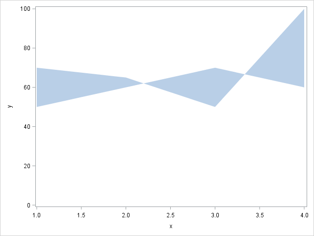
RW9's proposal to use POLYGON will work, but you will need to compute the intersection of the two lines, which may not occur at exact axis value. A partial result is obtained by using one band to wrap back over itself as shown below. You will get the correct filled area. But, now we need to figure out how to color each area differently. 🙂
data temp;
input x y;
datalines;
1 50
2 60
3 70
4 60
4 100
3 50
2 65
1 70
;
run;
proc sgplot data=temp;
band x=x upper=y lower=0;
run;
- Mark as New
- Bookmark
- Subscribe
- Mute
- RSS Feed
- Permalink
- Report Inappropriate Content
I am doing something similar for a consort diagram and needing to have boxes that are shaded differently. I discovered that if I created two xy sets then I could label them individually. Not sure if that would work for you here but since I found this while looking for a solution I thought I would include it.
data final;
set box ;
if subnode in (1,3) then do; x_yellow=xb; y_yellow=yb;end;
if subnode in (2) then do; x_maize=xb; y_maize=yb;end;
run;
ods graphics / reset width=8.5in height=24in noborder;
proc sgplot data=final noborder noautolegend;
polygon id=box x=x_yellow y=y_yellow/ fill fillattrs=(color=CxFFC000) outline;
polygon id=box x=x_maize y=y_maize/ fill fillattrs=(color=CxBF9000) outline;
run;
- Mark as New
- Bookmark
- Subscribe
- Mute
- RSS Feed
- Permalink
- Report Inappropriate Content
I've done something similar to this with band plot. Take a look at page 2 of https://support.sas.com/resources/papers/proceedings09/324-2009.pdf
Hope this helps!
Dan
Catch up on SAS Innovate 2026
Dive into keynotes, announcements and breakthroughs on demand.
Explore Now →Learn how use the CAT functions in SAS to join values from multiple variables into a single value.
Find more tutorials on the SAS Users YouTube channel.
SAS Training: Just a Click Away
Ready to level-up your skills? Choose your own adventure.


