- Home
- /
- Programming
- /
- Graphics
- /
- Re: CHORO and ANNOTATE combination
- RSS Feed
- Mark Topic as New
- Mark Topic as Read
- Float this Topic for Current User
- Bookmark
- Subscribe
- Mute
- Printer Friendly Page
- Mark as New
- Bookmark
- Subscribe
- Mute
- RSS Feed
- Permalink
- Report Inappropriate Content
Good afternoon,
I am using SAS Enterprise Guide and supplementing the code with items I've found on various SAS blog pages (Robert Allison and others). I was able to use Enterprise Guide to easily create a choro map showing all the counties in our state - with different colors for those with varying amounts of payments made by our organization. I was also able to use instructions found on blogs to download a shape file and write code to create a map of the state which marks major highways and cities. My question is: is there a way to combine both maps? So far my attempts to add an annotate data set to the choropleth code have been unsuccessful, which made me wonder if it is even possible? Any help would be appreciated!
Thanks very much,
Brooke
Accepted Solutions
- Mark as New
- Bookmark
- Subscribe
- Mute
- RSS Feed
- Permalink
- Report Inappropriate Content
You will typically want to have your coloring/response data in a separate dataset from your map, with 1 observation per map area. And specify that as your data= dataset. Gmap will then match up the choro values from your data= dataset, to the colors specified in the pattern statements (or use the default colors from the ods style you're using).
The following chapter should help you in this area:
http://robslink.com/SAS/book1/Chapter_05_Maps.pdf
- Mark as New
- Bookmark
- Subscribe
- Mute
- RSS Feed
- Permalink
- Report Inappropriate Content
I don't see any reason why not.
Have you seen the OpenStreetMap example on Robs page? Maybe that may help.
Can you post what you have so far?
- Mark as New
- Bookmark
- Subscribe
- Mute
- RSS Feed
- Permalink
- Report Inappropriate Content
Thanks for the quick reply! I got an error message or perhaps was not on the right page when I tried to look at the OpenStreetMap example. I have excerpted what I believe are the relevant code sections, sorry this is kind of long. Thanks in advance for any help you can provide!
/* Shape file import for North Carolina roads */
/* This blog-copied code works fine */
proc mapimport out=NCMAPS.NC_Roads
datafile="<myfilepath>/tl_2016_37_prisecroads.shp";
run;
/* Select only major interstates */
/* This EG generated code works fine */
%_eg_conditional_dropds(NCMAPS.NC_Interstates);
PROC SQL;
CREATE TABLE NCMAPS.NC_Interstates(label="NC_Interstates") AS
SELECT t1.X,
t1.Y,
t1.SEGMENT,
t1.FULLNAME,
t1.LINEARID,
t1.MTFCC,
t1.RTTYP
FROM NCMAPS.NC_ROADS t1
WHERE t1.MTFCC = 'S1100' AND t1.FULLNAME = 'I- 85' OR t1.FULLNAME = 'I- 26' OR t1.FULLNAME = 'I- 40' OR
t1.FULLNAME = 'I- 95' OR t1.FULLNAME = 'I- 74' OR t1.FULLNAME = 'I- 77';
QUIT;
/* Use MAPSGFK.USCITY to identify cities in North Carolina */
/* This EG generated code works fine */
%_eg_conditional_dropds(NCMAPS.NC_Cities);
PROC SQL;
CREATE TABLE NCMAPS.NC_Cities(label="NC_Cities") AS
SELECT t1.ID,
t1.X,
t1.Y,
t1.LONG,
t1.LAT,
t1.STATE,
t1.STATECODE,
t1.COUNTY,
t1.CITY,
t1.COUNTY_NAME,
t1.CAPITAL,
t1.POP_TYPE,
t1.FEATURE_ID,
t1.ALT_M,
t1.ALT_FT
FROM MAPSGFK.USCITY t1
WHERE t1.STATECODE = 'NC';
QUIT;
/* Select only a handfull of the larger cities in North Carolina */
/* This EG generated code works fine */
%_eg_conditional_dropds(NCMAPS.NC_Major_Cities);
PROC SQL;
CREATE TABLE NCMAPS.NC_Major_Cities(label="NC_Major_Cities") AS
SELECT t1.ID,
t1.LONG,
t1.LAT,
t1.STATE,
t1.STATECODE,
t1.COUNTY,
t1.CITY,
t1.COUNTY_NAME,
t1.CAPITAL,
t1.POP_TYPE,
t1.FEATURE_ID,
t1.ALT_M,
t1.ALT_FT,
/* x */
(t1.LONG) AS x,
/* y */
(t1.LAT) AS y
FROM NCMAPS.NC_CITIES t1
WHERE t1.CITY = 'Asheville' OR t1.CITY = 'Chapel Hill' OR t1.CITY = 'Charlotte' OR t1.CITY = 'Greenville' OR
t1.CITY = 'Raleigh' OR t1.CITY = 'Wilmington' OR t1.CITY = 'Winston-Salem';
QUIT;
/* Draw map of North Carolina including major cities and interstates */
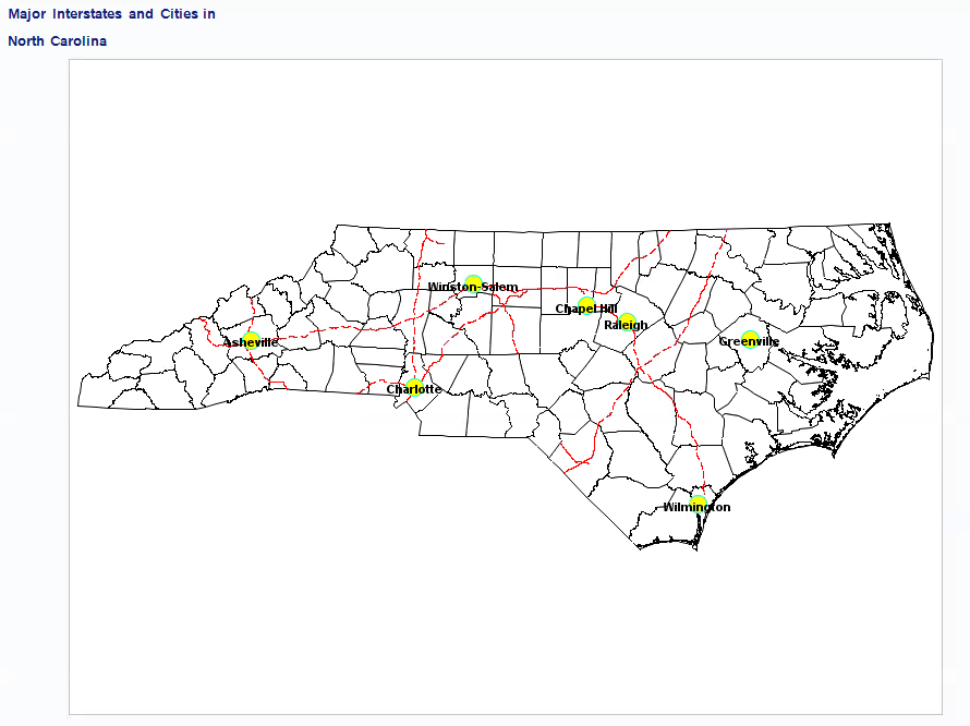
/* This code works fine and makes a good map, I ripped it off from SAS examples and blogs like Robert Allison's ![]() */
*/
goptions reset=all border;
data nc_counties;
length dsn $8;
set mapsgfk.us_counties(where=(fipstate(state)="NC"));
x=long;
y=lat;
dsn='map';
run;
data highways;
set NCMAPS.nc_interstates(where=(mtfcc in:('S1100' /*'S1200' 'H'*/)));
run;
/*
proc ginside map=nc data=roads out=rdsinwake insideonly;
id id;
run;
*/
data anno_roads(drop=statefp countyfp);
length STATE COUNTY 5 text color $8;
retain xsys ysys '2' when 'A';
/*set rdsinwake;*/ /* Uncomment this if you run the GINSIDE proc.*/
set highways; /* Comment out this data set if you run GINSIDE proc.*/
dsn='lines';
/* Define SAS variables: SAS data sets have */
/* state and county defined as numeric */
STATE=statefp; county=countyfp;
id='US-'||put(state,z2.)||put(county,z3.);
LONG=X; LAT=Y;
by linearid notsorted;
text=mtfcc;
if mtfcc='S1100' then do; line=3; color='red'; size=1.25; end;
/* else if mtfcc='S1200' then do; line=2; color='green';end;
else if mtfcc=:'H' then do; line=4; color='blue'; end; */
if first.linearid then do;
function='MOVE';
output;
end;
else do;
function='DRAW';
output;
end;
run;
data city_markers;
length STATE 5 COUNTY 5 text $45 font $8 color $8
function $8 dsn $8;
retain STATE 37 COUNTY 183 xsys ysys '2' when 'A'
font 'marker';
set ncmaps.nc_major_cities;
;
dsn='points';
text=City;
style='Albany AMT/bold';
function='label';
output;
function='pie';
rotate=360;
style='psolid';
color='yellow';
position='5';
size=.75;
output;
/* Draw a dark ring around pie, to help */
/* distinguish overlapping ones */
style='pempty';
color='cyan';
line=1;
html='';
output;
run;
data all;
length function $8 text $45 style $20;
set nc_counties anno_roads city_markers;
run;
proc gproject data=all out=prj degrees eastlong dupok;
id dsn id;
run;
data map lines points;
set prj;
if dsn='map' then output map;
else if dsn='lines' then output lines;
else output points;
run;
proc gmap map=map data=map anno=lines;
id id; choro state/discrete nolegend anno=points stat=sum;
pattern v=s r=100 color=cream;
title1 j=left font='Albany AMT/bold' height=2 'Major Interstates and Cities in';
title2 j=left font='Albany AMT/bold' height=2 'North Carolina';
/*footnote j=l c=red '- Major Interstates';
footnote2 j=l c=black '- Major Cities';
footnote3 j=l c=blue '- Water';*/
run;
quit;
/* Draw choro map showing counties with different colors based on amount of payments made*/
/* We used our internal data set which I had added county codes to for this. */
/* I started with the EG generated code for the choro map and then tried to add in the city annotations from above. */
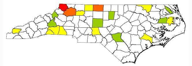
/* This code produced a good choro map ![]() , but without city annotations.
, but without city annotations. ![]() */
*/
/* If I can get cities to annotate, I'll try adding highways next. */
/* -------------------------------------------------------------------
Code generated by SAS Task
Generated on: Thursday, May 4, 2017 at 1:57:01 PM
By task: Map Chart
Map Data: SASApp:MAPSGFK.US_COUNTIES Response Data: SASApp:WORK.ADDCOUNTYID Server: SASApp
------------------------------------------------------------------- */
%_eg_conditional_dropds(WORK.MAPCHARTMAPPREP);
PROC SQL;
CREATE VIEW WORK.MAPCHARTMAPPREP AS
SELECT *
FROM MAPSGFK.US_COUNTIES
WHERE STATECODE = 'NC'
;
QUIT;
%_eg_conditional_dropds(WORK.MAPCHARTRESPONSEPREP);
PROC SQL;
CREATE VIEW WORK.MAPCHARTRESPONSEPREP AS
SELECT *
FROM WORK.ADDCOUNTYID
;
QUIT;
GOPTIONS CBACK= ;
PATTERN1 VALUE=SOLID COLOR=CX99CC00;
PATTERN2 VALUE=SOLID COLOR=WHITE;
PATTERN3 VALUE=SOLID COLOR=YELLOW;
PATTERN4 VALUE=SOLID COLOR=CXFF6600;
PATTERN5 VALUE=SOLID COLOR=RED;
LEGEND1
DOWN=5
FRAME
LABEL=( FONT='Times New Roman' HEIGHT=14pt JUSTIFY=LEFT "Light green counties have unusually LOW spending. "
FONT='Times New Roman' HEIGHT=14pt JUSTIFY=LEFT "White counties have spending that is within plus or minus one standard deviation from the mean. "
FONT='Times New Roman' HEIGHT=14pt JUSTIFY=LEFT "Yellow, orange, and red counties have unusually HIGH spending.")
;
TITLE;FOOTNOTE;
TITLE1 "Spend Per County";
TITLE2 "Standard Deviations Above or Below Average";
FOOTNOTE1 "";
PROC GMAP GOUT=MAPCHART DATA=WORK.MAPCHARTRESPONSEPREP MAP=WORK.MAPCHARTMAPPREP ANNO=ncmaps.NC_MAJOR_CITIES;
ID STATE COUNTY;
choro Deviations /
WOUTLINE=1
CDEFAULT=BLACK
DISCRETE
LEGEND=LEGEND1
;
RUN;
QUIT;
TITLE;FOOTNOTE;
GOPTIONS RESET=LEGEND;
GOPTIONS RESET=PATTERN;
GOPTIONS CBACK=;
%_eg_conditional_dropds(WORK.MAPCHARTRESPONSEPREP);
%_eg_conditional_dropds(WORK.MAPCHARTMAPPREP);
/* -------------------------------------------------------------------
End of task code
------------------------------------------------------------------- */
- Mark as New
- Bookmark
- Subscribe
- Mute
- RSS Feed
- Permalink
- Report Inappropriate Content
You have at least two issues that can be problems. First the SHP file may well not import to the same range of X,Y coordinates in another map set such as something derived from Maps.uscounty or similar. If your SHP has latitude and longitude values you may be able to project (GPROJECT) in such a fashion that the data represents the same X,Y coordinate system.
Second is that AFTER you have the SHP converted you are likely to have issues as it will not contain boundaries but are linear features.
You may find some help here:
http://blogs.sas.com/content/sastraining/2017/02/23/how-to-add-roads-to-your-sas-maps/
Note that with proc gmap you may have two annotate data sets, one on the PROC statement and another nn the CHORO statment options. This may be helpful if you were attempting to combine multiple features into one annotate set.
- Mark as New
- Bookmark
- Subscribe
- Mute
- RSS Feed
- Permalink
- Report Inappropriate Content
Thank you for the insights! I believe you are correct that there is an issue with X and Y. The USCITIES (used for cities annotation) and USCOUNTIES (used to build CHORO map) datasets contained X Y LAT and LONG. (I don't know what X and Y are but they do not appear to match latitude and longitude.) The Roads shape file (used to annotate highways) contained only X and Y, but on closer inspection the values appear to actually be latitude and longitude. I attempted to compensate by renaming the USCITIES LAT and LONG to X and Y - that way all my annotations were consistent - but this may have caused a problem when trying to combine with the CHORO map. Should I have done something different to create consistency in the X and Y variables? Thanks again.
- Mark as New
- Bookmark
- Subscribe
- Mute
- RSS Feed
- Permalink
- Report Inappropriate Content
Proc map expects a map data set to contain coordinates as variables X and Y for easting (left-right) and northing (up-down). The (x,y) are fairly arbitrary as they result from projecting a more geo oriented coordinate system (which is 3-dimensional at heart) into a flat plane for display/print. That is part of the purpose of the GPROJECT procedure, conversion of geo-coordinates (in the correct form!) to (x,y) pairs in the display space. About the only thing I can say about the values of (x,y) is that (0,0) should be near the center of the projected area.
Note that, at least in my USCities the label for x is "Projected Longitude from Radians" and the Long(itude) variable is "Unprojected Longitude in Degrees". Which does sort of tell you what happens: Degrees are converted to radians (with some attention to which hemispere and such) for Gproject to use.
It may be best if you have your road data in a SHP file to see if the same source can provide the associated county/city/state boundary and point locations as those may well come in a form where the converted map sets are in the same X-Y ranges.
Otherwise you need the geocoordinates to project.
OR if you are real good at interpolation and have identified matching points in two different map sets you can use those matched points to develope an interpolation formula (or linear regression) to shift on set to the other. This requires an extremely accurate co-loction identification though and may end up with things around the edges not aligning as well. Scale may affect your decision on how much precision is needed. My state is big enough that on a statewide map if a town is 5 or 10 miles out of place it may not be noticeable on a typical printed page size unless it clashes with another nearby town. What location error acceptable in a largish western state may not be so in someplace like Rhode Island though 🙂
- Mark as New
- Bookmark
- Subscribe
- Mute
- RSS Feed
- Permalink
- Report Inappropriate Content
I used the US_COUNTIES data set for both maps, however I can see what you mean about the borders showing up in slightly different places, probably due to something being handled different as far as projecting. When I tried to manually overlay the images in Word (made one transparent), the borders didn't quite line up. So thinking from another angle...
I actually have a pretty good map and was thinking maybe instead of using the choropleth function I could hard code the color values of each county myself. Here's what I have so far:
Would it be fairly easy to set the color of each county individually according to my data on payment amounts? I only have a few counties to color, looking similar to this (my choro map):
- Mark as New
- Bookmark
- Subscribe
- Mute
- RSS Feed
- Permalink
- Report Inappropriate Content
I would expect the county boundaries, unless you have done something very interesting should work for a choro statement. You would likely find that to be much more flexible than any hard code approach in the long run. Remember that the Choro statement can calculate some statistics such as sum, frequency or mean. Which for some data may save steps such as a map of number of crashes per county and starting with a data set of accidents with one per record (freq map) or number of injuries/fatalities per crash and use Sum for total.
Your response data set would only require a matching ID variable for county identification and the response value you want. The Choro statement would reference that response variable. Since it appears that you only have a few counties then you would want the MISSING option on the Choro statement and possibly set the CDEFAULT= color to assign a specific color to the background color for the counties missing the response variable. I find it very often helps to use a custom format to create groups to match the number of levels/colors I want the map to display ( a corresponding LEVELS option on the Choro statement).
- Mark as New
- Bookmark
- Subscribe
- Mute
- RSS Feed
- Permalink
- Report Inappropriate Content
Thank you, I am getting there bit by bit. I added a column to my response data set that includes the desired color for each county, since I had already computed the standard deviations and where each county fell. From the map I posted (no legend) you couldn't tell, but the white counties were actually counties within 1 standard deviation of the norm rather than missing data, so missing data is not an issue for this task. I would like to update the CHORO map to include the colors from the column I added (I called it "color") but I'm not sure what edit to make to this code:
proc gmap map=map data=map anno=lines;
id id; choro state/discrete nolegend anno=points stat=sum;
pattern v=s r=100 color=white;
title1 j=left font='Albany AMT/bold' height=2 'Major Interstates and Cities in';
title2 j=left font='Albany AMT/bold' height=2 'North Carolina';
run;
- Mark as New
- Bookmark
- Subscribe
- Mute
- RSS Feed
- Permalink
- Report Inappropriate Content
You will typically want to have your coloring/response data in a separate dataset from your map, with 1 observation per map area. And specify that as your data= dataset. Gmap will then match up the choro values from your data= dataset, to the colors specified in the pattern statements (or use the default colors from the ods style you're using).
The following chapter should help you in this area:
http://robslink.com/SAS/book1/Chapter_05_Maps.pdf
- Mark as New
- Bookmark
- Subscribe
- Mute
- RSS Feed
- Permalink
- Report Inappropriate Content
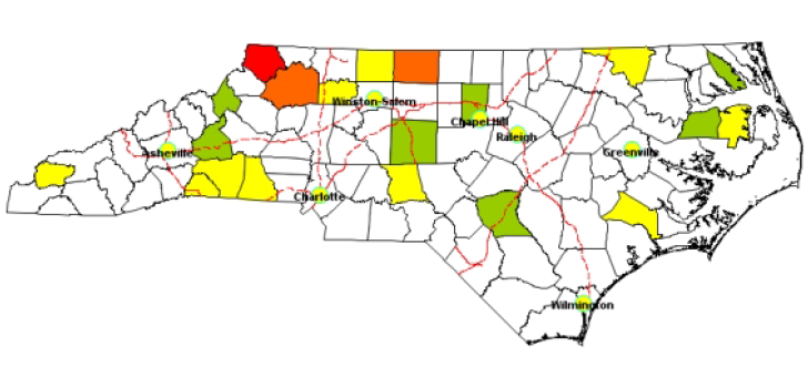
That worked! Thank you so much!
The winning code for the patterns and GMAP sections:
PATTERN1 VALUE=SOLID COLOR=CX99CC00;
PATTERN2 VALUE=SOLID COLOR=WHITE;
PATTERN3 VALUE=SOLID COLOR=YELLOW;
PATTERN4 VALUE=SOLID COLOR=CXFF6600;
PATTERN5 VALUE=SOLID COLOR=RED;
proc gmap map=map data=work.addcountyid anno=lines;
id county; choro deviations/legend=legend1 html=tooltip anno=points;
Catch up on SAS Innovate 2026
Nearly 200 sessions are now available on demand with the SAS Innovate Digital Pass.
Explore Now →Learn how use the CAT functions in SAS to join values from multiple variables into a single value.
Find more tutorials on the SAS Users YouTube channel.
SAS Training: Just a Click Away
Ready to level-up your skills? Choose your own adventure.


