- Home
- /
- Programming
- /
- Graphics
- /
- Re: Axis attributes in sgplot
- RSS Feed
- Mark Topic as New
- Mark Topic as Read
- Float this Topic for Current User
- Bookmark
- Subscribe
- Mute
- Printer Friendly Page
- Mark as New
- Bookmark
- Subscribe
- Mute
- RSS Feed
- Permalink
- Report Inappropriate Content
Hi all. I'm using SAS University and proc sgplot to create scatter plots. I understand how to change the attributes of axis labels and axis values, but I'm having trouble figuring out how to change the appearance of the axises themselves. What I want to do is to increase the weight or thickness of the axises or frame surrounding the plot area and the tick marks. Does anyone have any suggestions for how I can do this?
- Mark as New
- Bookmark
- Subscribe
- Mute
- RSS Feed
- Permalink
- Report Inappropriate Content
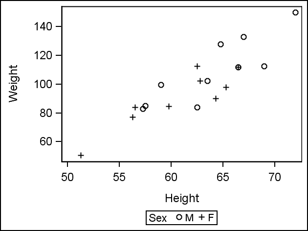
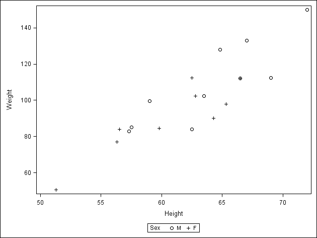
I find that line, symbol, label, etc. dimensions are usually well proportioned in SG-graphics. Make sure your target graph size is well chosen, that's what determines the overall appearance of the graph. You can adjust the pixel counts of your image with image_dpi= option. Compare these two graphs with the same pixel counts but different target sizes
ods listing gpath="consultations\SAS Community\Graphs" image_dpi=200
style=journal;
ods graphics / width=8cm height=6cm imagename="test200";
proc sgplot data=sashelp.class;
scatter x=height y=weight / group=sex;
run;
ods listing gpath="consultations\SAS Community\Graphs" image_dpi=100
style=journal;
ods graphics / width=16cm height=12cm imagename="test100";
proc sgplot data=sashelp.class;
scatter x=height y=weight / group=sex;
run;
PG
- Mark as New
- Bookmark
- Subscribe
- Mute
- RSS Feed
- Permalink
- Report Inappropriate Content
I have the same question.
- Mark as New
- Bookmark
- Subscribe
- Mute
- RSS Feed
- Permalink
- Report Inappropriate Content
RIght now, the only direct way to change the axis line thickness is via the GRAPHAXISLINES style element in the ODS style.
- Mark as New
- Bookmark
- Subscribe
- Mute
- RSS Feed
- Permalink
- Report Inappropriate Content
thank you so much. It works. Here is my code in case others may be interested.
proc template;
define style mystyle;
parent=styles.sasweb;
class graphwalls / frameborder=off;
class graphbackground / color=white;
class graphaxislines / contrastcolor=red;
class graphaxislines / linethickness=8px;
end;
run;
ods listing close;
ods html style=mystyle path='.' file='newgraph.html';
ods graphics / reset=all IMAGENAME="prog" OUTPUTFMT=gif border=off width=600px height=400px;
proc sgplot data=sashelp.heart;
where status in('Alive') and ageatstart < 50;
title1 'Remove Frame Border & Assign White to Background Color';
hbar ageatstart / response=weight group=sex;
run;
ods html close;
ods listing;
- Mark as New
- Bookmark
- Subscribe
- Mute
- RSS Feed
- Permalink
- Report Inappropriate Content
I suspect I must be missing something obvious but I've been searching for more than an hour to find out how I create an SGPLOT
that hides the x2 and y2 axes. Old SYSTAT called it "axes=L". I want the graph below to hide the upper x axis and right-side y axis. I'm sure it must be super easy to do in SAS but I can't figure it out. "x2axis display=none" doesn't work. Can this not be controlled using axis options? Thanks for any help you can offer! Rick
- Mark as New
- Bookmark
- Subscribe
- Mute
- RSS Feed
- Permalink
- Report Inappropriate Content
If you are using any level of SAS 9.4, you can do this by using the NOBORDER option on the PROC SGPLOT statement:
proc sgplot data=whatever noborder;
In SAS 9.2 and later, this can also be done through the ODS style through the GraphWalls style element:
style GraphWalls from GraphWalls /
frameborder=no
;
Hope this helps!
Dan
- Mark as New
- Bookmark
- Subscribe
- Mute
- RSS Feed
- Permalink
- Report Inappropriate Content
Thanks, Dan! I am using 9.4 and it works, to my surprise. I really appreciate your help.
Is it only me, or is it totally noninutuitive that the option "noborder" removes the upper x axis and right-side y axis (and only those)? Why wouldn't the option include the word "axis", for example? I searched in help, support, and all over the web, assuming that the command I was looking for to remove (or hide) axes would include the word "axis" and thus I never found the "noborder" option. Can you recommend a Forum paper or other document that shows how SAS words correspond to every element of a graph? Sorry for griping...and thanks again for helping.
Rick
- Mark as New
- Bookmark
- Subscribe
- Mute
- RSS Feed
- Permalink
- Report Inappropriate Content
The axis lines are coincident with the wall border. So, even if you ensure the axis lines are removed, you will still see the wall border. So, if you have only X & Y axes, you need to remove the wall border (NOBORDER option on the procedure statement) to remove the lines on the top and right. Then, if you suppress the x & y axis lines, all the lines bounding the data will be removed. I agree this may be a little obscure.
Note: The NOBORDER option on the ODS GRAPHICS statement removes the outermost border around the whole graph.
- Mark as New
- Bookmark
- Subscribe
- Mute
- RSS Feed
- Permalink
- Report Inappropriate Content
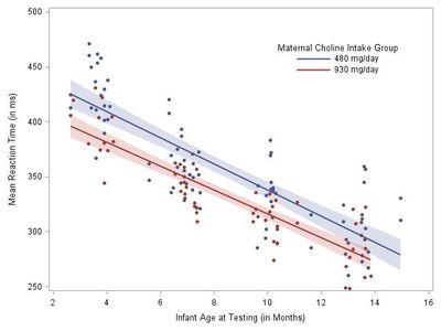
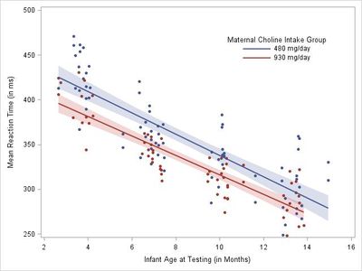
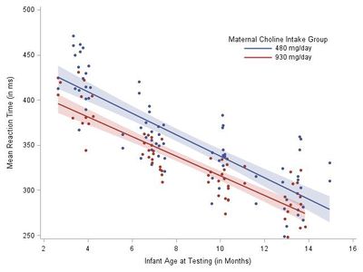
Thanks, Sanjay. I wish I weren't still confused. The way I thought it worked is shown in my code and images below. The "ODS border=off" suppresses the border lines, which are not coincident with the axes but outside the axes as shown in image 1. Then what is odd to me is that the sgplot "noborder" option controls the appearance/nonappearance of axes (but only 2 of them) and not what ODS calls the "border" lines. Adding the ODS border=off and sgplot noborder commands turns image 1 into image 2 (the code for image 2 precedes it). I find it confusing that sgplot and ODS seem to use different definitions for the term "border". And, as much as I dearly love sgplot, I must say that I agree with the ODS definition of border and think sgplot could use an intuitive option for the axis statements such as "x2axis display=none". That would make it easy to control the appearance of each axis line at the same time one is writing all the other axis statements.
Regardless of my frustrations, I truly appreciate your attempt to clarify the situation. SAS plots are so beautiful these days and so easy to produce that I get lulled into thinking it should be easy to make them look just the way I want them to without having a SAS GRAPH programmer on staff. Best, Rick
ODS GRAPHICS/ RESET border=off IMAGENAME='AGESPECIFIC' IMAGEFMT=JPEG
HEIGHT=480PX WIDTH=640PX;
ODS LISTING PATH = 'C:\Users\rlc5-admin\Documents\RESEARCH\Choline\Manuscript files';
Title ;
proc sgplot data=predADJ noborder;
reg y=pred x=age_months / group=cholineintake markerattrs=(symbol=circlefilled size=1.25 pct)
lineattrs=( pattern=solid) clm clmtransparency=.75 ;
*refline 403 277;
xaxis label= 'Infant Age at Testing (in Months)' values=(2 to 16 by 2);
yaxis label= 'Mean Reaction Time (in ms)' values=(250 to 500 by 50);
*inset "Main effect of choline dose P=0.0304)"/position=topright textattrs=graphfootnotetext;
keylegend/ noborder outerpad=(top=35pt) outerpad=(right=35pt) across=1
title='Maternal Choline Intake Group' location=inside position=topright;
run;
- Mark as New
- Bookmark
- Subscribe
- Mute
- RSS Feed
- Permalink
- Report Inappropriate Content
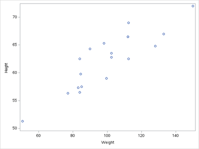
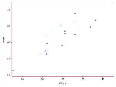
The border around the data area is called the wall border. The axes are drawn on top of the wall border. Because the axis line style attributes are the same as the wall border, the box around the data area looks seemless; but if you change the color of the axis lines, this arrangement becomes more obvious:
ods html style=htmlblue;
proc sgplot data=sashelp.class;
scatter x=weight y=height;
run;
proc template;
define style styles.axis;
parent=styles.htmlblue;
class GraphAxisLines /
contrastcolor=red;
end;
run;

ods html style=axis;

proc sgplot data=sashelp.class;
scatter x=weight y=height;
run;
All four axes (X, Y, X2, Y2) have the ability to control their display; but it the wall border is turned on, you might not get the appearance you would expect.
- Mark as New
- Bookmark
- Subscribe
- Mute
- RSS Feed
- Permalink
- Report Inappropriate Content
Thanks, help me a lot
Catch up on SAS Innovate 2026
Nearly 200 sessions are now available on demand with the SAS Innovate Digital Pass.
Explore Now →Learn how use the CAT functions in SAS to join values from multiple variables into a single value.
Find more tutorials on the SAS Users YouTube channel.
SAS Training: Just a Click Away
Ready to level-up your skills? Choose your own adventure.


