- Home
- /
- Programming
- /
- Graphics
- /
- Axis alignments using barplot and stepplot in proc template
- RSS Feed
- Mark Topic as New
- Mark Topic as Read
- Float this Topic for Current User
- Bookmark
- Subscribe
- Mute
- Printer Friendly Page
- Mark as New
- Bookmark
- Subscribe
- Mute
- RSS Feed
- Permalink
- Report Inappropriate Content
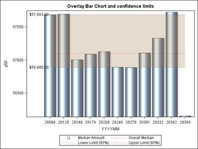
I m showing a control chart using a bar plot and 3 series plot (for lower limit, upper limit and mean values). The 3 series plot act as confidence limit band.
Here is my data:
DATA median_data;
INPUT p50 8. yyyymm date9. overall_p50 8. lcl50 8. ucl50 8.;
DATALINES ;
57683 01Jan2015 57097 56886 57683
57693 01feb2015 57097 56886 57683
57006 01mar2015 57097 56886 57683
57088 01apr2015 57097 56886 57683
57128 01may2015 57097 56886 57683
56893 01jun2015 57097 56886 57683
56886 01jul2015 57097 56886 57683
57106 01aug2015 57097 56886 57683
57330 01sep2015 57097 56886 57683
57722 01oct2015 57097 56886 57683
56156 01nov2015 57097 56886 57683
;
run;
and here is my proc template for showing bar plot and stepplot together. The problem i face is that my y axis starts from 0 and my confidence band limits end up looking very tiny bands and all the bars have the same height.
If I had used a scatterplot instead of barplot, my y axis would have adjusted automatically.
But only with barplot the axis are not proper and in turn everything else looks like a sloppy graph.
I would like the numbers in y axis start automatically from the minimum of the p50 value.
Also, I have to put this code into macro, so it would be helpful to see if you can come with dynamic variables to be used for this purpose.
Please let me know if someone can solve this.
proc template;
define statgraph barline;
begingraph;
entrytitle 'Overlay Bar Chart and confidence limits';
layout overlay/ yaxisopts=( /*linearopts=(viewmin=50000)*/)
xaxisopts=(label="YYYYMM");
barchart x=yyyymm y=p50/ dataskin=sheen primary=true legendlabel="Median Amount" name="p50";
bandplot x=yyyymm limitlower=lcl50 limitupper=ucl50 /
legendlabel="95% CLI" name="band1" display=(fill) fillattrs=(color=GraphData4:color)
datatransparency=.7 fillattrs=GraphError
legendlabel="Out-of-control"
name="error";
/* datavalues cannot be shown in reference line*/
*referenceline y=overall_p50 /curvelabel=eval(putn(mean(ovearall_50),'dollar12.2')) lineattrs=(color=red pattern=dot) ;
*referenceline y=ucl50 /curvelabel=eval(putn(mean(ucl50),'dollar12.2')) lineattrs=(color=blue pattern=dot) ;
*referenceline y=lcl50 /curvelabel=eval(putn(mean(lcl50),'dollar12.2')) lineattrs=(color=green pattern=dot) ;
/*Datavalues can be shown in series, needle or stepplot*/
stepplot x=yyyymm y=overall_p50 /curvelabel=eval(putn(mean(ovearall_50),'dollar12.2')) curvelabellocation=inside curvelabelposition=start lineattrs=(color=red pattern=dot) name="overall" legendlabel="Overall Median";
stepplot x=yyyymm y=ucl50 /curvelabel=eval(putn(mean(ucl50),'dollar12.2')) curvelabellocation=inside curvelabelposition=start lineattrs=(color=blue pattern=dot) name="ucl50" legendlabel="Upper Limit (95%)";
stepplot x=yyyymm y=lcl50 /curvelabel=eval(putn(mean(lcl50),'dollar12.2')) curvelabellocation=inside curvelabelposition=start lineattrs=(color=green pattern=dot) name="lcl50" legendlabel="Lower Limit (95%)";
discretelegend "p50" "overall" "lcl50" "ucl50";
endlayout;
endgraph;
end;
proc sgrender data=median_data template=barline;
run;
- Mark as New
- Bookmark
- Subscribe
- Mute
- RSS Feed
- Permalink
- Report Inappropriate Content
A BARCHART by design always includes the zero baseline in the plot. SCATTERPLOT does not. So, Bar Chart is not likely the best plot to use for this graph as it can be misleading to have a baseline other than zero.
However, if you must, then you can find the min value and save it in a macro variable, and then set the Y axis ViewMin value to this value: " yaxisopts=(linearopts=(viewmin=&minp50)) "
Catch up on SAS Innovate 2026
Dive into keynotes, announcements and breakthroughs on demand.
Explore Now →Learn how use the CAT functions in SAS to join values from multiple variables into a single value.
Find more tutorials on the SAS Users YouTube channel.
SAS Training: Just a Click Away
Ready to level-up your skills? Choose your own adventure.


