- Home
- /
- Programming
- /
- Graphics
- /
- Re: Assigning legend labels by group in plot
- RSS Feed
- Mark Topic as New
- Mark Topic as Read
- Float this Topic for Current User
- Bookmark
- Subscribe
- Mute
- Printer Friendly Page
- Mark as New
- Bookmark
- Subscribe
- Mute
- RSS Feed
- Permalink
- Report Inappropriate Content
Hello,
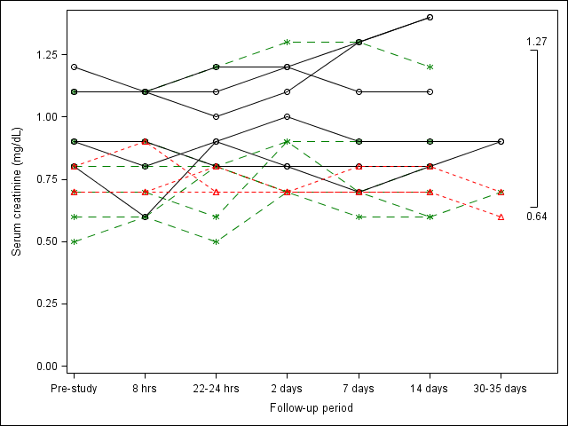
I have a plot that I'm creating using longitudinal data from 15 patients. Each patient is followed up for at most 7 time points. Each patient can belong into one of three groups. I can create the graph where patients in similar groups will have the same color and line patterns. However, I cannot seem to assign the legend labels properly. To further describe the creation of the plot, I created individual columns for each of the three groups. Some rows will be blank, of course, since some patients will be in other groups. I used sgrender to plot x = time and y = value BY PT. This got me the individual curves for each of the 15 patients. However, in doing this, SAS assigns a legend item to each patient, when I really want to assign only 3 categories defined by each GROUP. Is there a fix for this?
Thanks!
Here is what I have so far:

The code used to generate this is:
proc template;
define statgraph sgplot1;
begingraph /;
layout overlay / xaxisopts=(label = "Follow-up period" linearopts = (viewmax=7.7 tickvaluelist=(1 2 3 4 5 6 7))) yaxisopts=(linearopts=(viewmin=0)) ;
SeriesPlot X=time Y=level1val / display = all primary=true Group=pt lineattrs = (Color=CX008000 pattern=20) Markerattrs=( Color=CX008000 Symbol=ASTERISK) LegendLabel="Level 1" NAME="Dose";
SeriesPlot X=time Y=level2val / display = all Group=pt lineattrs = (Color=CX000000 pattern=1) Markerattrs=( Color=CX000000 Symbol=CIRCLE) LegendLabel="Level 2" NAME="Dose";
SeriesPlot X=time Y=level3val / display = all Group=pt lineattrs = (Color=CXFF0000 pattern=2) Markerattrs=(Color=CXFF0000 Symbol=TRIANGLE) LegendLabel="Level 3" NAME="Dose";
beginpolyline x = 7.4 y = 1.27/drawspace = datavalue lineattrs=(color=CX000000 thickness=1.5);
draw x = 7.5 y = 1.27/drawspace = datavalue;
draw x = 7.5 y = 0.64/drawspace = datavalue;
draw x = 7.4 y = 0.64/drawspace = datavalue;
endpolyline;
drawtext textattrs=(size = 9pt) "0.64" /x = 7.5 y = 0.60 drawspace = datavalue;
drawtext textattrs=(size = 9pt) "1.27"/x = 7.5 y = 1.30 drawspace = datavalue;
endlayout;
endgraph;
end;
run;
proc sgrender template = sgplot1 data = creat;
run;
Thanks,
John
Accepted Solutions
- Mark as New
- Bookmark
- Subscribe
- Mute
- RSS Feed
- Permalink
- Report Inappropriate Content
Thank you everyone for chiming in. Ultimately I found my answer in another post - https://communities.sas.com/message/141826#141826.
- Mark as New
- Bookmark
- Subscribe
- Mute
- RSS Feed
- Permalink
- Report Inappropriate Content
Code you used would help.
- Mark as New
- Bookmark
- Subscribe
- Mute
- RSS Feed
- Permalink
- Report Inappropriate Content
Data would help too. The GTL experts may be able to tell you what you need just by looking at your code but it always helps to have a complete working (or not working) program with data.
- Mark as New
- Bookmark
- Subscribe
- Mute
- RSS Feed
- Permalink
- Report Inappropriate Content
The problem is that the plot reports back the group information to the legend, while your desired result is to have each series (without group) in the legend. There are some possible solutions, but I need to know the version of SAS you're using to give you the correct solution.
- Mark as New
- Bookmark
- Subscribe
- Mute
- RSS Feed
- Permalink
- Report Inappropriate Content
I have done similar using BREAK option where I "spaghetti plot" subjects in normal range groups, Normal or High (with legend for range group), by adding an observation between each subject with missing values for the plot variables. This makes a separate line for each subject with attributes of the normal range groups.
BREAK=boolean
breaks the plot line at missing values of the X or Y variable.
- Mark as New
- Bookmark
- Subscribe
- Mute
- RSS Feed
- Permalink
- Report Inappropriate Content
Thank you everyone for chiming in. Ultimately I found my answer in another post - https://communities.sas.com/message/141826#141826.
Catch up on SAS Innovate 2026
Dive into keynotes, announcements and breakthroughs on demand.
Explore Now →Learn how use the CAT functions in SAS to join values from multiple variables into a single value.
Find more tutorials on the SAS Users YouTube channel.
SAS Training: Just a Click Away
Ready to level-up your skills? Choose your own adventure.


