- Home
- /
- Programming
- /
- Graphics
- /
- Annotate SGPANEL or similar
- RSS Feed
- Mark Topic as New
- Mark Topic as Read
- Float this Topic for Current User
- Bookmark
- Subscribe
- Mute
- Printer Friendly Page
- Mark as New
- Bookmark
- Subscribe
- Mute
- RSS Feed
- Permalink
- Report Inappropriate Content
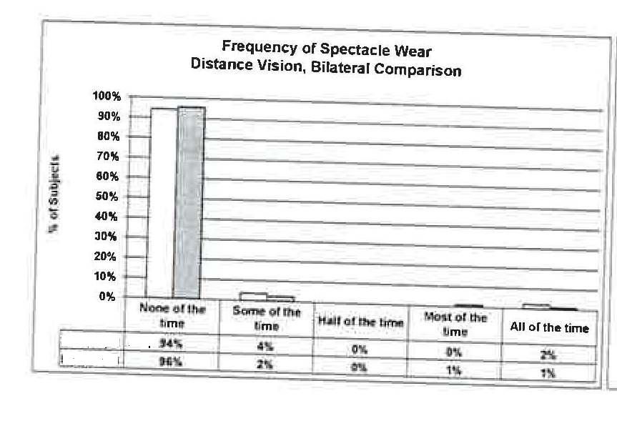
How can I create a similar chart in 9.2 TS2M3 to the one attached? The construction of the annotations below the graph itself are problematic.

- Mark as New
- Bookmark
- Subscribe
- Mute
- RSS Feed
- Permalink
- Report Inappropriate Content
I would start off by looking at Rob Allisons graph page and seeing if you can find an example.
It's definitely doable, but you can help out by providing what your sample data looks like as well, because that's an important factor.
Survival Kaplan Meier graphs for example have this option by semi-default.
- Mark as New
- Bookmark
- Subscribe
- Mute
- RSS Feed
- Permalink
- Report Inappropriate Content
Sample data set contains two products - test and control, the categories shown on the bottom of the sample, and percentages of each denominated against the product totals.
- Mark as New
- Bookmark
- Subscribe
- Mute
- RSS Feed
- Permalink
- Report Inappropriate Content
What I'm trying to do is attach the data table to the bottom of the panel chart
- Mark as New
- Bookmark
- Subscribe
- Mute
- RSS Feed
- Permalink
- Report Inappropriate Content
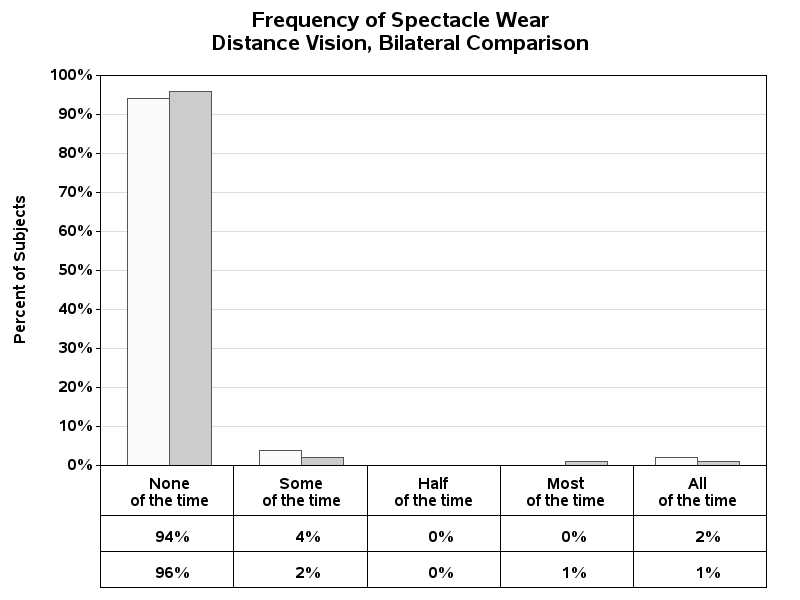
I didn't really have any examples like this, with a grouped bar chart (the annotate coordinates for a grouped bar chart are a little tricker than for regular bar charts or gplots), therefore I wrote one to produce this specific chart.
%let name=grouped_bar_table;
filename odsout '.';
proc format;
value bartxt
1 = 'None\of the time'
2 = 'Some\of the time'
3 = 'Half\of the time'
4 = 'Most\of the time'
5 = 'All\of the time'
;
run;
data my_data;
format group_num bartxt.;
input group_num bar_num percent_of_subjects;
datalines;
1 1 .94
1 2 .96
2 1 .04
2 2 .02
3 1 .00
3 2 .00
4 1 .00
4 2 .01
5 1 .02
5 2 .01
;
run;
/* determine how many groups, to determine geometry of table */
proc sql;
select count(unique(group_num)) into :groups from my_data;
quit; run;
data anno_table_lines;
length function color $8 text $50;
xsys='1'; hsys='3'; when='a'; color='black';
/* draw the table lines going up/down */
do x=0 to 100 by (100/&groups);
ysys='1'; y=0; function='move'; output;
ysys='3'; y=2; function='draw'; size=.001; output;
end;
/* draw the table lines going across */
ysys='3';
x=0; y=14; function='move'; output;
x=100; function='draw'; output;
x=0; y=8; function='move'; output;
x=100; function='draw'; output;
x=0; y=2; function='move'; output;
x=100; function='draw'; output;
run;
data anno_table_numbers; set my_data;
length function color $8 text $50;
function='label'; position='5'; color='black';
xsys='1'; x=group_num*(100/&groups)-(100/&groups/2);
ysys='3';
if bar_num=1 then do;
y=11; text=put(percent_of_subjects,percentn7.0); output;
end;
if bar_num=2 then do;
y=5; text=put(percent_of_subjects,percentn7.0); output;
end;
run;
data anno_table; set anno_table_lines anno_table_numbers;
run;
goptions device=png;
goptions noborder;
ODS LISTING CLOSE;
ODS HTML path=odsout body="&name..htm"
(title="Frequence of Spectacle Wear") style=sasweb;
goptions gunit=pct htitle=3.5 ftitle="albany amt/bold" htext=2.7 ftext="albany amt/bold";
pattern1 v=s c=grayfa;
pattern2 v=s c=graycc;
axis1 label=(a=90 "Percent of Subjects") order=(0 to 1.00 by .10) minor=none offset=(0,0);
axis2 label=none value=none offset=(3,3);
axis3 label=none split='\' offset=(3,3);
title1 ls=1.5 "Frequency of Spectacle Wear";
title2 h=3.5 "Distance Vision, Bilateral Comparison";
footnote1 height=10pct " ";
proc gchart data=my_data anno=anno_table;
format percent_of_subjects percentn7.0;
vbar bar_num / discrete
type=sum sumvar=percent_of_subjects nolegend
group=group_num subgroup=bar_num
raxis=axis1 maxis=axis2 gaxis=axis3
autoref clipref lref=1 cref=graydd
width=6 space=0 gspace=6
coutline=gray55
des='' name="&name";
run;
quit;
ODS HTML CLOSE;
ODS LISTING;
- Mark as New
- Bookmark
- Subscribe
- Mute
- RSS Feed
- Permalink
- Report Inappropriate Content
Here is the chart that the above code produces...

Learn how use the CAT functions in SAS to join values from multiple variables into a single value.
Find more tutorials on the SAS Users YouTube channel.
SAS Training: Just a Click Away
Ready to level-up your skills? Choose your own adventure.


