- Home
- /
- Programming
- /
- Graphics
- /
- Aligning group values in Gchart hbar
- RSS Feed
- Mark Topic as New
- Mark Topic as Read
- Float this Topic for Current User
- Bookmark
- Subscribe
- Mute
- Printer Friendly Page

- Mark as New
- Bookmark
- Subscribe
- Mute
- RSS Feed
- Permalink
- Report Inappropriate Content
Hello,
When using the following, the values of the group variable (dimension) appears vertically and could not been displayed properly. How can I turn the to appear horizontal?
I tried rotate with different values in the axis statement but no success. Thanks
goptions hpos=67 vsize= 8.4200 inches hsize= 8.6 inches ftext="times" htext=1.5 ctext=navy HORIGIN=0.0 IN device=activex;
axis1 noplane order=(2 to 5 by 1) label=(font=times '') style=0 major=none minor=none value=none;
axis2 color=red NOPLANE VALUE=(ROTATE=0 ) label=none SPLIT="*" style=0 ;
axis3 color=black NOPLANE label=(font=simulate '' ) SPLIT="*" style=0;
proc gchart data=KukuAppend;
hbar Entity / descending mean group=dimension patternid=midpoint sumvar=_Engineering2012 name="Height" raxis=axis1 gaxis=axis2 maxis=axis3 GSPACE=0.1 SPACE=0.1 ;
format _Engineering2012 5.2;
pattern1 c=orange;
pattern2 c=navy;
Abe
Accepted Solutions

- Mark as New
- Bookmark
- Subscribe
- Mute
- RSS Feed
- Permalink
- Report Inappropriate Content
If you are using SGPLOT, you have to use GROUPDISPLAY=CLUSTER option with HBAR to get the side-by-side bars:
proc sgplot data=a001DistributionYouAndOthers ;
hbar dimension/ STAT= mean group=entity response=PctN_10 dataskin=pressed DATALABEL
GROUPDISPLAY=CLUSTER;

- Mark as New
- Bookmark
- Subscribe
- Mute
- RSS Feed
- Permalink
- Report Inappropriate Content
Please provide some sample data.
Thanks!

- Mark as New
- Bookmark
- Subscribe
- Mute
- RSS Feed
- Permalink
- Report Inappropriate Content
Does the following simple example work ok for you, and produce group axis values vertical and horizontal as expected?
axis1 value=(angle=90);
axis2 value=(angle=0);
proc gchart data=sashelp.shoes
(where=(
subsidiary in ('Khartoum' 'Luanda') and
product in ('Boot' 'Sandal' 'Slipper')));
hbar product / type=sum sumvar=sales group=subsidiary gaxis=axis1;
hbar product / type=sum sumvar=sales group=subsidiary gaxis=axis2;
run;
If that works, then you might try paring down your goptions & axis options to the bare minimum in your code, and see if that fixes the problem, and then work from there. Also, you might try device=png rather than device=activex, to see if this is one of those scenarios where an option might be partially or differently supported in activex.
- Mark as New
- Bookmark
- Subscribe
- Mute
- RSS Feed
- Permalink
- Report Inappropriate Content
Thanks,
Your code works well for few bars but not with more 6-7 values in the vertical axis. the values appear vertical and are unreadable
Tried also other devices but other issues arise
Abe
- Mark as New
- Bookmark
- Subscribe
- Mute
- RSS Feed
- Permalink
- Report Inappropriate Content
Can you post up an image, or a Web url link, to an example of a graph that is like the one you're wanting?
(If so, then I will write some example code to produce a graph like that...)
- Mark as New
- Bookmark
- Subscribe
- Mute
- RSS Feed
- Permalink
- Report Inappropriate Content
Thanks
I want to achieve something like that (http://www.ezpaste.net/ftp/Sample.png) , even much less fancy but readable
Abe
- Mark as New
- Bookmark
- Subscribe
- Mute
- RSS Feed
- Permalink
- Report Inappropriate Content
With SAS 9.3 SGPLOT procedure you can get a reasonable facsimile. You could even do the overlapping bars. Do you have SAS 9.3?
- Mark as New
- Bookmark
- Subscribe
- Mute
- RSS Feed
- Permalink
- Report Inappropriate Content
Looks very nice. Thanks
Can it be achieved with older versions of sas as 9.0?
I was thinking about annotate but not sure how to handle that complex feature. Could you help?
Abe
- Mark as New
- Bookmark
- Subscribe
- Mute
- RSS Feed
- Permalink
- Report Inappropriate Content
I can get part of the way there. The key is to insert unique blanks into the list of companies. Each unique blank is made up of a leading and trailing nsbp, and increasing number of blanks. To retain data order, the companies have to be indexed by numeric id, and then formatted to show company name. Here is the graph and code. I am sure it can be improved upon.
One problem is the "0.0" stat shown for the gaps. Maybe you can use Annotate to label the bars near the top, and not label the gaps.
proc format;
value company
1 = 'Company 1'
2 = 'Company 2'
3 = 'Company 3'
4 = 'A0'x ' ' 'A0'x
5 = 'Company 4'
6 = 'Company 5'
7 = 'Company 6'
8 = 'Company 7'
9 = 'Company 8'
10 = 'A0'x ' ' 'A0'x
11 = 'Company 9'
12 = 'Company 10';
run;
data companies;
length Type $12;
format i Company.;
drop r1 r2;
format response 3.1;
do i=1 to 12;
r1=2+2*ranuni(2);
r2=3+2*ranuni(2);
if i in (4 10) then do;
r1=.; r2=.;
end;
Type="Other"; Response=r1;output;
Type="Engineering"; Response=r2;output;
end;
run;
goptions reset=all device=png vsize=6in hsize=4in htext=8pt
gsfname=graphout gsfmode=replace noimageprint;
filename graphout 'C:\Work\Blogs\Communities\images\BarBreakGroupGChart.png';
axis1 label=none value=none major=none minor=none;
axis2 label=none major=none minor=none;
proc gchart data=companies;
hbar type / sumvar=response group=i subgroup=type
maxis=axis1 raxis=axis1 gaxis=axis2 outside=sum sumlabel=none;
run;
- Mark as New
- Bookmark
- Subscribe
- Mute
- RSS Feed
- Permalink
- Report Inappropriate Content
Hello,
I'm learning the sgplot procedure which looks great. Trying to achieve similar to your chart but always getting stacked bar instead of sideByside
proc sgplot data=a001DistributionYouAndOthers ;
hbar dimension/ STAT= mean group=entity response=PctN_10 dataskin=pressed DATALABEL ;
Could you help?
Thanks
Abe
- Mark as New
- Bookmark
- Subscribe
- Mute
- RSS Feed
- Permalink
- Report Inappropriate Content
If you are using SGPLOT, you have to use GROUPDISPLAY=CLUSTER option with HBAR to get the side-by-side bars:
proc sgplot data=a001DistributionYouAndOthers ;
hbar dimension/ STAT= mean group=entity response=PctN_10 dataskin=pressed DATALABEL
GROUPDISPLAY=CLUSTER;
- Mark as New
- Bookmark
- Subscribe
- Mute
- RSS Feed
- Permalink
- Report Inappropriate Content
Thanks a lot
Is there a way to control the order of the bars and the way the categories appear on the axis as the split=* does not seem to work with sgplot?
Abe
- Mark as New
- Bookmark
- Subscribe
- Mute
- RSS Feed
- Permalink
- Report Inappropriate Content
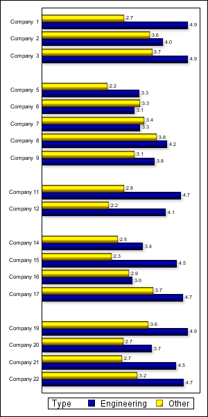
By default, SGPLOT will order the categories alphabetically. But since we are introducing special categoreis for the gaps, we must request SGPLOT to display the categories in data order. Here is the SGPLOT program I used to create the graph.
NOTE: You will need to look up the SGPLOT doc. Options you are familiar with in SAS/GRAPH procedures like GCHART will not translate over to the SG procedures.
/*--Create the data--*/
data companies;
length Company Type $12;
drop i r1 r2;
format response 3.1;
do i=1 to 22;
Company="Company " || put(i, 2.);
r1=2+2*ranuni(2);
r2=3+2*ranuni(2);
if i eq 4 then Company='. .';
else if i eq 10 then Company='. .';
else if i eq 13 then Company='. .';
else if i eq 18 then Company='. .';
if i in (4 10 13 18) then do;
r1=.; r2=.;
end;
Company=translate(Company, 'A0'x, '.');
Type="Other"; Response=r1;output;
Type="Engineering"; Response=r2;output;
end;
run;
/*--Create the graph--*/
ods graphics / reset noscale width=3in height=6in imagename='BarGapGroup';
proc sgplot data=companies;
hbar company / response=response group=type groupdisplay=cluster datalabel
dataskin=sheen datalabelattrs=(size=5);
yaxis display=(nolabel noticks) discreteorder=data valueattrs=(size=6);
xaxis display=none;
run;

- Mark as New
- Bookmark
- Subscribe
- Mute
- RSS Feed
- Permalink
- Report Inappropriate Content
I'm trying to achieve the same in SAS9.2 I realise i can't use the GROUPDISPLAY=CLUSTER option there. Is there a work around to do the same using proc sgplot?
thanks,
RK
.jpg")
Catch up on SAS Innovate 2026
Nearly 200 sessions are now available on demand in the Innovate Hub.
Watch Now →Learn how use the CAT functions in SAS to join values from multiple variables into a single value.

Find more tutorials on the SAS Users YouTube channel.
SAS Training: Just a Click Away
Ready to level-up your skills? Choose your own adventure.
-
13 replies
-
01-08-2013 06:18 AM
-
8648 views
-
7 likes
-
5 in conversation
-
