- Home
- /
- Programming
- /
- Graphics
- /
- Aligning Point Labels in pointlabel option
- RSS Feed
- Mark Topic as New
- Mark Topic as Read
- Float this Topic for Current User
- Bookmark
- Subscribe
- Mute
- Printer Friendly Page
- Mark as New
- Bookmark
- Subscribe
- Mute
- RSS Feed
- Permalink
- Report Inappropriate Content
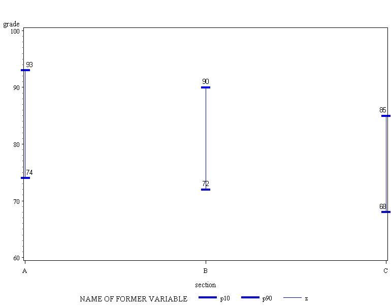
I am trying to do a simple plot showing the 10th and 90th percentile ranges of grades as well as the labels. Unfortunately, when I run the code the bottom label is not going below the tickmark.
**Setting up the data;
data grades;
input section $ grade @@;
datalines;
A 74 A 89 A 91 A 76 A 87 A 93 A 93 A 96 A 55 A 80 A 82
B 72 B 72 B 84 B 81 B 97 B 78 B 88 B 90 B 74 B 80 B 82
C 62 C 74 C 71 C 87 C 68 C 78 C 80 C 85 C 82 C 80 C 82
;
proc means data=grades noprint;
by section;
output out=grades2(drop=_:) p10(grade)=p10 p90(grade)=p90;
run;
proc transpose data=grades2 out=grades3(rename=(_name_=type col1=grade));
by section;
run;
*Prepare for 3 symbols;
*Symbol1 (p10), symbol2 (p90), symbol3 (connecting p10 and p90 with hilo);
data grades4;
set grades3 grades3(in=inb);
if inb then type='z';
run;
graphs
ods rtf file="K:\test.rtf";
symbol1 C=blue I=hilot V=none w=3 pointlabel=(j=c position=bottom f=times);
symbol2 C=blue I=hilot V=none w=3 pointlabel=(j=c position=top f=times);
symbol3 C=blue I=hilot V=none w=.01 pointlabel=none;
proc gplot data=grades4;
plot grade*section=type;
run;
quit;
ods rtf close;
The resulting output from the rtf is attached. As seen, the p10 labels are not shown below the tickmarks. Very oddly, at some point when I was testing the code the labels were aligned properly, but I am not sure what is causing this. Any help would be appreciated.

- Mark as New
- Bookmark
- Subscribe
- Mute
- RSS Feed
- Permalink
- Report Inappropriate Content
With SAS 9.2 unable to duplicate this behavior. I get the bottom labels below.
I would try running this code and looking for any additional options in your symbol1 statement.
proc goptions symbol;run;
The log will have the full definition of the symbols. Sometimes other options hang around you don't expect. If you see something you don't expect then try
symbol1;
to clear the full current assignment and then re-run your symbol definitions and the gplot code.
- Mark as New
- Bookmark
- Subscribe
- Mute
- RSS Feed
- Permalink
- Report Inappropriate Content
I'm running SAS 9.4. This behavior occurs even after I restart SAS. I do have this warning message for some reason which I cannot determine: WARNING: The height specified for the pointlabel might cause the labels to overlap other elements on the graph.
- Mark as New
- Bookmark
- Subscribe
- Mute
- RSS Feed
- Permalink
- Report Inappropriate Content
I have found that under some conditions some of the graph options will persist across sessions at least with 9.2 and earlier version 9.
Did you try the proc goptions code and look at the symbol definitions?
The warning is possibly related to font size and the default distance from the plot element such as the HILO line or the ends. You may note that your work library has both a GSEG catalog and an RTF catalog with versions of the graph in each. And they may not look alike. See if the text looks like it is overlapping in one (most likely the GSEG).
- Mark as New
- Bookmark
- Subscribe
- Mute
- RSS Feed
- Permalink
- Report Inappropriate Content
I reran the code today and oddly enough it generated the correct output.
Catch up on SAS Innovate 2026
Dive into keynotes, announcements and breakthroughs on demand.
Explore Now →Learn how use the CAT functions in SAS to join values from multiple variables into a single value.
Find more tutorials on the SAS Users YouTube channel.
SAS Training: Just a Click Away
Ready to level-up your skills? Choose your own adventure.


