- Home
- /
- Programming
- /
- Graphics
- /
- Add a Table to a SAS Graph
- RSS Feed
- Mark Topic as New
- Mark Topic as Read
- Float this Topic for Current User
- Bookmark
- Subscribe
- Mute
- Printer Friendly Page
- Mark as New
- Bookmark
- Subscribe
- Mute
- RSS Feed
- Permalink
- Report Inappropriate Content
Is there a simple way to add a frequency table to a SAS graph without creating an annotate dataset? (I have not had time to figure out annotations yet, althought I know they can come in quite handy.) I am making a "waterfall" chart using the INTERPOL=NEEDLE option in the SYMBOL statement. I want to overlay on the plot a frequency table that shows the counts of patients that are above, below, or between a given range.
I have seen plots where the data table is below the graph (I think it was summary data below a bunch of side-by-sde boxplots), but I don't want that. I want an actual table on the graph itself.
- Mark as New
- Bookmark
- Subscribe
- Mute
- RSS Feed
- Permalink
- Report Inappropriate Content
I don't think there's any way to do this automatically - you'll have to use one of the 'tricks' to add extra text.
I would probably use annotate, and programmatically position the text using a data step.
There are several other tricks you can use to get text on a graph, such as using 'note' statements, or writing the text on a gslide, and then 'greplay' that gslide onto the chart. But nothing easy/automated that I know of.
- Mark as New
- Bookmark
- Subscribe
- Mute
- RSS Feed
- Permalink
- Report Inappropriate Content
Use PROC SGPLOT and use the statement
scatter x=x y=y / MARKERCHAR=cell x2axis
where x and y are the coordinates in the table and cell is contents of the cell. See p. 11 of Sanjay's paper http://www.pharmasug.org/proceedings/2011/SAS/PharmaSUG-2011-SAS-AD01.pdf
- Mark as New
- Bookmark
- Subscribe
- Mute
- RSS Feed
- Permalink
- Report Inappropriate Content
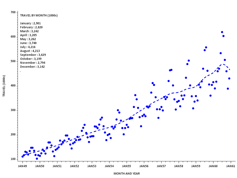
Hi ... one idea without annotation is to use a legend to put extra information on SAS/GRAPH output . I used SQL to create a macro variable with
text for the legend (it might have been just as easy to type out the entries !!!). Anyways, the following inserts something that looks
a bit like a table in the upper left portion of the plot. Every J=L produces a new line in the legend.
proc sql noprint;
create view counts as
select distinct put(date,monname. -l) as month, put(sum(air),comma.) as freq
from sashelp.air
group month
order month(date);
select cat('j=l "',strip(month),' : ',strip(freq), '"') into :tmp separated by ' '
from counts;
quit;
goptions reset=all ftext='calibri' htext=2 gunit=pct
device=png xpixels=1024 ypixels=768 gsfname=gout;
legend1
position=(top inside left)
label=(position=top j=l "TRAVEL BY MONTH (1000s)" j=l ' ' &tmp)
shape=symbol(.00001,.0001) value=none;
symbol f='wingdings' v='6c'x c=blue h=2 i=smp66 l=2 w=2;
axis1 label=(a=90 'TRAVEL (1000s)');
axis2 label=('MONTH AND YEAR') offset=(2,2)pct;
title1 ls=2;
filename gout 'z:\plot_table.png';
proc gplot data=sashelp.air;
plot air*date/ legend=legend1 vaxis=axis1 haxis=axis2 noframe;
format date monyy.;
run;
quit;

- Mark as New
- Bookmark
- Subscribe
- Mute
- RSS Feed
- Permalink
- Report Inappropriate Content
If you are using SAS 9.2, you can use SG Procedures or GTL to add statistics tables to your graphs without resorting to annotation. Rick pointed to a way using SG Procedures. For more flexibility, you can use GTL. Please see my recent blog post on this subject. Axis aligned statistics tables can be added along the horizontal or vertical, discrete or interval axis.
Catch up on SAS Innovate 2026
Dive into keynotes, announcements and breakthroughs on demand.
Explore Now →Learn how use the CAT functions in SAS to join values from multiple variables into a single value.
Find more tutorials on the SAS Users YouTube channel.
SAS Training: Just a Click Away
Ready to level-up your skills? Choose your own adventure.


