- Home
- /
- Programming
- /
- Graphics
- /
- Re: 2 level X Axis in SGPlot?
- RSS Feed
- Mark Topic as New
- Mark Topic as Read
- Float this Topic for Current User
- Bookmark
- Subscribe
- Mute
- Printer Friendly Page
- Mark as New
- Bookmark
- Subscribe
- Mute
- RSS Feed
- Permalink
- Report Inappropriate Content
I have created a simple vbar chart from data like the attached (I can't figure out how to paste into this browser).
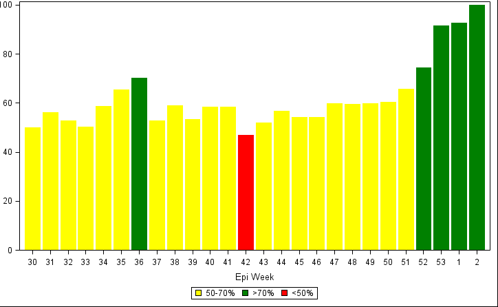
And I have used sgplot to make a simple bar chart, with the colors of the bars different for each week depending on the "code" column. I also got the weeks to appear in the data order! This is nice, since the data is epi data, and they do things by year and week.
Attached is a sample of the output.
The code was this, roughly.......
proc sgplot data= d300 dattrmap=attrmap;
vbar week /response=percent group=code attrid=code nooutline;
xaxis label='Epi Week' type=discrete discreteorder=data;
keylegend / title='';
run;
So right now it all looks like I want. However, I see a need in the future to have both the week and the year as the labels on the xaxis. So, in other words, the week would still be displayed as it is now, with year as a second level label under the weeks (year only appearing once, centered under the weeks it covers).
I have not been able to find an example of how to do this. Is it possible?
Thank you,
Nicole

- Mark as New
- Bookmark
- Subscribe
- Mute
- RSS Feed
- Permalink
- Report Inappropriate Content
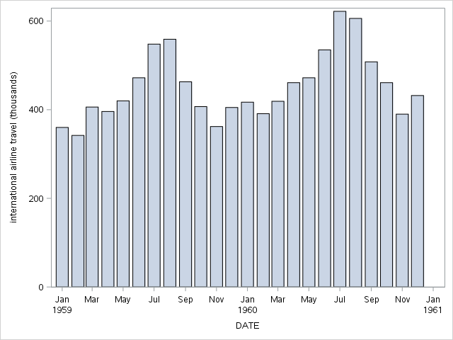
In the next release of SAS, we will have support for interval bar charts. This means you'll be able to plot bar charts along a continuous number line, including time lines. Our time axis already has support for the two-level labeling you describe, so the code will be very simple:
proc sgplot data=sashelp.air;
where date >= '01jan1959'd;
xaxis type=time;
vbar date / response=air;
run;

- Mark as New
- Bookmark
- Subscribe
- Mute
- RSS Feed
- Permalink
- Report Inappropriate Content
That does look like what I want, except I don't have dates, I have weeks. And my x axis is not a time axis, so it sounds like I will have to wait until the next version of SAS?
- Mark as New
- Bookmark
- Subscribe
- Mute
- RSS Feed
- Permalink
- Report Inappropriate Content
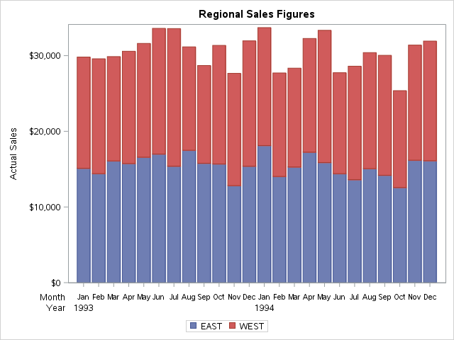
The interval bar chart will be in the next release; but, the only axis with two-level support is the time axis. If you are willing to use GTL, you might be able to accomplish what you want using block plots in conjunction with a bar chart. Basically, you would turn off the X-axis and use two axis-aligned block plots. Try the following example and see if it works for you:
proc template;
define statgraph bar_sample;
begingraph;
entrytitle "Regional Sales Figures";
layout lattice / rowweights=preferred;
layout overlay / xaxisopts=(display=(line ticks));
barchartparm x=year_month y=actual / group=region name="sales";
endlayout;
blockplot x=year_month block=month / valuehalign=start display=(label values)
valuefitpolicy=shrink;
blockplot x=year_month block=year / valuehalign=start display=(label values)
valuefitpolicy=shrink;
sidebar / align=bottom spacefill=false;
discretelegend "sales";
endsidebar;
endlayout;
endgraph;
end;
run;
/* Pre-summarize the data so that the block plots will render correctly */
proc summary data=sashelp.prdsale nway;
class year month region;
var actual;
output out=temp sum=;
run;
/* Build the X-axis variable to create unique category values */
data temp2;
set temp;
year_month = year||month;
run;
proc sgrender data=temp2 template=bar_sample; run;

- Mark as New
- Bookmark
- Subscribe
- Mute
- RSS Feed
- Permalink
- Report Inappropriate Content
Here are some ideas for EPI graphs in this blog article that you may find useful..
- Mark as New
- Bookmark
- Subscribe
- Mute
- RSS Feed
- Permalink
- Report Inappropriate Content
Sanjay, thank you for the response. The link did not work for me--did you mean this one?
http://blogs.sas.com/content/graphicallyspeaking/2014/08/09/epidemic-curve-graph/
I have referenced many of your articles and your book (graphics by example) as I have learned sgplot. Thank you for breaking things down for the average user. I learned to apply the attribute map from that blog article.
I did read that article on epi curves, although I did not need to go to the full extent of using the data labels to label the x axis--we had a variable for epiweek in the data, and I just made sure there was an observation for each week in the data, so there are no gaps. Then ordering the xaxis by the data was enough.
However, to go the next step, once the epiweeks start "wrapping," (i.e. we have epi week 30 for both 2014 and 2015 in the data), I foresee a need to be able to put the year under the week in the xaxis, sort of as a second level category.
I will give the GTL example above from Dan a try at some point, although I am trying to keep the code as simple as possible, because I am trying to convince some folks who love excel that SAS can do it just as well, and that it is not too difficult.
Learn how use the CAT functions in SAS to join values from multiple variables into a single value.
Find more tutorials on the SAS Users YouTube channel.
SAS Training: Just a Click Away
Ready to level-up your skills? Choose your own adventure.


