- Home
- /
- Programming
- /
- Graphics
- /
- Re: 100% Stacked and Grouped Bar Chart
- RSS Feed
- Mark Topic as New
- Mark Topic as Read
- Float this Topic for Current User
- Bookmark
- Subscribe
- Mute
- Printer Friendly Page
- Mark as New
- Bookmark
- Subscribe
- Mute
- RSS Feed
- Permalink
- Report Inappropriate Content
Hi
I am trying to built a stacked bar chart that shows the frequency percentage of a variable, stacked to 100% and further grouped in categories
This example might explain what I am trying to do
http://www.cdc.gov/nchs/data/databriefs/db182_fig1.png
So there are three levels
Year x (population, discharge, days of care )
And each bar shows age categories stacked to 100%
I can arrange the bars as a stack or group, but cant use both in the same chart
Any suggestions please?
Accepted Solutions
- Mark as New
- Bookmark
- Subscribe
- Mute
- RSS Feed
- Permalink
- Report Inappropriate Content
Hello,
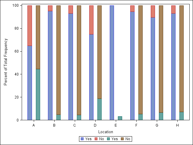
I think it may be easier to first use Proc Frequency to calculate the percentages for the groups you are interesting, and then plot the graph. The code below plots the percentages of the outcomes for each location, but you will need to modify it so that it can be further stratified by drug. I think all you need to do extra is calculate the percentages by the drug stratification, and then modify Sanjay's code with some of the methods shown below.

proc format;
invalue $outcome
"Yes" = 1
"No" = 0;
value outcome
0 = "Yes"
1 = "No"
other = "";
run;
data sample;
set data.sample;
outcome1n = input(input(outcome1, $outcome.),best.);
outcome2n = input(input(outcome2, $outcome.),best.);
run;
proc sort data = sample;
by location;
run;
/* Obtaining Percentages for Outcome 1 by location */
proc freq data = sample;
by location;
tables outcome1n / out = freq_summ_1n;
run;
/* Obtaining Percentages for Outcome 2 by location*/
proc freq data = sample;
by location;
tables outcome2n / out = freq_summ_2n;
run;
/* Merging Percentages */
proc sql;
create table final_data as
select a.location, coalesce(a.outcome1n, b.outcome2n) as outcome, a.outcome1n as a_outcome, b.outcome2n as b_outcome, a.percent as a_pct, b.percent as b_pct
from Freq_summ_1n as a full join Freq_summ_2n as b
on a.location = b.location and a.outcome1n = b.outcome2n;
quit;
/* Plotting the data */
proc sgplot data = final_data;
vbar location / response = a_pct group = outcome discreteoffset = -0.2 groupdisplay = stack barwidth = 0.2 name = "leg1"; /* Outcome 1 */
vbar location / response = b_pct group = outcome discreteoffset = 0.2 groupdisplay = stack barwidth = 0.2 name = "leg2"; /* Outcome 2 */
keylegend "leg1" "leg2";
format outcome outcome.;
run;
- Mark as New
- Bookmark
- Subscribe
- Mute
- RSS Feed
- Permalink
- Report Inappropriate Content
Please move to SAS Graphs
- Mark as New
- Bookmark
- Subscribe
- Mute
- RSS Feed
- Permalink
- Report Inappropriate Content
Please show the code that "doesn't work" and what is not appearing that you want. It would help to also provide at least a snippet of your data as data structure may require a different approach in the graphic procedure or modifications to the data.
Proc Gchart with group and subgroup are possibly one way.
- Mark as New
- Bookmark
- Subscribe
- Mute
- RSS Feed
- Permalink
- Report Inappropriate Content
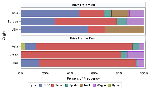
With SAS 9.4:
proc sgpanel data=sashelp.cars(where=(drivetrain in ('All', 'Front'))) pctlevel=group;
panelby drivetrain / columns=1;
hbar origin / group=type stat=pct;
run;

- Mark as New
- Bookmark
- Subscribe
- Mute
- RSS Feed
- Permalink
- Report Inappropriate Content
Great, this is almost exactly what I am looking for
If may ask for a further help here, I tried to tweak your code but couldn't achieve what I want
I am attaching a sample of the dataset in the original post now, also available through this link:
I have also created an image to explain what I am trying to do:
and if it can further be stratified by drug (2 panels) it would even be better
Really appreciate your help.
- Mark as New
- Bookmark
- Subscribe
- Mute
- RSS Feed
- Permalink
- Report Inappropriate Content
Hello,
I think it may be easier to first use Proc Frequency to calculate the percentages for the groups you are interesting, and then plot the graph. The code below plots the percentages of the outcomes for each location, but you will need to modify it so that it can be further stratified by drug. I think all you need to do extra is calculate the percentages by the drug stratification, and then modify Sanjay's code with some of the methods shown below.

proc format;
invalue $outcome
"Yes" = 1
"No" = 0;
value outcome
0 = "Yes"
1 = "No"
other = "";
run;
data sample;
set data.sample;
outcome1n = input(input(outcome1, $outcome.),best.);
outcome2n = input(input(outcome2, $outcome.),best.);
run;
proc sort data = sample;
by location;
run;
/* Obtaining Percentages for Outcome 1 by location */
proc freq data = sample;
by location;
tables outcome1n / out = freq_summ_1n;
run;
/* Obtaining Percentages for Outcome 2 by location*/
proc freq data = sample;
by location;
tables outcome2n / out = freq_summ_2n;
run;
/* Merging Percentages */
proc sql;
create table final_data as
select a.location, coalesce(a.outcome1n, b.outcome2n) as outcome, a.outcome1n as a_outcome, b.outcome2n as b_outcome, a.percent as a_pct, b.percent as b_pct
from Freq_summ_1n as a full join Freq_summ_2n as b
on a.location = b.location and a.outcome1n = b.outcome2n;
quit;
/* Plotting the data */
proc sgplot data = final_data;
vbar location / response = a_pct group = outcome discreteoffset = -0.2 groupdisplay = stack barwidth = 0.2 name = "leg1"; /* Outcome 1 */
vbar location / response = b_pct group = outcome discreteoffset = 0.2 groupdisplay = stack barwidth = 0.2 name = "leg2"; /* Outcome 2 */
keylegend "leg1" "leg2";
format outcome outcome.;
run;
- Mark as New
- Bookmark
- Subscribe
- Mute
- RSS Feed
- Permalink
- Report Inappropriate Content
Thank you
Learn how use the CAT functions in SAS to join values from multiple variables into a single value.
Find more tutorials on the SAS Users YouTube channel.
SAS Training: Just a Click Away
Ready to level-up your skills? Choose your own adventure.


