- Home
- /
- Analytics
- /
- Stat Procs
- /
- restricted cubic splines in SAS
- RSS Feed
- Mark Topic as New
- Mark Topic as Read
- Float this Topic for Current User
- Bookmark
- Subscribe
- Mute
- Printer Friendly Page
- Mark as New
- Bookmark
- Subscribe
- Mute
- RSS Feed
- Permalink
- Report Inappropriate Content
Thank you for this very helpful page!
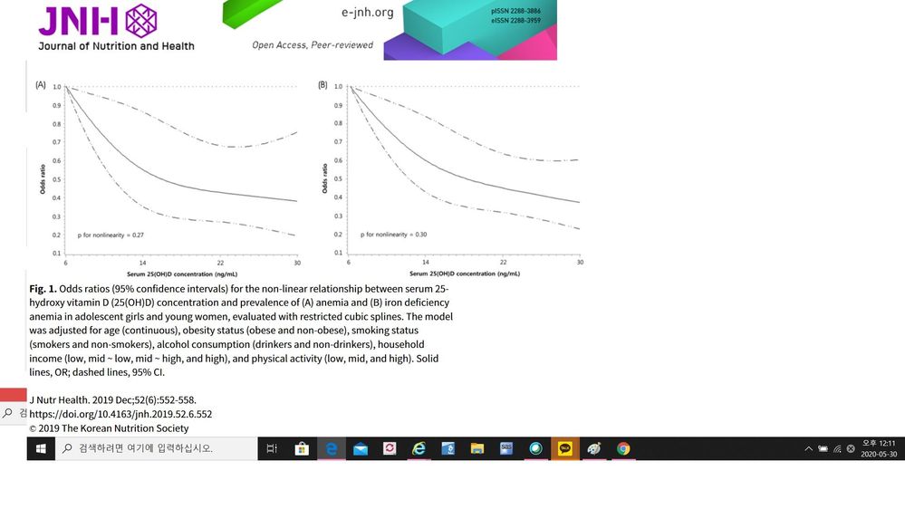
I have used the EFFECT statement together with PROC LOGISTIC. But I haven't figured out how to modify the code in order to plot odds ratios on the y axis, instead of logit or predicted values. Is it possible to do that?
[example]
ods select ANOVA ParameterEstimates SplineKnots;
proc logistic data=cars;
effect spl = spline(weight / details naturalcubic basis=tpf(noint)
knotmethod=percentiles(5) );
model mpg_city = spl / selection=none;
output out=SplineOut predicted=Fit;
quit;
proc sgplot data=SplineOut noautolegend;
scatter x=weight y=mpg_city;
series x=weight y=Fit / lineattrs=(thickness=3 color=red);
run;
[sample figure]
Accepted Solutions
- Mark as New
- Bookmark
- Subscribe
- Mute
- RSS Feed
- Permalink
- Report Inappropriate Content
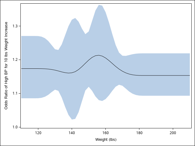
Here is a worked out example based on @StatDave advice, including how to flip the graph
proc logistic data=sashelp.heart;
where BP_status ne "Optimal";
  effect spl = spline(weight / details naturalcubic basis=tpf(noint)
                               knotmethod=percentiles(5) );
   model BP_status(event="High") = spl / selection=none alpha=0.1;
   units weight=10;
   oddsratio weight / at(weight=110 to 210 by 2) cl=pl;
   ods output ORPlot=orp;
quit;

data orpGraph;
set orp;
Weight = input(scan(DisplayLabel, 2, "="), best.);
label weight="Weight (lbs)";
run;

proc sgplot data=orpGraph noautolegend;
band x=weight upper=upperCLdisplay lower=lowerCLdisplay;
series x=weight y=OddsRatioEstDisplay;
yaxis label="Odds Ratio of High BP for 10 lbs Weight Increase";
run;- Mark as New
- Bookmark
- Subscribe
- Mute
- RSS Feed
- Permalink
- Report Inappropriate Content
A plot of the odds ratios can be made using the ODDSRATIO statement as shown below. The plot is rotated compared to the example you show but conveys the same information. The following statements use the data in the example titled "Nonparametric Logistic Regression" in the PROC GAMPL documentation.
proc logistic data=diabetesstudy;
  effect spl = spline(age / details naturalcubic basis=tpf(noint)
                               knotmethod=percentiles(5) );
   model diabetes(event="1") = spl ;
   oddsratio age / at(age=20 to 60 by 10);
run;
Catch up on SAS Innovate 2026
Dive into keynotes, announcements and breakthroughs on demand.
Explore Now →ANOVA, or Analysis Of Variance, is used to compare the averages or means of two or more populations to better understand how they differ. Watch this tutorial for more.
Find more tutorials on the SAS Users YouTube channel.


