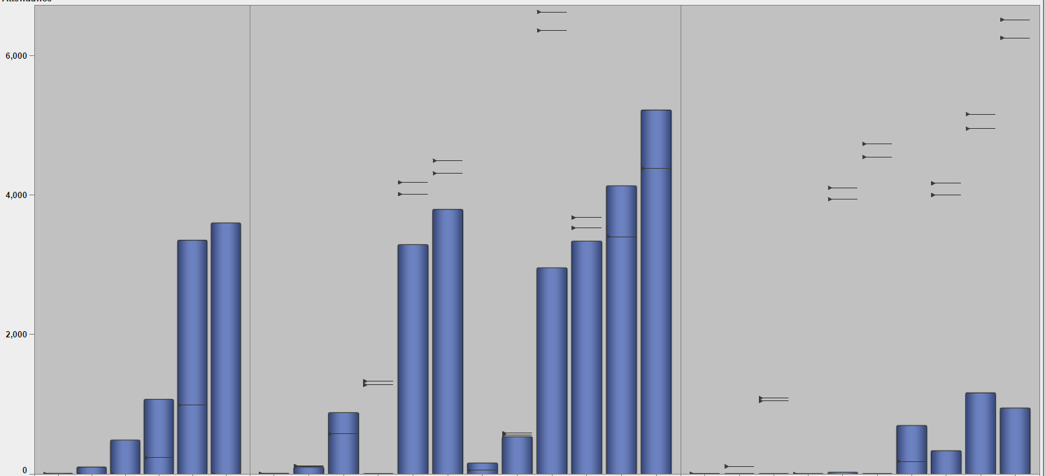
Internally, we would like to show year over year growth of 20% with 25% being a stretch goal. Standard visuals only support one target for a targeted bar chart. Also we are unable to show the data values for this target within the report, only within the data tip values.
Here is my current solution build using the custom graph application:

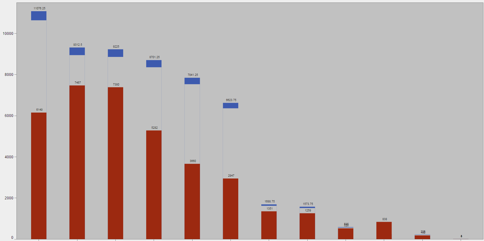
We would like to see the high/low target range shading similar to below:

This was built with the customer builder as well, but it does not look the best in the standard data styling skin consistent with the rest of our reporting.
-shawn