- Home
- /
- SAS Viya
- /
- Visual Analytics
- /
- set up of dashboard structure
- RSS Feed
- Mark Topic as New
- Mark Topic as Read
- Float this Topic for Current User
- Bookmark
- Subscribe
- Mute
- Printer Friendly Page

- Mark as New
- Bookmark
- Subscribe
- Mute
- RSS Feed
- Permalink
- Report Inappropriate Content
I’m wondering how to set up following dashboard structure in SAS VA. The dashboard has three layers with different details:
- At the top level a list with all KPI’s for the entire enterprise. For each KPI we want to see a gauge with its own norms and ranges. Filtering of date ranges must be possible at the top level and must be pushed down to the other levels.
- At the mid level details from each KPI individually divided in business units and departments. The structure of this level is identical for all KPI’s
- At the low level the detail lines of each KPI containing different columns per KPI
First challenge is the list with KPI's at the top level. Is it possible to create this list in SAS VA? The problem seems to be the deviation per KPI in norms and ranges in the gauges.
Second challenge is linking all levels. We preferably don’t want to duplicate the objects on the mid level for different KPI’s because of maintenance effort in the long run. We foresee over 100 different KPI’s
- Mark as New
- Bookmark
- Subscribe
- Mute
- RSS Feed
- Permalink
- Report Inappropriate Content
So for the first challenge we now use multiple listtable objects without headers. If you put the listtable objects beneath each other it looks a bit like a list, but not quite. Anyone having an idea how to accomplish this with SAS VA?

- Mark as New
- Bookmark
- Subscribe
- Mute
- RSS Feed
- Permalink
- Report Inappropriate Content
Can you send a picture of what you are trying to do?
Tricia Aanderud
Twitter: @taanderud - Follow me!
- Mark as New
- Bookmark
- Subscribe
- Mute
- RSS Feed
- Permalink
- Report Inappropriate Content
Hi Jim,
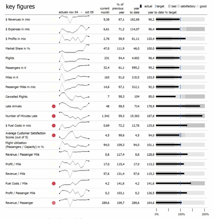
I enclosed an example of an almost perfect dashboard (Stephen Few says so 😉
The first challenge in SAS VA is how to list multiple KPI's gauges with different ranges. So the KPI's can be normalized to 100% but the ranges will be different for the KPI's. In the example the "year to date % target" column has different ranges for "bad", "satisfactory" and "good" for the listed KPI's. I think using a list table is not possible in SAS VA because there is only one display rule possible on the "year to date % target" column. So my 'sollution' so far is creating multiple list table objects: one for each KPI. Unfortunately this does not look very clean, some unwanted boundary lines show up. Maybe I'm missing something here?
- Mark as New
- Bookmark
- Subscribe
- Mute
- RSS Feed
- Permalink
- Report Inappropriate Content
Funny - I wrote a blog post about Stephen Few's dashboards in SAS Visual Analytics (see it here).
The only suggestion I can make it an old trick used in SAS BI Dashboards. You set each display rule as follows: Red=1, Yellow=2, Green=3. Then instead of plotting the actual percentage you convert it to 1,2,3. So 0-.50 =1, .51-.90 =2, and .91-1.0 = 3. The problem is that it hides the actual percentage but it's possible to display that value next to the bullet graph.
Good luck - I look forward to hearing about your results.
Tricia Aanderud
Twitter: @taanderud - Follow me!
- Mark as New
- Bookmark
- Subscribe
- Mute
- RSS Feed
- Permalink
- Report Inappropriate Content
Hi Jim,
I think your dashboard example looks fine. I think this is the way to go with dashboards in SAS VA. In your example you list one kpi for different regions which is very usefull I think, I also like to show this type of detail in my dashboard designs.
However, how to display different type of performance indicators in one list with different ranges for "bad", "satisfactory" and "good" exactly like the example I put above? Sofar I think it is not possible using one list object since you can define only one display rule for a column in a list object. Or am I missing something here? So if this is true I only can think of one workaround: to arrange multiple list objects beneath each other, so it looks like one table. The problem with this workaround is that the composite list does not look very neat. It's also cumbersome to arrange these list objects.
.jpg")
Catch up on SAS Innovate 2026
Nearly 200 sessions are now available on demand with the SAS Innovate Digital Pass.
Explore Now →See how to use one filter for multiple data sources by mapping your data from SAS’ Alexandria McCall.

Find more tutorials on the SAS Users YouTube channel.
-
5 replies
-
04-23-2015 05:07 AM
-
2844 views
-
0 likes
-
2 in conversation
-
