- Home
- /
- SAS Viya
- /
- Visual Analytics
- /
- SAS plot
- RSS Feed
- Mark Topic as New
- Mark Topic as Read
- Float this Topic for Current User
- Bookmark
- Subscribe
- Mute
- Printer Friendly Page
- Mark as New
- Bookmark
- Subscribe
- Mute
- RSS Feed
- Permalink
- Report Inappropriate Content
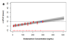
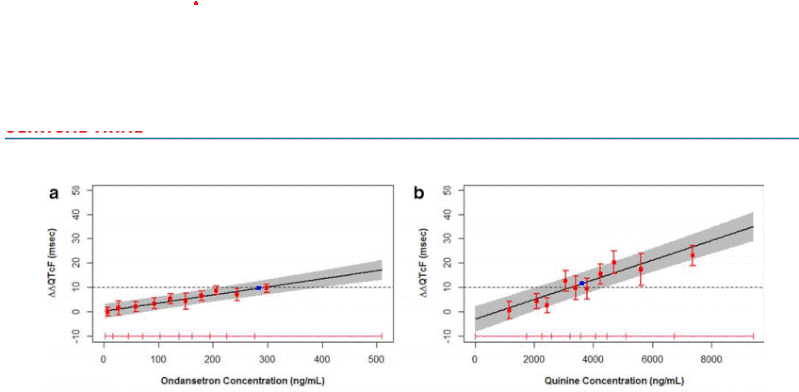
I saw the figure in the journal article "Results From the IQ-CSRC Prospective Study Support Replacement of the Thorough QT Study by QT Assessment in the Early Clinical Phase ". Can we do this kind of plot in SAS? where The predicted effect on DDQTcF using concentration/QTc effect models. The solid black line with gray shaded area denotes the model-predicted mean placebo-adjusted DQTcF with 90% CI as a function of plasma concentration. The horizontal red lines with tick marks show the range of plasma concentrations divided into deciles. Red squares with vertical bars denote the observed arithmetic means and 90% CIs for the placebo-adjusted DQTcF within each plasma concentration decile.
I want to do the same plot in SAS. any suggestion?
Accepted Solutions
- Mark as New
- Bookmark
- Subscribe
- Mute
- RSS Feed
- Permalink
- Report Inappropriate Content
Here is some example that may get you started.
data work.class;
   set sashelp.class;
   error = rand('integer',15);
   yupper = weight+error;
   ylower = weight-error;
run;
Proc sgplot data=work.class;
   /* simple linear regression with confidence limit
      band for the mean and suppress the individual
      points
   */
   reg x=height y=weight / clm nomarkers ;
   /* horizontal reference line at 80*/
   refline ( 80) ;
   /* place error bars around points*/
   scatter x=height y=weight / yerrorupper=yupper
                               yerrorlower=ylower
   ;
run;
However if you want the regression to extrapolate past the values in the data you will likely need to run your data through a regression procedure that will do that.
- Mark as New
- Bookmark
- Subscribe
- Mute
- RSS Feed
- Permalink
- Report Inappropriate Content
Give us a link to the article. Or scan the plot and insert it into your reply here using the "Insert Photos" icon.
Paige Miller
- Mark as New
- Bookmark
- Subscribe
- Mute
- RSS Feed
- Permalink
- Report Inappropriate Content
"Results From the IQ-CSRC Prospective Study Support Replacement of the Thorough QT Study by QT Assessment in the Early Clinical Phase"
- Mark as New
- Bookmark
- Subscribe
- Mute
- RSS Feed
- Permalink
- Report Inappropriate Content
It's really too small for us to make any use of. Make the scan larger.
Paige Miller
- Mark as New
- Bookmark
- Subscribe
- Mute
- RSS Feed
- Permalink
- Report Inappropriate Content
Sorry. I was having some difficulty to attach the figure. please check the below figure.
- Mark as New
- Bookmark
- Subscribe
- Mute
- RSS Feed
- Permalink
- Report Inappropriate Content
So, the answer is YES, this can be done via SAS PROC GPLOT.
Show us a portion of your actual data, provided as SAS DATA step code following these instructions. Do not provide a screen capture or an attachment.
Paige Miller
- Mark as New
- Bookmark
- Subscribe
- Mute
- RSS Feed
- Permalink
- Report Inappropriate Content
I dont have any specific data yet. Any sample data will work for me where there is error bar with the predicted data.
- Mark as New
- Bookmark
- Subscribe
- Mute
- RSS Feed
- Permalink
- Report Inappropriate Content
- Mark as New
- Bookmark
- Subscribe
- Mute
- RSS Feed
- Permalink
- Report Inappropriate Content
Here is some example that may get you started.
data work.class;
   set sashelp.class;
   error = rand('integer',15);
   yupper = weight+error;
   ylower = weight-error;
run;
Proc sgplot data=work.class;
   /* simple linear regression with confidence limit
      band for the mean and suppress the individual
      points
   */
   reg x=height y=weight / clm nomarkers ;
   /* horizontal reference line at 80*/
   refline ( 80) ;
   /* place error bars around points*/
   scatter x=height y=weight / yerrorupper=yupper
                               yerrorlower=ylower
   ;
run;
However if you want the regression to extrapolate past the values in the data you will likely need to run your data through a regression procedure that will do that.
- Mark as New
- Bookmark
- Subscribe
- Mute
- RSS Feed
- Permalink
- Report Inappropriate Content
Catch up on SAS Innovate 2026
Dive into keynotes, announcements and breakthroughs on demand.
Explore Now →See how to use one filter for multiple data sources by mapping your data from SAS’ Alexandria McCall.
Find more tutorials on the SAS Users YouTube channel.


