- Home
- /
- SAS Viya
- /
- Visual Analytics
- /
- SAS Visual Analytics 8.4 and the new SAS Visual Analytics SDK are now ...
- RSS Feed
- Mark Topic as New
- Mark Topic as Read
- Float this Topic for Current User
- Bookmark
- Subscribe
- Mute
- Printer Friendly Page
- Mark as New
- Bookmark
- Subscribe
- Mute
- RSS Feed
- Permalink
- Report Inappropriate Content
I'm excited to announce the availability of SAS Visual Analytics 8.4, the smartest BI tool on the planet, along with the new SAS Visual Analytics SDK for embedded insights. You might have already seen the What's New page summarizing the VA 8.4 highlights.
In this post, you'll find links to the product documentation pages for those highlights and more so you can dig deeper. Still, there are too many new features to list here, so check out the What’s New in SAS Visual Analytics 8.4: Details product documentation for a comprehensive list of enhancements.
Here are the top five enhancements:
- Automated Explanation - Automated Analysis has a new name: Automated Explanation. It also has improved capabilities. We’ve rewritten and redesigned it to give you smarter and clearer insights, more interactivity, and easier-to-read explanations. In seconds, you can get the analytical story for the business that would take hours to do manually. Automated Explanation is a game-changer!
- Viewer report customization - Take the guesswork out of creating reports by giving your report consumers the ability to customize their reports. Based on the controls you give them, report consumers can change what they see, including legends and chart types. With even more power in SAS VA 8.4, they can create self-service queries like filters, ranks, and custom groups. They can even change business metrics – all with undo and redo.
- SAS Visual Analytics Software Development Kit (SDK) - The insights you discover with SAS Visual Analytics 8.4 can now be embedded in websites and web apps using the new SDK. You can embed a whole report or individual objects for a unique, innovative, and customized experience. See the article Embedded Insights with SAS Visual Analytics SDK, by @Meera_SAS, to learn much more.
- Related measures - With the related measures feature, customers automatically see potential relationships between measures right in the data pane. A subtle indicator highlights measures that may be related to the selected measure, so customers can quickly find relationships to further explore.
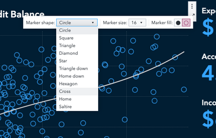
- Work in context - It’s more convenient than ever to craft the perfect chart: Right-click on the visualization and change its settings. Contextual menus and the options bar provide a more guided experience. Do the red and orange bars need to be combined into a single bar called warm colors? Select them and group them right on the bar chart, thereby saving time. Can’t see the whole table at once? Freeze columns in a list table as you view a report, just like a spreadsheet.
Here are just some of my favorite features requested by customers as well.
- Reuse objects with data in new reports by using enhanced object templates (see step 2).
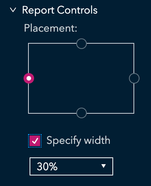
- Customize the location of report & page filter controls (see item seven for report controls and item six for page controls)
- Print what you see by choosing the new use page size
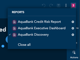
- View and edit multiple reports at a time.
- Easier sharing of reports and objects with specific users and groups.
- Duplicate data item names are now permitted.
Need more? If you're using VA 7 on SAS 9 or a prior release of VA 8 on SAS Viya, this functional comparison matrix will help you compare SAS VA 8.4 to the release you are using. These How-To videos are new or have been updated for VA 8.4.
Rick Styll
SAS Visual Analytics Product Management
See how to use one filter for multiple data sources by mapping your data from SAS’ Alexandria McCall.
Find more tutorials on the SAS Users YouTube channel.


