- Home
- /
- SAS Viya
- /
- Visual Analytics
- /
- Re: Plot of Standard Deviation in SAS VA Report Designer
- RSS Feed
- Mark Topic as New
- Mark Topic as Read
- Float this Topic for Current User
- Bookmark
- Subscribe
- Mute
- Printer Friendly Page
- Mark as New
- Bookmark
- Subscribe
- Mute
- RSS Feed
- Permalink
- Report Inappropriate Content
Hi,
I am struggling with creating a visualization that represents the scatter/standard deviation...around a particular measure.
Adding the simple error bars has been an issue; getting a box plot another issue...
My data has daily measures and I want to aggregate them by month, showing the average and for example the 1st and 3rd Quartile.
I have started using a custom graph with a vector and a line graph. But I got no where...
I guess, what I am looking for are suggestions of visualizations that have worked in SAS VA. There are plenty out there in SAS, excel...but I would like to know how is has been represented in SAS VA.
i will keep this post updated in case I find one way.
Cheers
rita
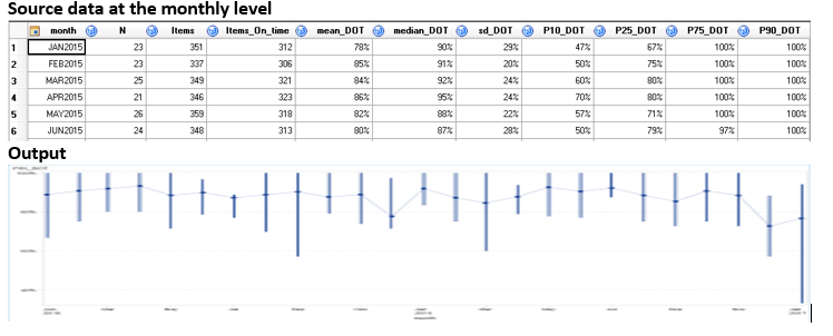
Just to give an example what I have been trying out.
Stock high-Low Profile Plot
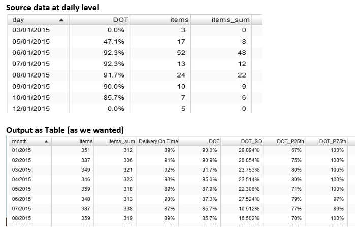
When I have the source data aggregated in te lvel that I want to display, the stock high-low plot seems to do the job.
However, when the data is daily and I would like the graph to aggregate my measurements monthly, I achieve a very different looking graph. Table with aggregation is fine. Just not the graph
The Output Graph (very different...)
If anyone knows the answer, what i might be doing wrong, it would be a massive help.
email back, if you have dealt with STD/scatter in another way...
- Mark as New
- Bookmark
- Subscribe
- Mute
- RSS Feed
- Permalink
- Report Inappropriate Content
Hi
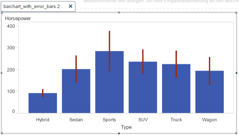
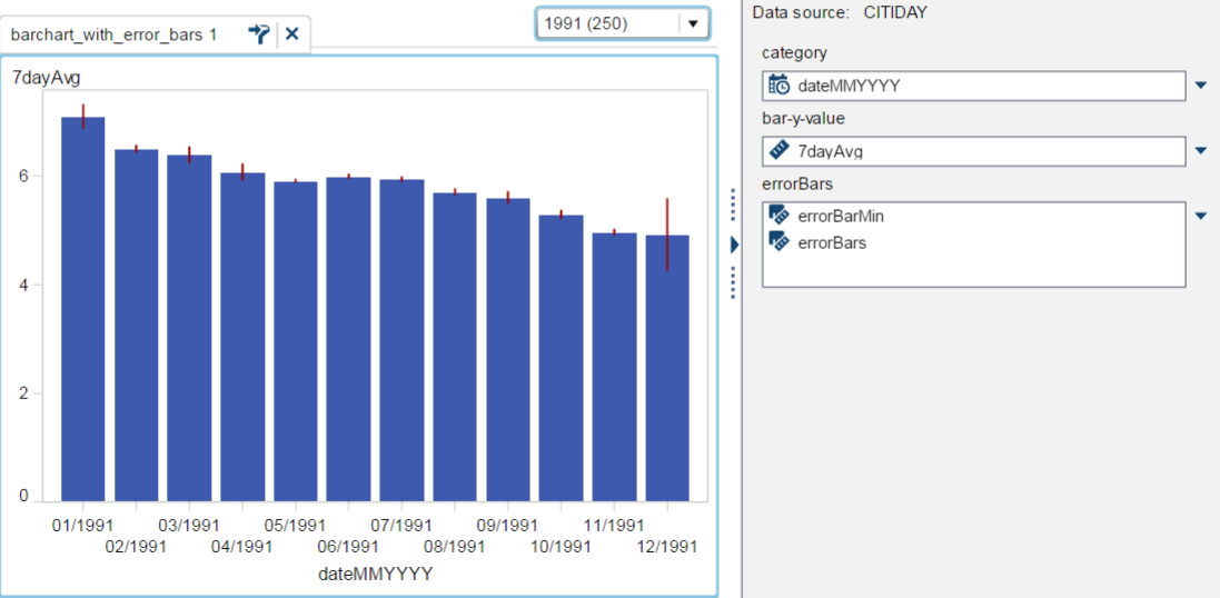
Are you looking for something like this, barchart with errorbars, see also attached screenshot.
Bruno
- Mark as New
- Bookmark
- Subscribe
- Mute
- RSS Feed
- Permalink
- Report Inappropriate Content
Hi Bruno,
Yes something like that.
And without needing to be an aggregation in the data preparation.
Can you post your instructions?
Thanks
Rita
- Mark as New
- Bookmark
- Subscribe
- Mute
- RSS Feed
- Permalink
- Report Inappropriate Content
hi Rita
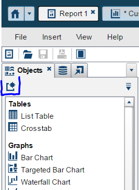
You can use a custom graph to build this. To create the custom graph, you can use this button when on the report obejcts tab.
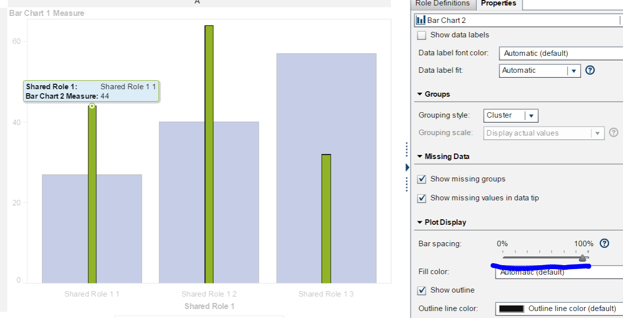
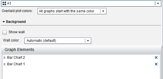
Put two barcharts on top of each other and change the bar spacing for the second bar to make it smaller.
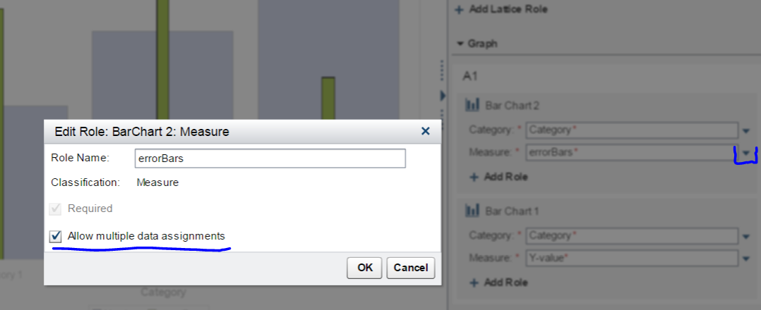
Next, edit the roles to change the names to be something sensible. Also allow multiple data assignments for the error bar because you will need to use two data points there.
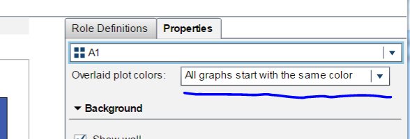
Go to the properties of the first cell, the one with the two barcharts in it, and set the way color are given, this will ensure, that we only have to set the color for the error bars.
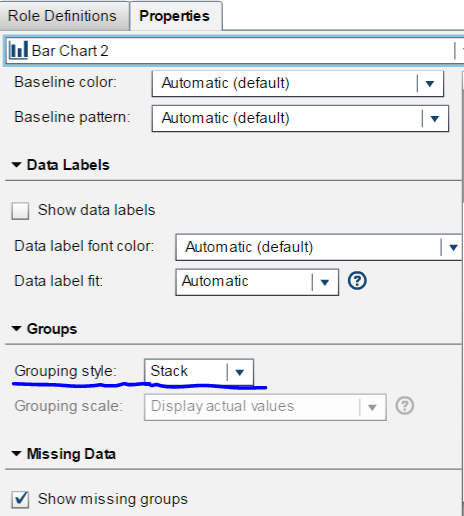
Set the grouping style for the second bar chart, the one that displays the error bars, to stack, so the two measures will be put on top of each other.
That is basically it, you might want to set other properties on how the bar are displayed. Save your custome graph to a folder and add it to the report objects tab.
You need two new aggregated measures computed with the follwoing expressions, you have to adapt it for the data item you want to display (change the name of 'HorsePower'n to the name you need.
errorBarMin, that is the value for the first measre on the errorBars role:
Avg [_ByGroup_] ('Horsepower'n) - ( 1 * StdDev [_ByGroup_] ('Horsepower'n) )
the second aggregated measure looks like this:
errorBars, that is the actual value for the error bars:
2 * StdDev [_ByGroup_] ('Horsepower'n)
Use the custom graph in your report like this:
Learned this techniques from @PetriRoine.
Bruno
- Mark as New
- Bookmark
- Subscribe
- Mute
- RSS Feed
- Permalink
- Report Inappropriate Content
Thanks @BrunoMueller!
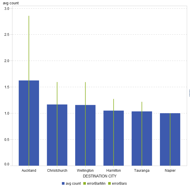
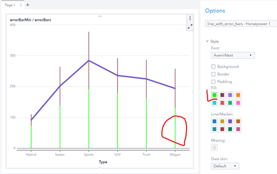
I have tried to replicate the graph. However I have encounter a problem and I do not know which step I may have missed. The error bars are starting from 0, as the image below:
I have select the option:
- Mark as New
- Bookmark
- Subscribe
- Mute
- RSS Feed
- Permalink
- Report Inappropriate Content
Hi
First I would change the colors of the two measures errorBarMin and errorBars so that you can distinguish them from each other, currently they have the same color.
Second I would display the new data items within a list table to see whether the calculated numbers are correct.
Bruno
- Mark as New
- Bookmark
- Subscribe
- Mute
- RSS Feed
- Permalink
- Report Inappropriate Content
Hi @BrunoMueller,
thanks so much. Yes it was the colour!
I had done the table and the calculations were correct.
If you have more useful customized graphs, please feel free to share.
Cheers,
Rita
- Mark as New
- Bookmark
- Subscribe
- Mute
- RSS Feed
- Permalink
- Report Inappropriate Content
Hi
Thanks for your post. I got exactly the same issue. How do you change the color of the errorbarmin and errorbars in SAS viya?
With regards
Fan
- Mark as New
- Bookmark
- Subscribe
- Mute
- RSS Feed
- Permalink
- Report Inappropriate Content
- Mark as New
- Bookmark
- Subscribe
- Mute
- RSS Feed
- Permalink
- Report Inappropriate Content
Thanks! I am using 8.3 and I have solved the problem. But now I am trying to add standard deviation on line chart. For now, I can only make scatter+line chart and band+line chart as alternatives. Any tip to make the normal one? Thanks and have a nice weekend!
- Mark as New
- Bookmark
- Subscribe
- Mute
- RSS Feed
- Permalink
- Report Inappropriate Content
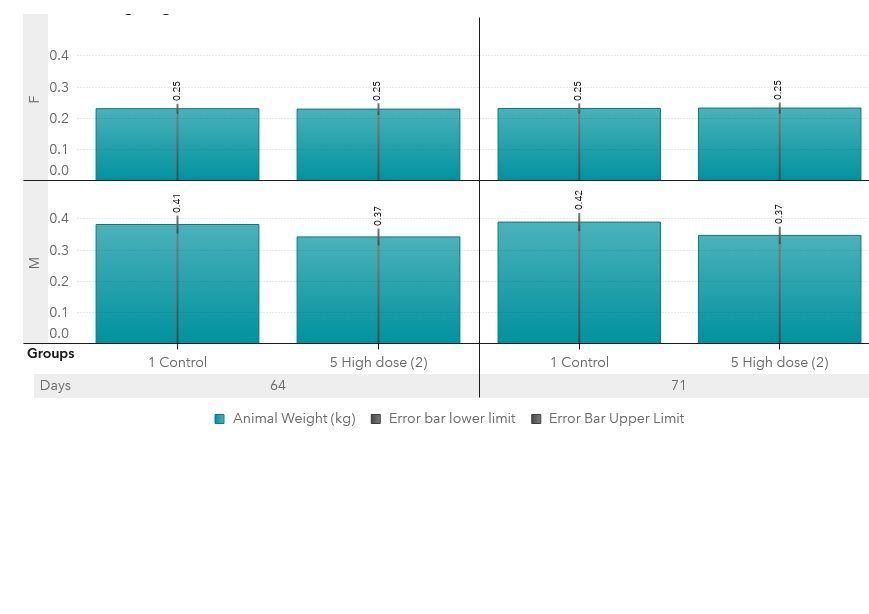
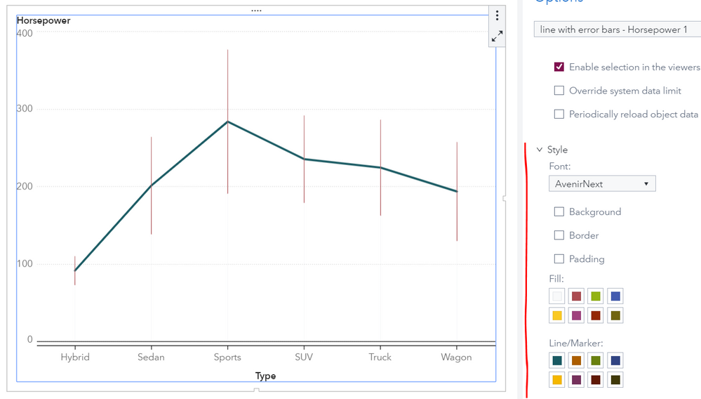
You can basically use the same technique: combine a bar chart with very thin bars together with a line chart. As outline above the bar chart needs more than one measure that is stacked.
With VA8.4 colors can be controlled on the individual object level. You can also control whether a legend is displayed or not. See below what it looks like.
- Mark as New
- Bookmark
- Subscribe
- Mute
- RSS Feed
- Permalink
- Report Inappropriate Content
Hi Bruno
Thank you so much for your help! It works pretty well now.
Best regards
Fan
- Mark as New
- Bookmark
- Subscribe
- Mute
- RSS Feed
- Permalink
- Report Inappropriate Content
Can this plot be done in VA8.5?
I tried it and didn't work out. I'm not sure what other settings to try.
My data and like this:
Rate = 5; Upper = 6.5; Lower = 4; Year = 2015. So basically many years in this dataset and was loaded to CAS.
In VA8.5, Year was the shared role and represented in the line graph and response variable was Rate.
The bar graph contains the upper and lower measure and I selected the "allow multiple data assignments" and grouping was selected to Stacked. I used Graph Builder to overlay the line and bar chart.
Still, it doesn't work.
Any advice?
- Mark as New
- Bookmark
- Subscribe
- Mute
- RSS Feed
- Permalink
- Report Inappropriate Content
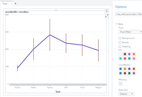
Yes it can.
As you can see once the custom graph is used within a report you can change the colors, set the green to white and it will look like this:
Please note, that when you do make changes to your custom graph template you need to recreate it in the report.
This example is using the SASHELP.CARS data. The Y axis of the line is using the average or Horsepower, the two measures used in the bar chart are calculated as described above.
April 27 – 30 | Gaylord Texan | Grapevine, Texas
Registration is open
Walk in ready to learn. Walk out ready to deliver. This is the data and AI conference you can't afford to miss.
Register now and lock in 2025 pricing—just $495!
See how to use one filter for multiple data sources by mapping your data from SAS’ Alexandria McCall.
Find more tutorials on the SAS Users YouTube channel.
