- Home
- /
- SAS Viya
- /
- Visual Analytics
- /
- Re: How to create a Dot Plot with Categorical Y Axis (Barbell Chart)
- RSS Feed
- Mark Topic as New
- Mark Topic as Read
- Float this Topic for Current User
- Bookmark
- Subscribe
- Mute
- Printer Friendly Page

- Mark as New
- Bookmark
- Subscribe
- Mute
- RSS Feed
- Permalink
- Report Inappropriate Content
I am trying to create a Dot Plot to show comparisons from a pre-test to a post-test. Similar to what I copied below.
I want to have a categorical Y axis, and a numeric X axis, with two dots showing the values for the pre- and post-test for each category. Ideally they could be connected with a line in between. It would also be ideal to include data labels for each dot, either inside the dot or to the left/right. These are easy to do in R and Tableau, and can be made with some wrangelling in Excel/Powerpoint, but I have not been able to find a way to create what I want in Visual Analytics.
I have tried creating this using the graph builder in SAS VA 8.3 on VIYA by combining different chart types, but have not had any luck getting what I want. Both the Dot Plot chart and the Vector Chart require you to have a numeric Y axis. I can't seem to get them to communicate with a chart that has a Categorical Y axis.
Any ideas would be great!
http://r-statistics.co/Top50-Ggplot2-Visualizations-MasterList-R-Code.html#Bubble%20Plot

- Mark as New
- Bookmark
- Subscribe
- Mute
- RSS Feed
- Permalink
- Report Inappropriate Content
Hi,
You can try to create a custom graph:
Add a schedule plot for the lines and set the start and end value as a measure. Set the bar width to a smaller value to get a 'line'.
Add two scatter plots with a shared categorical role and let one represent the min and the other the max value.
Of course you need to prepare your data as well.
I'm not able to share a example now, but give it a try.
Regards
Dennis

- Mark as New
- Bookmark
- Subscribe
- Mute
- RSS Feed
- Permalink
- Report Inappropriate Content
Hi @mhoolsema ,
Hope you are doing well,
Did you succeed in creating the chart in SAS? I know that flourish is easy to do, but I would like to do it via SAS.
Thank you

- Mark as New
- Bookmark
- Subscribe
- Mute
- RSS Feed
- Permalink
- Report Inappropriate Content
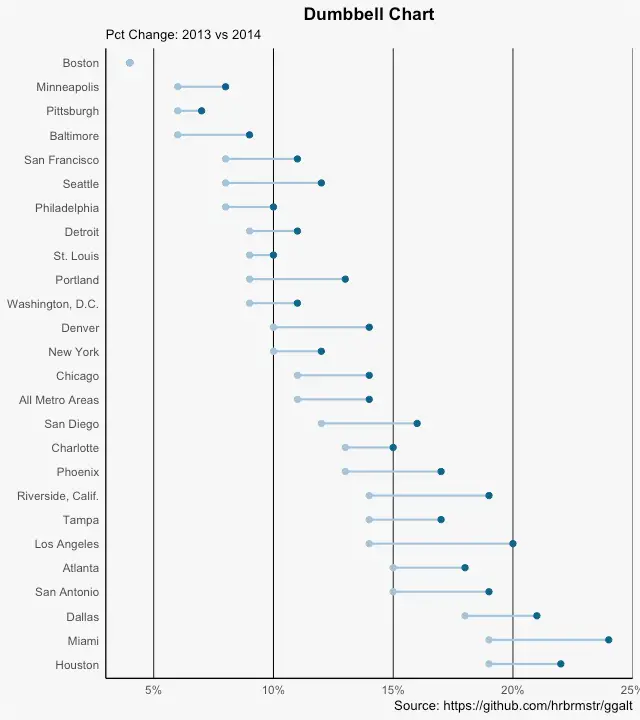
it is how @DMenkveld has proposed.
"Area","pct_2014","pct_2013"
"Houston",0.19,0.22
"Miami",0.19,0.24
"Dallas",0.18,0.21
"San Antonio",0.15,0.19
"Atlanta",0.15,0.18
"Los Angeles",0.14,0.2
"Tampa",0.14,0.17
"Riverside, Calif.",0.14,0.19
"Phoenix",0.13,0.17
"Charlotte",0.13,0.15
"San Diego",0.12,0.16
"All Metro Areas",0.11,0.14
"Chicago",0.11,0.14
"New York",0.1,0.12
"Denver",0.1,0.14
"Washington, D.C.",0.09,0.11
"Portland",0.09,0.13
"St. Louis",0.09,0.1
"Detroit",0.09,0.11
"Philadelphia",0.08,0.1
"Seattle",0.08,0.12
"San Francisco",0.08,0.11
"Baltimore",0.06,0.09
"Pittsburgh",0.06,0.07
"Minneapolis",0.06,0.08
"Boston",0.04,0.04
FILENAME REFFILE FILESRVC FOLDERPATH='/Public'  FILENAME='health.txt';

PROC IMPORT DATAFILE=REFFILE
	DBMS=DLM
	OUT=WORK.IMPORT;
delimiter=",";
	GETNAMES=YES;
RUN;

PROC CONTENTS DATA=WORK.IMPORT; RUN;

data mkt.hh(promote=yes);
set import;
format pct_2013 pct_2014 miny maxy;
miny=min(pct_2013, pct_2014);
maxy=max(pct_2013, pct_2014);
run;

.jpg")
Catch up on SAS Innovate 2026
Nearly 200 sessions are now available on demand in the Innovate Hub.
Watch Now →See how to use one filter for multiple data sources by mapping your data from SAS’ Alexandria McCall.

Find more tutorials on the SAS Users YouTube channel.
-
3 replies
-
09-13-2019 10:25 AM
-
3851 views
-
0 likes
-
4 in conversation
-
