- Home
- /
- SAS Viya
- /
- Visual Analytics
- /
- Re: How can I use an aggregated measure as a category?
- RSS Feed
- Mark Topic as New
- Mark Topic as Read
- Float this Topic for Current User
- Bookmark
- Subscribe
- Mute
- Printer Friendly Page

- Mark as New
- Bookmark
- Subscribe
- Mute
- RSS Feed
- Permalink
- Report Inappropriate Content
I am working with an email history table:
- campaign id
- campaign send date
- account ID
What I want to do is present a slider based on campaign send date and then display how many people have received 1 campaign in that time period vs 2, 3, 4, etc.
An aggregated value to "count distinct" account ID gets me started as it does accurately reflect the number of campaigns a person has received based on the slider range but I want to twist this data. Instead of showing that account 1 had 6 campaigns I want to say that 1 person had 1 campaign, 0 people had 2 campaigns, 1 person had 3 campaigns, etc.
Any ideas on how to proceed?
Sample data:
| acct_id | camp_id | send_date |
| 1 | EM-1 | 10/15/2013 |
| 1 | EM-2 | 10/22/2013 |
| 1 | EM-3 | 10/29/2013 |
| 1 | EM-4 | 11/5/2013 |
| 1 | EM-5 | 11/12/2013 |
| 1 | EM-6 | 11/19/2013 |
| 1 | EM-7 | 11/26/2013 |
| 1 | EM-8 | 12/3/2013 |
| 2 | EM-1 | 10/15/2013 |
| 2 | EM-3 | 10/29/2013 |
| 2 | EM-4 | 11/5/2013 |
| 2 | EM-5 | 11/12/2013 |
| 2 | EM-7 | 11/26/2013 |
| 2 | EM-8 | 12/3/2013 |
| 3 | EM-1 | 10/15/2013 |
| 3 | EM-5 | 11/12/2013 |
| 4 | EM-3 | 10/29/2013 |
| 4 | EM-4 | 11/5/2013 |
| 4 | EM-6 | 11/19/2013 |
| 4 | EM-7 | 11/26/2013 |
| 4 | EM-8 | 12/3/2013 |
| 4 | EM-9 | 12/10/2013 |
| 5 | EM-1 | 10/15/2013 |
| 5 | EM-2 | 10/22/2013 |
| 5 | EM-4 | 11/5/2013 |
| 5 | EM-5 | 11/12/2013 |
| 5 | EM-7 | 11/26/2013 |
| 6 | EM-2 | 10/22/2013 |
| 6 | EM-3 | 10/29/2013 |
| 6 | EM-4 | 11/5/2013 |
| 6 | EM-6 | 11/19/2013 |
| 6 | EM-7 | 11/26/2013 |
| 6 | EM-8 | 12/3/2013 |
| 6 | EM-9 | 12/10/2013 |
| 7 | EM-1 | 10/15/2013 |
| 7 | EM-3 | 10/29/2013 |
| 7 | EM-5 | 11/12/2013 |
| 7 | EM-8 | 12/3/2013 |
| 7 | EM-9 | 12/10/2013 |
| 8 | EM-1 | 10/15/2013 |
| 8 | EM-2 | 10/22/2013 |
| 8 | EM-3 | 10/29/2013 |
| 8 | EM-5 | 11/12/2013 |
| 8 | EM-7 | 11/26/2013 |
| 8 | EM-8 | 12/3/2013 |
| 8 | EM-9 | 12/10/2013 |

- Mark as New
- Bookmark
- Subscribe
- Mute
- RSS Feed
- Permalink
- Report Inappropriate Content

Hello EppDog,
I believe that if you drag campaign id onto the visualization you could lattice the columns and it would do what you are asking for in my top picture. It will lattice the Campaign id on the bottom of the axis. In picture two, you could create a colorized group that would group 1-5 by color. Either way it would give you the breakouts you are asking for. I believe that would work because campaign-id is a category in your data. Please let me know if I did not understand your question correctly. Please also let me know if you accomplished it with a different method.
Regards,
Ted Werner
- Mark as New
- Bookmark
- Subscribe
- Mute
- RSS Feed
- Permalink
- Report Inappropriate Content
Thanks for the reply Ted.
Unfortunately that doesn't quite work. For this exercise I care less about WHICH campaigns but rather HOW MANY campaigns. So as I drag the slider Account #1 goes from being in 8 campaigns to only 2 or 3 depending upon the dates. Others may go up, depending upon where the sliders are at.
The aggregate count does a perfect job of classifying everyone by the number of unique campaigns they are in during that period. However, I don't see a way to move that aggregate measure to the category section. Meaning I don't care about how many campaigns account #1 was in but rather how many accounts were in only 1 campaign during that time period (or 2, 3, 4,... campaigns).
To put this into something we all experience, think of your favorite retailer who sends you emails. I want to say "for the month of March, retailer X sent 20 emails to 100 people, 19 emails to 85 people, etc."
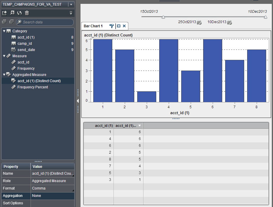
Your bottom graph did give me an idea that I could still put the actual accounts as the category variable and let the natural sort group them together. That does allow for visually seeing how many campaigns people were in (especially if I could use colors but those are only available for categorical variables) but I don't know how that will work when I have 6 million accounts - I don't think VA will want to throw that many categories into a bar chart.
- Mark as New
- Bookmark
- Subscribe
- Mute
- RSS Feed
- Permalink
- Report Inappropriate Content
Epp_Dog,
I don't have a good answer for you at this juncture. I am looking into it though and your use case here is pretty solid from a visualization perspective. I don't know that visualizing 6 million accounts at a time is a good idea, but there are ways to parametrize the report so long as you have data segmenting it appropriately. I am still thinking about it though and I will try and find some type of work around this week. If anyone else comes up with an alternative, please bring forth your idea.
Regards,
Ted Werner

- Mark as New
- Bookmark
- Subscribe
- Mute
- RSS Feed
- Permalink
- Report Inappropriate Content
have you found a solution about the problem?
If you remember it! it's quite a long time ago 😉
- Mark as New
- Bookmark
- Subscribe
- Mute
- RSS Feed
- Permalink
- Report Inappropriate Content
Sadly, our VA server got turned off accidentally shortly after this question and our IT team was never able to resurrect it. I had poor user adoption on SAS VA so I couldn't get executive support to get the machine running again. So figuring this out was never again a priority. We are in the midst of installing Viya and hope that I can get better adoption/usage this time. Sorry I'm no help at this time.
- Mark as New
- Bookmark
- Subscribe
- Mute
- RSS Feed
- Permalink
- Report Inappropriate Content
Thank you for your response
.jpg")
Catch up on SAS Innovate 2026
Nearly 200 sessions are now available on demand with the SAS Innovate Digital Pass.
Explore Now →See how to use one filter for multiple data sources by mapping your data from SAS’ Alexandria McCall.

Find more tutorials on the SAS Users YouTube channel.
-
6 replies
-
03-26-2014 11:13 AM
-
4218 views
-
5 likes
-
3 in conversation
-
