- Home
- /
- SAS Viya
- /
- Visual Analytics
- /
- Re: Filters in vertical data
- RSS Feed
- Mark Topic as New
- Mark Topic as Read
- Float this Topic for Current User
- Bookmark
- Subscribe
- Mute
- Printer Friendly Page

- Mark as New
- Bookmark
- Subscribe
- Mute
- RSS Feed
- Permalink
- Report Inappropriate Content
Hi everyone!
I've got data structured in a vertical form like this:
id question answer
ID1 questionA answerA
ID1 questionA answerB
ID1 questionB answerC
ID2 questionA answerA
ID2 questionC answerD
ID2 questionC answerE
...
Note that each ID can answer each question more than once (ID1 have answered questionA twice).
Since I have only 3 variables I visualize the variable "question" in a list, where I select the question I want.
This question filters the answers in a bar chart.
I like this kind of representation, but I need to make my report more interactive.
For example I'd like to filter IDs that have answered answerA to questionA, and see how they answered other questions, but I didn't find the way.
Could you give me any suggestion? About tricks to solve the problem, or data structures more appropriate...
Thanks a lot
Irene

- Mark as New
- Bookmark
- Subscribe
- Mute
- RSS Feed
- Permalink
- Report Inappropriate Content
add a dropdown filters on your report and assign them categories such as Question and answer...based on your selection in dropdown filter the data will be filtered in your list or cross tab view.
Thanks.
- Mark as New
- Bookmark
- Subscribe
- Mute
- RSS Feed
- Permalink
- Report Inappropriate Content
Maybe I haven't been clear enough. I'll try again.
If I use a filter (dropdown or not I think is the same) with the variable Question and I select, for exemple QuestionA, the observations left are:
| ID1 | questionA | answerA |
| ID1 | questionA | answerB |
| ID2 | questionA | answerA |
In this way I can't view any other question!
- Mark as New
- Bookmark
- Subscribe
- Mute
- RSS Feed
- Permalink
- Report Inappropriate Content
if you have to look at the all of the questions, can you try creating 2 crosstabs with interactions so based on your selection on the first report. the below report will display filtered data.

- Mark as New
- Bookmark
- Subscribe
- Mute
- RSS Feed
- Permalink
- Report Inappropriate Content
Hello,
I tested a couple of options, and it really depends on how you want the interaction to feel for the end user. While there are some interesting options with displaying the filtered information as an info window, that might limit you on your ability with additional graphs and filters to other sections in this report. If this is the only section, than the info window might be a good option as it will open in a pop up box for the user to navigate the additional charts.
After I uploaded the data in your example, I first created two control lists and two bar charts. You will want to set the interaction view so that control list 1 filters to bar chart 2, bar chart 2 filters to control list 2, and the control list 2 BRUSHES to bar chart two.
I set it up so control list 1 had the question you wish to select. The benefit of the control list is that it allows the user to pick one or more than one option. That filtered bar chart 1. I added the ID as the Category, then I added the question as the group, and then the answer as a lattice column (you may want to change the arrangement based on your needs). Since people can answer more than one time for each question, it allows you to visualize who selected each answer and the frequency.
I then took bar chart 1 and filtered it to control list 2. For control list two, I utilized the ID category. This step is necessary since people can choose more than one answer. Then I took control list 2 and set it to BRUSH bar chart 2. Bar chart 2 has the question as the category and the answer as the group. This will tell you the total responses for each question and how many times this person answered each question with what results.
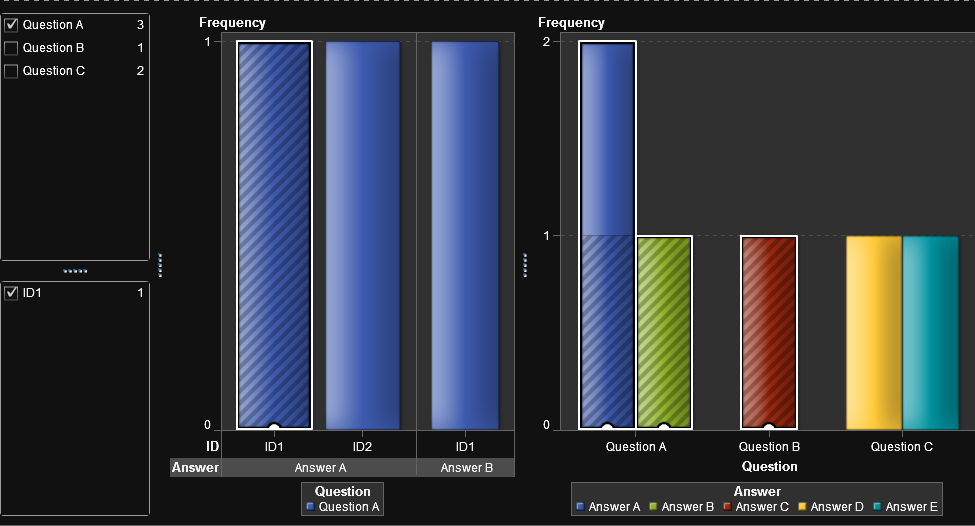
This was a very quick attempt and I did not spend a lot of time looking at charts other than the types you had mentioned. You should be able to do some pretty interesting visualizations with it though.
Good luck!
- Mark as New
- Bookmark
- Subscribe
- Mute
- RSS Feed
- Permalink
- Report Inappropriate Content
Thank you very much! That's a good idea, and I didn't consider it at all.
Unluckly, data that I have to explore come from a survey, and questions (and answers) are more than one hundred and IDs are about 200 thousands... I can't select every ID and search its answers among the others like this!
However, thanks for your suggestion, I'll try to implement ti in another ways.
Can I ask you a thing? What do you mean when you say "displaying the filtered information as an info window"?
Thanks again!
Irene
- Mark as New
- Bookmark
- Subscribe
- Mute
- RSS Feed
- Permalink
- Report Inappropriate Content
Hello Irene,
Glad to help. I'm sure there is a better way to search through the data, perhaps with some grouping. Let me know if you get stuck.
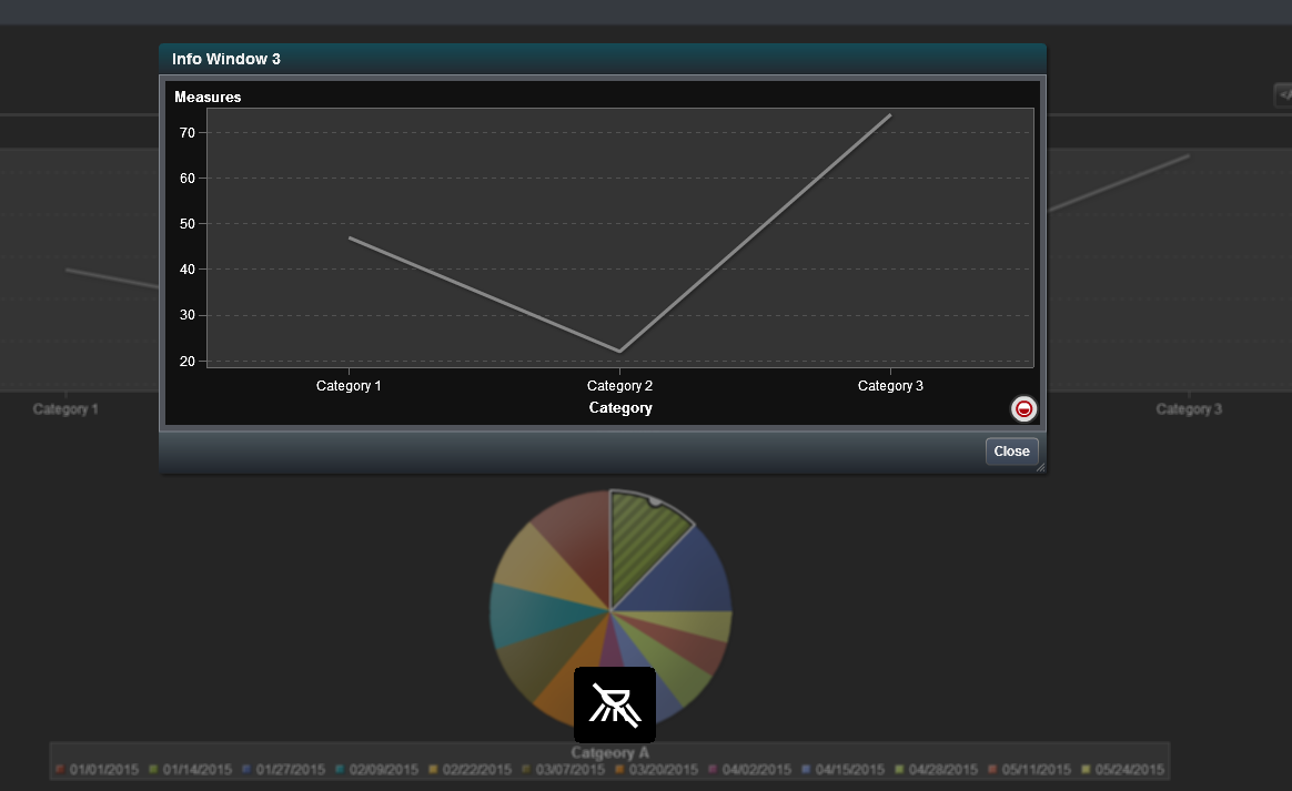
Info Windows are kind of a fun tool that allow the end user to double click on a graph element and, instead of linking to another section tab, it opens up a pop up window. The downside is that you are not able to link to individual sections of the info window. I have used this tool a lot related to marketing and other drill down needs to have a map show up along with a list. You can have multiple graphs in each info window.
To create and info window, click on the arrow next to the section name in the tab. Then, click info window. It will change the name of the tab to info window.

You can have multiple info windows on the report attached to different chart elements. You can link the graphs to the info window the same way you would set up a filter in the interactions view. You can also filter within the info window from one chart element to another.
*Note - the info window only displays as the pop up box when you are in report view, otherwise when you double click on a chart element it goes to the correct info window tab. I went to report view to show you how when I clicked on a specific section of the pie chart, the window shows up. The data will be filtered from that specific section of the pie chart.
Sorry I didn't have time to put in good sample data for this example, most of what I have is confidential and can't be shared. If you have further questions I would be happy to help.
Good luck!
Mike
- Mark as New
- Bookmark
- Subscribe
- Mute
- RSS Feed
- Permalink
- Report Inappropriate Content
Sorry, it doesn't look like it added all of my screenshot attachments. I probably went over the file size limits. Real quick, this is what the info window view would look like in report viewer. (hopefully it works).
- Mark as New
- Bookmark
- Subscribe
- Mute
- RSS Feed
- Permalink
- Report Inappropriate Content
I'm still having the same problem... is there anyone who can help me?
Thanks
Irene
.jpg")
Catch up on SAS Innovate 2026
Nearly 200 sessions are now available on demand in the Innovate Hub.
Watch Now →See how to use one filter for multiple data sources by mapping your data from SAS’ Alexandria McCall.

Find more tutorials on the SAS Users YouTube channel.
-
8 replies
-
07-22-2015 05:51 AM
-
6045 views
-
6 likes
-
3 in conversation
-
