- Home
- /
- SAS Viya
- /
- Visual Analytics
- /
- Change Stack Grouping based on dropdown choice
- RSS Feed
- Mark Topic as New
- Mark Topic as Read
- Float this Topic for Current User
- Bookmark
- Subscribe
- Mute
- Printer Friendly Page
- Mark as New
- Bookmark
- Subscribe
- Mute
- RSS Feed
- Permalink
- Report Inappropriate Content
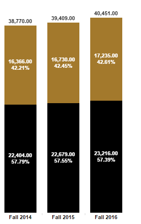
We are trying to find out if it is possible to change the grouping of a bar chart based on the choices in a drop down. An example of what we are going for can be found here: https://www.purdue.edu/datadigest/ under the "Student Enrollment" report. What we are looking to do is the equivalent of the "Break Color By" drop down in the left hand menu. The rest of the dropdowns seem to be traditional filters.
Thanks
Accepted Solutions
- Mark as New
- Bookmark
- Subscribe
- Mute
- RSS Feed
- Permalink
- Report Inappropriate Content
Hi dakuwan,
This is possible, but you need to create a small reference table and load it in SAS VA with the column names you want to be able to choose from. This can be a one column table, so it's very small. This table needs to be added as a datasource to the report. Use the category in this reference table to populate the dropdown list. Now assign a parameter to the dropdown list.
Next create a new calculated item 'Grouped by' (in the original dataset). This calculated item uses the if - return - else logic to populate it with the chosen value of the dropdown list. The code looks something like this:
IF ('p_dropdown'p = 'column A')
RETURN ('Column A'n)
ELSE (
            IF ('p_dropdown'p = 'column B')
            RETURN ('Column B'n)
            ELSE ('Column C'n)
           )
Now assign this calculated item 'Grouped by' to the group role in the bar chart and the magic should happen 🙂
Best regards,
- Lodewijk
- Mark as New
- Bookmark
- Subscribe
- Mute
- RSS Feed
- Permalink
- Report Inappropriate Content
Thanks, this worked perfectly and was a lot simpler to implement than i expected.
Really appreciate the help.
- Mark as New
- Bookmark
- Subscribe
- Mute
- RSS Feed
- Permalink
- Report Inappropriate Content
@Lodewijk Thanks for this. Much appreciated. I did try something similar but it seems I got confused as to which data source had to contain what field, though it makes sense now.
I seems like VA needs to have a character parameter that can store/accept a bunch of values, one of which is current. Like the numeric parameter. Having to have a table just for menu entries is sad. Do you read this VA devs?
I limited the sadness by adding a step to your process. I import a table called blank entries that contains values 01 to 99 , and I create a custom category for each drop-down list with the values I need. This way, I only need one sad menu entry table for all reports.
A limitation to the process you demonstrated is that aggregated measures cannot be displayed. I worked around this by creating an aggregated measure instead of a calculated item, so I can display both in my report (the % format is lacking however):
IF ( 'p_dropdown'p = '# A' )
RETURN Sum [_ByGroup_] ( '# A'n )
ELSE (
            IF ( 'p_dropdown'p = '% A' )
            RETURN ( '% A'n * 100 )
            ELSE  ...
Creating VA reports is fun when you accept it with the right mind set: it's a challenge much like playing Lego; you try and build systems with a set of overly simplistic tools, and you rack your brains trying to devise smart solutions. But really, the needs outlined here are simple, common and straightforward. The tool should natively enable this.
- Mark as New
- Bookmark
- Subscribe
- Mute
- RSS Feed
- Permalink
- Report Inappropriate Content
@ChrisNZ We were running into the same need of having a default that was just the sum. In our case this was wanting to default to a total headcount when the bars weren't broken by whatever choice they had made. So our chart is breaking by gender, ethnicity, location, etc. Each choice breaks up the headcount and looks good. What we're missing is that last else statement where if nothing is chosen the chart is just a single bar of the headcount unbroken.
Could you elaborate on how you did this? Looking at your example i was confused by what the return sum line. That may be due to my overall lack of SAS experience and straightforward for others.
Thanks
- Mark as New
- Bookmark
- Subscribe
- Mute
- RSS Feed
- Permalink
- Report Inappropriate Content
Have you tried
IF        ( 'p_dropdown'p = 'By Gender' )   RETURN  ( 'GENDER'n )
ELSE IF ( 'p_dropdown'p = 'By Age' )  RETURN ( 'AGE'n )
ELSE 'No Split'- Mark as New
- Bookmark
- Subscribe
- Mute
- RSS Feed
- Permalink
- Report Inappropriate Content
Thanks @ChrisNZ. That worked perfectly. I didnt realize i could just put anything in there and it would default to showing it unbroken. I assumed i had to either reference a parameter or data element.
Thanks again.
- Mark as New
- Bookmark
- Subscribe
- Mute
- RSS Feed
- Permalink
- Report Inappropriate Content
Now if there was a way to compute split percentage to 100% without having to precalculate all the totals in the data...
- Mark as New
- Bookmark
- Subscribe
- Mute
- RSS Feed
- Permalink
- Report Inappropriate Content
Hi Chris,
thank you for the post, it is really helpful. Looking at your graph, you have the data labels for each groups within the stach graph. Can you please let me know how you achieved this in SAS VA?
- Mark as New
- Bookmark
- Subscribe
- Mute
- RSS Feed
- Permalink
- Report Inappropriate Content
I havent worked on VA for almost a year now, it was just a short stint, so I can't help you, sorry. It's too long ago and I can't recall.
- Mark as New
- Bookmark
- Subscribe
- Mute
- RSS Feed
- Permalink
- Report Inappropriate Content
Thanks for the reply, no matter what. Do you remember if you developed the graphs in VA or it was in another visualization tool (they look like Tableau)?
- Mark as New
- Bookmark
- Subscribe
- Mute
- RSS Feed
- Permalink
- Report Inappropriate Content
All in VA for sure.
- Mark as New
- Bookmark
- Subscribe
- Mute
- RSS Feed
- Permalink
- Report Inappropriate Content
The graph you're showing is from the original question from Dakuwan as taken from the website of Purdue. Looking at the website source, it seems that the visualisations are made using Tableau.
As far as I know, it's still not possible to create data labels inside the (stacked) barchart in SAS VA.
- Mark as New
- Bookmark
- Subscribe
- Mute
- RSS Feed
- Permalink
- Report Inappropriate Content
@Lodewijk Thank you! Unfortunately, that confirms my thoughts. It is not possible ti add the labels of the different grousp...
Catch up on SAS Innovate 2026
Nearly 200 sessions are now available on demand with the SAS Innovate Digital Pass.
Explore Now →See how to use one filter for multiple data sources by mapping your data from SAS’ Alexandria McCall.
Find more tutorials on the SAS Users YouTube channel.


