- Home
- /
- SAS Viya
- /
- VA Gallery
- /
- Visualizing Weather Event Data Using A Nested Bar Chart
- RSS Feed
- Mark as New
- Mark as Read
- Bookmark
- Subscribe
- Printer Friendly Page
- Report Inappropriate Content
Visualizing Weather Event Data Using A Nested Bar Chart
- Article History
- RSS Feed
- Mark as New
- Mark as Read
- Bookmark
- Subscribe
- Printer Friendly Page
- Report Inappropriate Content
As we make the transition from summer into fall, I've been seeing lots of news stories describing all the storms that are occurring. Be it hurricanes, thunderstorms, or just heavy rain it seems that this time of year has a lot of weather events. This got me thinking, what is the distribution of total weather events throughout the year? Are there more rainstorms in spring or fall? To answer this question I decided to create a nested bar chart using the SAS® Graph Builder in SAS Viya.
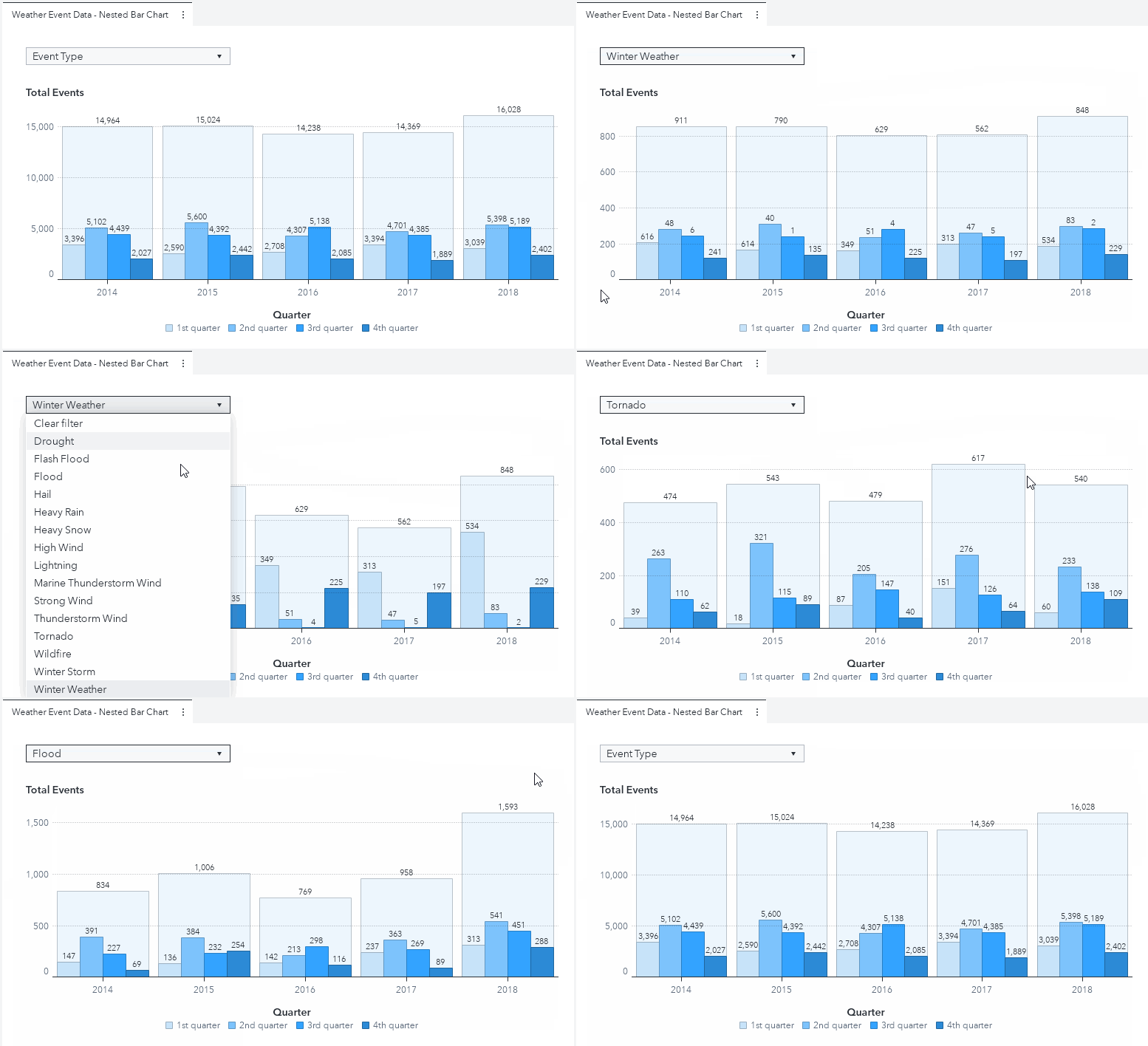
In just a short time, I was able to create the report below:
Very interesting! The custom graph allows us to see which quarter (or season) of the year specific storm events happen. More so, since the visual is a nested bar chart, we have the ability to see the number of events for each quarter as a proportion of the total events for the year.
The data source for the example report above is obtained from the SAS® Viya® Example Data Sets webpage and processed with with SAS Visual Analytics 8.5.
Get the details of how to re-create this chart in this SAS Communities Library article.


