- Home
- /
- Programming
- /
- Programming
- /
- SGPANEL: How to plot extreme values varying across panels
- RSS Feed
- Mark Topic as New
- Mark Topic as Read
- Float this Topic for Current User
- Bookmark
- Subscribe
- Mute
- Printer Friendly Page
- Mark as New
- Bookmark
- Subscribe
- Mute
- RSS Feed
- Permalink
- Report Inappropriate Content
Hello folks,
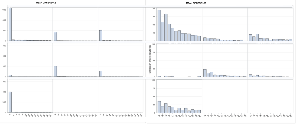
I'm trying to visualize extreme values in comparison to the rest of the data in PROC SGPANEL. Including extremes associated with where coverage in (0,99) makes the rest of the data appear flat and leaving my plot useless. Yet demonstrating the contrast between extremes and the remaining data is the key argument in the following write-up. Panel is grouped by "Group" categorical variable and each group has unique extreme values. is there any effective solution for this? Cutting axis might not be easy in SAS, right? I also though of expressing the extremes as REFLINE in each panels. However, each panel then requires unique REFLINE value and I don't know how to use different reflines across different panels. Do you know how? Maybe different way of plotting helps that I'm not aware of? I'm stuck with line or barcharts. Maybe there's more options beyond these two plotting options when it comes to data with extreme values like this?
Thanks in advance for your precious time!
DATA PLOT;
INPUT GROUP $	COVERAGE	N;
CARDS;
A	0	6537
A	15	341
A	30	268
A	60	317
A	90	254
A	120	230
A	150	211
A	180	215
A	210	198
A	240	197
A	270	195
A	300	186
A	330	187
A	360	181
A	999	876
B	0	1828
B	15	172
B	30	170
B	60	166
B	90	166
B	120	164
B	150	157
B	180	157
B	210	157
B	240	158
B	270	155
B	300	154
B	330	156
B	360	152
B	999	226
C	0	2179
C	15	191
C	30	178
C	60	193
C	90	167
C	120	169
C	150	166
C	180	158
C	210	162
C	240	162
C	270	161
C	300	160
C	330	159
C	360	162
C	999	275
D	0	452
D	15	155
D	30	151
D	60	156
D	90	153
D	120	154
D	150	151
D	180	151
D	210	151
D	240	151
D	270	152
D	300	151
D	330	151
D	360	155
D	999	177
E	0	2167
E	15	197
E	30	175
E	60	180
E	90	164
E	120	163
E	150	161
E	180	160
E	210	158
E	240	155
E	270	157
E	300	156
E	330	152
E	360	154
E	999	232
F	0	1241
F	15	165
F	30	158
F	60	161
F	90	156
F	120	158
F	150	153
F	180	152
F	210	154
F	240	153
F	270	154
F	300	152
F	330	152
F	999	181
G	0	4159
G	15	221
G	30	191
G	60	208
G	90	189
G	120	187
G	150	168
G	180	180
G	210	169
G	240	179
G	270	164
G	300	171
G	330	169
G	360	167
G	999	633
;

ods graphics / height=10IN width=12IN;
proc sgpanel data=PLOT;
panelby GROUP/onepanel novarname ROWS=3;
vbar COVERAGE/ RESPONSE=N;
/*WHERE COVERAGE NOT IN(0,999); */
run;
l
Accepted Solutions
- Mark as New
- Bookmark
- Subscribe
- Mute
- RSS Feed
- Permalink
- Report Inappropriate Content
- Mark as New
- Bookmark
- Subscribe
- Mute
- RSS Feed
- Permalink
- Report Inappropriate Content
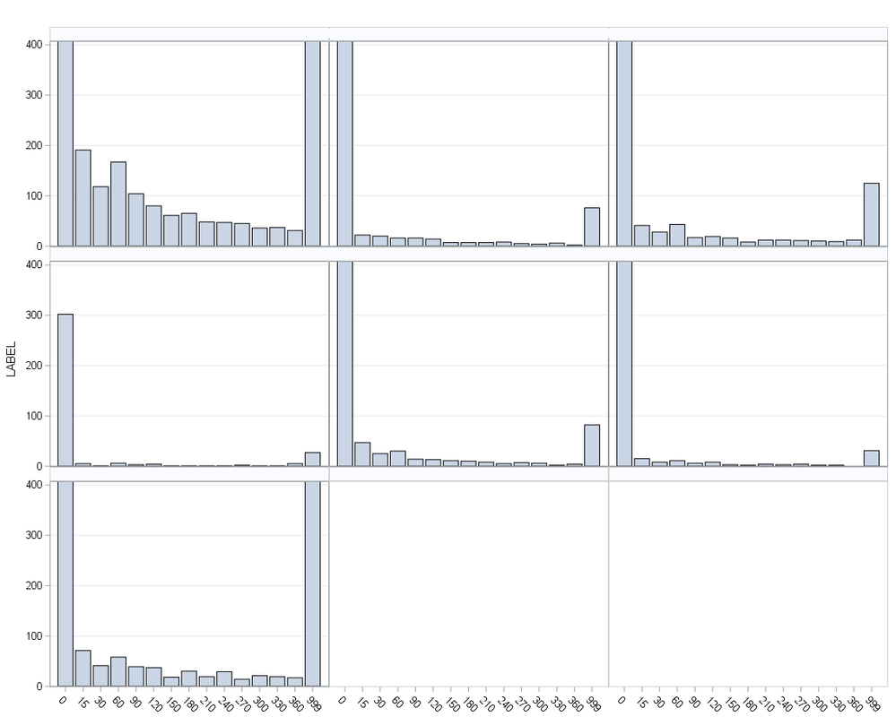
Try
rowaxis min=0 max=400;
or
rowaxis range=(0-200 200-max);
- Mark as New
- Bookmark
- Subscribe
- Mute
- RSS Feed
- Permalink
- Report Inappropriate Content
Thank you so much. It looks weird but shows extreme values exceeded the range of remaining data. Maybe I should report the max values using INSET function.
- Mark as New
- Bookmark
- Subscribe
- Mute
- RSS Feed
- Permalink
- Report Inappropriate Content
If you could switch SGPANEL into SGPLOT , try RANGE option.

proc sgplot
...........
yaxis range=(0-200 200-max);
- Mark as New
- Bookmark
- Subscribe
- Mute
- RSS Feed
- Permalink
- Report Inappropriate Content
Catch up on SAS Innovate 2026
Dive into keynotes, announcements and breakthroughs on demand.
Explore Now →Learn how use the CAT functions in SAS to join values from multiple variables into a single value.
Find more tutorials on the SAS Users YouTube channel.
SAS Training: Just a Click Away
Ready to level-up your skills? Choose your own adventure.


