- Home
- /
- Programming
- /
- Programming
- /
- Multiple scatterplots in GTL: remove extra space
- RSS Feed
- Mark Topic as New
- Mark Topic as Read
- Float this Topic for Current User
- Bookmark
- Subscribe
- Mute
- Printer Friendly Page
- Mark as New
- Bookmark
- Subscribe
- Mute
- RSS Feed
- Permalink
- Report Inappropriate Content
Hello,
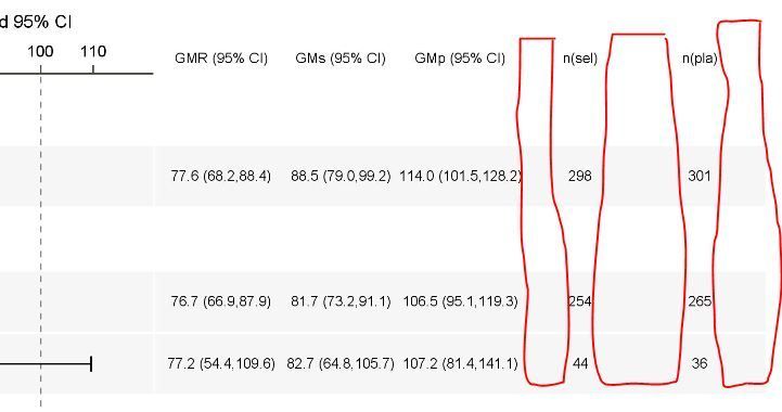
I built a forest plot by using proc template with 3 layout overlay statements i.e. one for the labels on the left, one for the graph in the middle and one for the figures on the right.
To display the right part with the figures I used multiple scatterplots statements within the layout overlay.
My issue is that SAS seems to reserve the same place to each scatterplot whereas each column does not display the same kind of figures and in my example this creates extra space for the last 2 columns that I would like to get rid of (see framed in red).
Any idea how to take that extra space off ?
Thanks !
- Mark as New
- Bookmark
- Subscribe
- Mute
- RSS Feed
- Permalink
- Report Inappropriate Content
As a minimum you should provide the code you are currently using, the GTL, the SGrender that calls it and best an example of the data to recreate your current graph.
Without any information at all one suspects an axis value issue but there are not enough details to tell what may be "causing" or how to resolve.
- Mark as New
- Bookmark
- Subscribe
- Mute
- RSS Feed
- Permalink
- Report Inappropriate Content
Yes sorry, here it is !
proc template;
  define statgraph ForestMacro;
    begingraph / designwidth=&Width designheight=&GraphHeight ;

	  layout lattice / columns=3 columnweights=(&LabelColWidth &GraphColWidth &StatColWidth) columngutter=0
                       rowdatarange=union;
        /*--Column # 1 contains the Study Labels--*/
        layout overlay / walldisplay=none x2axisopts=(display=none)
                         yaxisopts=(tickvalueattrs = (size = 6  family="arial" weight=normal) linearopts=(tickvaluesequence=(start=1 end=&count increment=1))
                                    offsetmin=&pct2 offsetmax=&pct display=none
                                    displaysecondary=(tickvalues &border)) ;
		  scatterplot y=studyvalue x=_or1 / yaxis=Y xaxis=X2 markerattrs=(size=0) includemissinggroup=true MARKERCHARACTERATTRS=(size=6pt);
		  scatterplot y=studyvalue x=_or1 / yaxis=Y xaxis=X2 markerattrs=(size=0) includemissinggroup=true MARKERCHARACTERATTRS=(size=6pt);

		endlayout;

	    /*--Column # 2 contains the graph--*/
        layout overlay / &GraphWallDisplay border=false
                         xaxisopts=(tickvalueattrs = (size = 7  family="arial" weight=normal)
                                    linearopts=(tickvaluesequence=(start=&xstart. end=&xend. increment=20) viewmin=&xstart. viewmax=&xend.)
                                    label="&PlotTitle" labelattrs = (size = 8  family="arial" weight=normal) display=(ticks tickvalues line)
                                    displaysecondary=(label line ticks tickvalues))
                         yaxisopts=(linearopts=(tickvaluesequence=(start=1 end=&count increment=1))
                                    offsetmin=&pct2 offsetmax=&pct display=none);

		  /*--Draw alternating bands using referenceline--*/
          referenceline y=_StudyRefb / lineattrs=(thickness=&RefThickness.PCT) datatransparency=0.9;

          referenceline x=&effect / lineattrs=(color=darkgrey);

          /*--Draw OddsRatio and Limits for Study Values--*/
          scatterplot y=studyvalue x=_or1 / xerrorupper=_ucl1 xerrorlower=_lcl1
                  markerattrs=graphdata1(symbol=squarefilled size=&MarkerSize);

		  /*--Draw box representing the weight of the study--*/
          vectorplot y=studyvalue x=_x2 xorigin=_x1 yorigin=studyvalue / lineattrs=GraphData1(thickness=8)
                 arrowheads=false;

          %boxes;

          referenceline x=0 /  lineattrs=(pattern=shortdash color=black) datatransparency=0.5 curvelabel=" ";


		  entry halign=left  "&Label1" / valign=bottom textattrs = (size = 8  family="arial" );
		  entry halign=right "&Label2" / valign=bottom location=inside textattrs = (size = 8  family="arial" );;
		endlayout;

	    /*--Column # 3 contains the statistics data--*/
        layout overlay / &StatWallDisplay border=false
                         x2axisopts=(display=(tickvalues &border) TICKVALUEATTRS = (size=6  family="arial" weight=normal) linearopts=(TICKVALUEFITPOLICY=STAGGERROTATE))
                         yaxisopts=(linearopts=(tickvaluesequence=(start=1 end=&count increment=1))
                                    offsetmin=&pct2 offsetmax=&pct
                                    display=none &DisplaySecondary.);

          /*--Draw alternating bands using referenceline--*/
          referenceline y=_StudyRefb / lineattrs=(thickness=&RefThickness.PCT) datatransparency=0.9;


          /*--Draw standard statistics columns--*/

          scatterplot y=studyvalue x=_OddsRatioLabel / markercharacter=_HR_  xaxis=x2 MARKERCHARACTERATTRS=(size=6) LABELSTRIP=TRUE ;

		  /*--Draw additional statistics columns--*/
          scatterplot y=studyvalue x=_StatColLabel1 / markercharacter=&StatCol1 xaxis=x2 MARKERCHARACTERATTRS=(size=6) LABELSTRIP=TRUE ;
          scatterplot y=studyvalue x=_StatColLabel2 / markercharacter=&StatCol2 xaxis=x2 MARKERCHARACTERATTRS=(size=6) LABELSTRIP=TRUE ;
          scatterplot y=studyvalue x=_StatColLabel3 / markercharacter=&StatCol3 xaxis=x2 MARKERCHARACTERATTRS=(size=6) LABELSTRIP=TRUE ;
          scatterplot y=studyvalue x=_StatColLabel4 / markercharacter=&StatCol4 xaxis=x2 MARKERCHARACTERATTRS=(size=6) LABELSTRIP=TRUE ;

		endlayout;
	  endlayout;
	endgraph;
  end;
run;


proc sgrender data=_forest template=ForestMacro description='Forest Plot';
run;- Mark as New
- Bookmark
- Subscribe
- Mute
- RSS Feed
- Permalink
- Report Inappropriate Content
I think part of your issue may be starting with Layout Lattice:
LAYOUT LATTICE Statement
Creates a grid of graphs that automatically aligns plot areas and tick display areas across grid cells to facilitate data comparisons among graphs.
Which is trying to create separate graphs, not everything in one graph. So I think that you are seeing the spacing between sub-elements of the lattice. Which means this space may be coming from the COLUMNGUTTER. So you might try setting a very small value for the COLUMNGUTTER= option on the Layout Lattice, maybe something like Columngutter=1pt
Sort of guessing here as without data or definitions for the way-to0-many macro variables there isn't any way to test my theory.
BTW, this block of code
          scatterplot y=studyvalue x=_StatColLabel1 / markercharacter=&StatCol1 xaxis=x2 MARKERCHARACTERATTRS=(size=6) LABELSTRIP=TRUE ;
          scatterplot y=studyvalue x=_StatColLabel2 / markercharacter=&StatCol2 xaxis=x2 MARKERCHARACTERATTRS=(size=6) LABELSTRIP=TRUE ;
          scatterplot y=studyvalue x=_StatColLabel3 / markercharacter=&StatCol3 xaxis=x2 MARKERCHARACTERATTRS=(size=6) LABELSTRIP=TRUE ;
          scatterplot y=studyvalue x=_StatColLabel4 / markercharacter=&StatCol4 xaxis=x2 MARKERCHARACTERATTRS=(size=6) LABELSTRIP=TRUE ;
Makes me think you might get by with one "_statcollabel" x variable and Group variable to control the markers. Maybe.
Which might move all the plots into a single scatterplot which might also reduce the space.
- Mark as New
- Bookmark
- Subscribe
- Mute
- RSS Feed
- Permalink
- Report Inappropriate Content
Thank, but I've tried small value for COLUMNGUTTER and it does not work.
Also I'm not sure I understand the second proposal with one single scatterplot.
What would be that Group variable knowing that I have 4 variables to display i.e. &Statcol1 to &Statcol4 ?
Does that mean that my dataset needs to be repeated 4 times with one variable having &Statcol1 values in 1st part, then &Statcol2 values in 2nd part, &Statcol3 values in 3rd part and finally &Statcol4 values in 4th part ?
- Mark as New
- Bookmark
- Subscribe
- Mute
- RSS Feed
- Permalink
- Report Inappropriate Content
Has anyone figured out a solution to this? I have the same issue
- Tags:
- @evilwell @ballardw
Catch up on SAS Innovate 2026
Dive into keynotes, announcements and breakthroughs on demand.
Explore Now →Learn how use the CAT functions in SAS to join values from multiple variables into a single value.
Find more tutorials on the SAS Users YouTube channel.
SAS Training: Just a Click Away
Ready to level-up your skills? Choose your own adventure.


