- Home
- /
- Programming
- /
- Programming
- /
- Re: How to restrict result values in Bar chart.
- RSS Feed
- Mark Topic as New
- Mark Topic as Read
- Float this Topic for Current User
- Bookmark
- Subscribe
- Mute
- Printer Friendly Page
- Mark as New
- Bookmark
- Subscribe
- Mute
- RSS Feed
- Permalink
- Report Inappropriate Content
Hi,
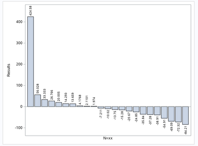
I have result values as 424, 56, 33, 26, 20, 14, 13, 4, 2, 1, -7, -10, -13, -15, -20, -24, -35, -37, -38, -54, -69, -72, -84. I am plotting a bar chart using the following code.
proc sgplot data=test;
vbar n/response=result datalabel;
xaxis label = 'N=xx' display=(novalues noticks);
yaxis label= 'Results' ;
run;
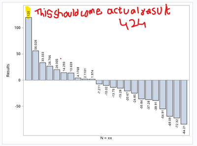
After running the above code am getting result like this, but the I need to restrict y-axis values as -100 to 140 by 20 and 100&above to display within 140. For that I harcoded the value above 100 to 120 like (if result > 100 then result_ = 120; else result_ = result;) with that update I have run the same code changing ressponse = result_ (new variable created0 but the data label show the new hardcoded value as 120 for the observations above 100. But I wanted to show the actual result value 424 in the place of 120, is that possible.
Thank you for your help in advance.
Accepted Solutions
- Mark as New
- Bookmark
- Subscribe
- Mute
- RSS Feed
- Permalink
- Report Inappropriate Content
Not commenting on whether this is a good idea or bad idea but it's possible. DATALABEL allows you specify a variable for the label so specify the original variable.
proc sgplot data=test1;
vbar n/response=result_ datalabel = result;
xaxis label='N=xx' display=(novalues noticks);
yaxis label='Results';
run;
@Sairampulipati wrote:
Thank you Miler, here is the code.
data test;
input result 8.;
datalines;
424
56
33
26
20
14
13
4
2
1
-7
-10
-13
-15
-20
-24
-35
-37
-38
-54
-69
-72
-84
;
run;data test;
set test;
n=_n_;
run;proc sgplot data=test;
vbar n/response=result datalabel;
xaxis label='N=xx' display=(novalues noticks);
yaxis label='Results';
run;data test1;
set test;
if result > 100 then result_=120;
else result_=result;
run;proc sgplot data=test1;
vbar n/response=result_ datalabel;
xaxis label='N=xx' display=(novalues noticks);
yaxis label='Results';
run;I am new to plots so I am not sure how to apply formats to data to show 120 as 424 in plot.
- Mark as New
- Bookmark
- Subscribe
- Mute
- RSS Feed
- Permalink
- Report Inappropriate Content
Its really hard to know what you did when you show us small parts of your program, and write words to describe the rest of the program. Show us the relevant parts of your program, PROCs and DATA steps need to be complete. Do not show us partial PROCs or partial DATA steps.
Also, have you tried formatting the data so 120 is shown as 424?
Paige Miller
- Mark as New
- Bookmark
- Subscribe
- Mute
- RSS Feed
- Permalink
- Report Inappropriate Content
Thank you Miler, here is the code.
data test;
input result 8.;
datalines;
424
56
33
26
20
14
13
4
2
1
-7
-10
-13
-15
-20
-24
-35
-37
-38
-54
-69
-72
-84
;
run;
data test;
set test;
n=_n_;
run;
proc sgplot data=test;
vbar n/response=result datalabel;
xaxis label='N=xx' display=(novalues noticks);
yaxis label='Results';
run;
data test1;
set test;
if result > 100 then result_=120;
else result_=result;
run;
proc sgplot data=test1;
vbar n/response=result_ datalabel;
xaxis label='N=xx' display=(novalues noticks);
yaxis label='Results';
run;
I am new to plots so I am not sure how to apply formats to data to show 120 as 424 in plot.
- Mark as New
- Bookmark
- Subscribe
- Mute
- RSS Feed
- Permalink
- Report Inappropriate Content
Not commenting on whether this is a good idea or bad idea but it's possible. DATALABEL allows you specify a variable for the label so specify the original variable.
proc sgplot data=test1;
vbar n/response=result_ datalabel = result;
xaxis label='N=xx' display=(novalues noticks);
yaxis label='Results';
run;
@Sairampulipati wrote:
Thank you Miler, here is the code.
data test;
input result 8.;
datalines;
424
56
33
26
20
14
13
4
2
1
-7
-10
-13
-15
-20
-24
-35
-37
-38
-54
-69
-72
-84
;
run;data test;
set test;
n=_n_;
run;proc sgplot data=test;
vbar n/response=result datalabel;
xaxis label='N=xx' display=(novalues noticks);
yaxis label='Results';
run;data test1;
set test;
if result > 100 then result_=120;
else result_=result;
run;proc sgplot data=test1;
vbar n/response=result_ datalabel;
xaxis label='N=xx' display=(novalues noticks);
yaxis label='Results';
run;I am new to plots so I am not sure how to apply formats to data to show 120 as 424 in plot.
- Mark as New
- Bookmark
- Subscribe
- Mute
- RSS Feed
- Permalink
- Report Inappropriate Content
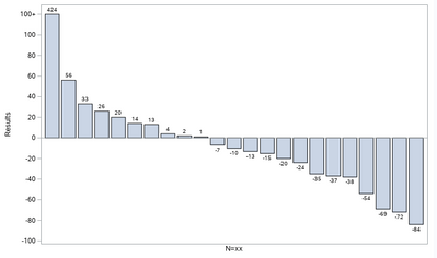
Thank you very much Reeza for the help, certainly it worked well. The read wants in such a way that above hundred should be like 100+ in the y-axis and actual result values in the data label. I have changed the code to
proc sgplot data=test1;
vbar n/response=result_ datalabel=result;
xaxis label='N=xx' display=(novalues noticks);
yaxis label='Results' values=(-100 -80 -60 -40 -20 0 20 40 60 80 100 120) valuesdisplay=('-100' '-80' '-60' '-40' '-20' '0' '20' '40' '60' '80' '100' '100+');
run;
And now the output looks as per the reader requirement
- Mark as New
- Bookmark
- Subscribe
- Mute
- RSS Feed
- Permalink
- Report Inappropriate Content
Are you actually intending to mislead the reader of your graph and imply that the value is actually 120 when in reality it was 424? Or do you want something so that the height of the bar is not drastically longer than others?
Consider (note, I am nice enough to provide a data set to actually graph):
data example;
   do y=424, 56, 33, 26, 20, 14, 13, 4, 2, 1, -7, -10, -13, -15, -20, -24, -35, -37, -38, -54, -69, -72, -84;
      x +1;
      output;
   end;
run;

/* as is*/
proc sgplot data=example;
   vbar x/response=y datalabel;
   xaxis label = 'N=xx' display=(novalues noticks);
   yaxis label= 'Results' ;
run;

/* break in yaxis*/
proc sgplot data=example;
   vbar x/response=y datalabel;
   xaxis label = 'N=xx' display=(novalues noticks);
   yaxis label= 'Results' ranges=(-100-100 400-450) ;
run;
The second graph makes much more sense than trying to corrupt an actual value.
Learn how use the CAT functions in SAS to join values from multiple variables into a single value.
Find more tutorials on the SAS Users YouTube channel.
SAS Training: Just a Click Away
Ready to level-up your skills? Choose your own adventure.


