- Home
- /
- Programming
- /
- Programming
- /
- Re: Creating a customized waterfall graph
- RSS Feed
- Mark Topic as New
- Mark Topic as Read
- Float this Topic for Current User
- Bookmark
- Subscribe
- Mute
- Printer Friendly Page
- Mark as New
- Bookmark
- Subscribe
- Mute
- RSS Feed
- Permalink
- Report Inappropriate Content
Hello,
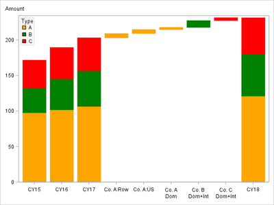
I am trying to create a waterfall graph in SAS showing annual revenues historically with a breakout of growth by source company by calendar year. I want to create a graph that looks just like the one in the attached Word document which shows a breakout of growth going from 2017 to 2018 as shown with column totals as shown. Here is the correspong (example) data I used:
| ID | Co. A | Co. B | Co. C | YoY Chg | Rolling Total |
| CY15 | 97.9 | 35.1 | 38.9 | 171.9 | |
| CY16 | 102.0 | 43.2 | 44.6 | 189.9 | |
| CY17 | 106.8 | 49.9 | 46.7 | 203.4 | |
| Co. A: ROW | 203.4 | 6.0 | 209.4 | ||
| Co. A: US | 209.4 | 5.5 | 214.9 | ||
| Co. A: Dom | 214.9 | 3.0 | 217.9 | ||
| Co. B: Dom+Int | 217.9 | 9.6 | 227.5 | ||
| Co. C: Dom + Int | 227.5 | 4.1 | 231.6 | ||
| CY18 | 121.3 | 59.5 | 50.8 | 231.6 |
How do I replicate this Excel graph using SAS? I spent hours trying to figure it out without luck.
Many thanks!
Jack
Accepted Solutions
- Mark as New
- Bookmark
- Subscribe
- Mute
- RSS Feed
- Permalink
- Report Inappropriate Content
The WATERFALL statement does not support "stacked bars" like you show in your example.
Also, your graph is not a pure waterfall plot: the first bars are based at 0 instead of being incremental bars based at the top of the previous bar.
I suggest that you use the VBARPARM statement to create this chart. You will need to add observations that draw the "blank cumulative bars" for the 4th-8th bars. You also have a complex labeling scheme here, so I recommend using the TEXT statement and drawing the labels yourself.
The program below should get you started. It draws the bars. Just add some computations for the text labels and you are done.
data Test;
length Name $13. Type $1.;
input Name $13. Amount Type $1.;
if missing(type) then type=".";
datalines;
CY15           97.9 A
CY15           35.1 B
CY15           38.9 C
CY16          102.0 A
CY16           43.2 B
CY16           44.6 C
CY17          106.8 A
CY17           49.9 B
CY17           46.7 C
Co. A:Row     203.4 M
Co. A:Row       6.0 A
Co. A:US      209.6 M
Co. A:US        5.5 A
Co. A:Dom     215.1 M
Co. A:Dom       3.0 A
Co. B:Dom+Int 218.1 M
Co. B:Dom+Int   9.6 B
Co. C:Dom+Int 227.7 M
Co. C:Dom+Int   4.1 C
CY18          121.3 A
CY18           59.5 B
CY18           50.8 C
;


proc sgplot data=Test;
  styleattrs datacolors=(orange green red white);
  vbarparm category=Name response=Amount / group=Type nooutline
    /*  seglabel seglabelfitpolicy=none seglabelattrs=(weight=bold) */;
  /* TO DO:  text x=Name y=YPOSITION text=Amount; */
  keylegend / exclude=("M") opaque across=1 position=topleft location=inside;
  xaxis display=(nolabel) splitchar=":";
  yaxis labelpos=top;
run;
- Mark as New
- Bookmark
- Subscribe
- Mute
- RSS Feed
- Permalink
- Report Inappropriate Content
Perhaps you should search for "Cascade Plot". I am seeing that the words "Waterfall" and "Cascade" are associated on the internet with the same kind of chart when looking at examples between Excel and SAS.
http://blogs.sas.com/content/iml/2015/04/27/cascade-chart.html
- Mark as New
- Bookmark
- Subscribe
- Mute
- RSS Feed
- Permalink
- Report Inappropriate Content
Yes I have seen the code posted online and thought I could easily copy-and-paste while making edits where necessary. The barrier I am encountering is how to create the bar graphs (as shown for the years CY15, CY16, CY17 and CY19) where the revenues are broken out and colored by the 3 source company (i.e. stacked graphs). I an fairly new to SAS.
Thanks.
- Mark as New
- Bookmark
- Subscribe
- Mute
- RSS Feed
- Permalink
- Report Inappropriate Content
- Mark as New
- Bookmark
- Subscribe
- Mute
- RSS Feed
- Permalink
- Report Inappropriate Content
The WATERFALL statement does not support "stacked bars" like you show in your example.
Also, your graph is not a pure waterfall plot: the first bars are based at 0 instead of being incremental bars based at the top of the previous bar.
I suggest that you use the VBARPARM statement to create this chart. You will need to add observations that draw the "blank cumulative bars" for the 4th-8th bars. You also have a complex labeling scheme here, so I recommend using the TEXT statement and drawing the labels yourself.
The program below should get you started. It draws the bars. Just add some computations for the text labels and you are done.
data Test;
length Name $13. Type $1.;
input Name $13. Amount Type $1.;
if missing(type) then type=".";
datalines;
CY15           97.9 A
CY15           35.1 B
CY15           38.9 C
CY16          102.0 A
CY16           43.2 B
CY16           44.6 C
CY17          106.8 A
CY17           49.9 B
CY17           46.7 C
Co. A:Row     203.4 M
Co. A:Row       6.0 A
Co. A:US      209.6 M
Co. A:US        5.5 A
Co. A:Dom     215.1 M
Co. A:Dom       3.0 A
Co. B:Dom+Int 218.1 M
Co. B:Dom+Int   9.6 B
Co. C:Dom+Int 227.7 M
Co. C:Dom+Int   4.1 C
CY18          121.3 A
CY18           59.5 B
CY18           50.8 C
;


proc sgplot data=Test;
  styleattrs datacolors=(orange green red white);
  vbarparm category=Name response=Amount / group=Type nooutline
    /*  seglabel seglabelfitpolicy=none seglabelattrs=(weight=bold) */;
  /* TO DO:  text x=Name y=YPOSITION text=Amount; */
  keylegend / exclude=("M") opaque across=1 position=topleft location=inside;
  xaxis display=(nolabel) splitchar=":";
  yaxis labelpos=top;
run;
- Mark as New
- Bookmark
- Subscribe
- Mute
- RSS Feed
- Permalink
- Report Inappropriate Content
Exactly what I am looking for! Many thanks...
Jack
Catch up on SAS Innovate 2026
Dive into keynotes, announcements and breakthroughs on demand.
Explore Now →Learn how use the CAT functions in SAS to join values from multiple variables into a single value.
Find more tutorials on the SAS Users YouTube channel.
SAS Training: Just a Click Away
Ready to level-up your skills? Choose your own adventure.


