- Home
- /
- Programming
- /
- SAS Procedures
- /
- Re: Using gplot or pareto?
- RSS Feed
- Mark Topic as New
- Mark Topic as Read
- Float this Topic for Current User
- Bookmark
- Subscribe
- Mute
- Printer Friendly Page
- Mark as New
- Bookmark
- Subscribe
- Mute
- RSS Feed
- Permalink
- Report Inappropriate Content
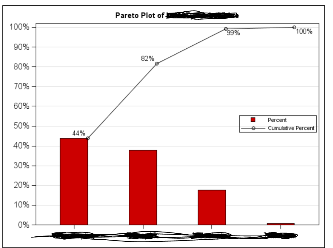
I want to plot the following graph by a given dataset. I think may be using PROC PARETO. But I am not exactly sure.
Thanks for code hint.
Accepted Solutions
- Mark as New
- Bookmark
- Subscribe
- Mute
- RSS Feed
- Permalink
- Report Inappropriate Content
output cumulative percent into table freq .
- Mark as New
- Bookmark
- Subscribe
- Mute
- RSS Feed
- Permalink
- Report Inappropriate Content
You can use SGPLOT or Pareto, it's a matter of choice, assuming you have the SAS/QC and PROC PARETO available.
What exactly is your question though?
- Mark as New
- Bookmark
- Subscribe
- Mute
- RSS Feed
- Permalink
- Report Inappropriate Content
OI don't have Pareto installed, I just found the fact. So I have to use SGPLOT.
The goal is
- The bar chart portion is to plot the individual percentages in each group.
- The line chart portion is used to plot the cumulative percentages in each group.
- Mark as New
- Bookmark
- Subscribe
- Mute
- RSS Feed
- Permalink
- Report Inappropriate Content
You really should post it at ODS Graphic forum.
proc freq data=sashelp.class noprint;
table age/out=freq outcum;
run;
data have;
 set freq;
 p=percent/100;
 cum_p=cum_pct/100;
format p cum_p percent7.2;

proc sgplot data=have;
vbar age/response=p nostatlabel fillattrs=graphdata2 legendlabel='percent';
vline age/response=cum_p markers datalabel legendlabel='cum percent';
yaxis label=' ';
keylegend  /across=1 position=right location=inside;
run;
- Mark as New
- Bookmark
- Subscribe
- Mute
- RSS Feed
- Permalink
- Report Inappropriate Content
So I have to calculate freq and cumulative percentage first on the given dataset?
The sashelp.class is just a demo example?
- Mark as New
- Bookmark
- Subscribe
- Mute
- RSS Feed
- Permalink
- Report Inappropriate Content
You can usually use the procs to do some summaries, but since you're needing two different statistics it's easier if you do it first yourself.
So yes, summarize the data using proc freq. SASHELP.CLASS is one of several demo dataset that almost all SAS installations will have. This allows others to run the same code and generate results.
- Mark as New
- Bookmark
- Subscribe
- Mute
- RSS Feed
- Permalink
- Report Inappropriate Content
table age/out=freq outcum;
For this line code. What is outcum?
It is not used in the later code.
- Mark as New
- Bookmark
- Subscribe
- Mute
- RSS Feed
- Permalink
- Report Inappropriate Content
output cumulative percent into table freq .
Catch up on SAS Innovate 2026
Dive into keynotes, announcements and breakthroughs on demand.
Explore Now →Learn the difference between classical and Bayesian statistical approaches and see a few PROC examples to perform Bayesian analysis in this video.
Find more tutorials on the SAS Users YouTube channel.
SAS Training: Just a Click Away
Ready to level-up your skills? Choose your own adventure.


