- Home
- /
- Programming
- /
- SAS Procedures
- /
- Re: Proc gchart bar colours
- RSS Feed
- Mark Topic as New
- Mark Topic as Read
- Float this Topic for Current User
- Bookmark
- Subscribe
- Mute
- Printer Friendly Page

- Mark as New
- Bookmark
- Subscribe
- Mute
- RSS Feed
- Permalink
- Report Inappropriate Content
I want to change the colour of bars in the vbar statement according to the value of sumvar, i.e. green if sumvar is positive and red if negative. I can create a conditional format with proc format statement but I can't work out how to use it with proc gchart. Any suggestions please?
Accepted Solutions

- Mark as New
- Bookmark
- Subscribe
- Mute
- RSS Feed
- Permalink
- Report Inappropriate Content
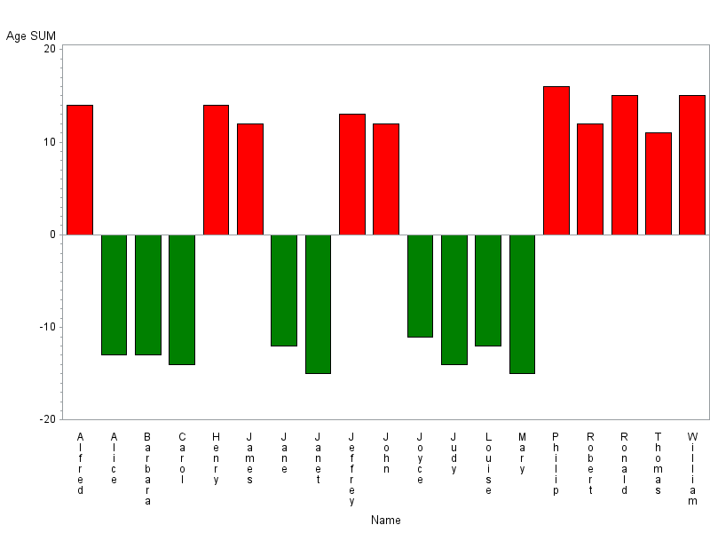
Something like:
data CLASS;
set SASHELP.CLASS;
if SEX='F' then AGE=-AGE;
call execute(catt('pattern',_N_,' color=',ifc(AGE>0,'red','green'),';'));
run;
proc gchart data=CLASS;
vbar NAME /patternid=midpoint sumvar=AGE ;
run;
quit;

- Mark as New
- Bookmark
- Subscribe
- Mute
- RSS Feed
- Permalink
- Report Inappropriate Content
Gchart displays colors basically in relationship to the order of the encountered data and the current definitions of Pattern statements. If PATTERN1 is red then the first value encountered (lowest value when stacked/grouped) for the X axis in the data set to chart is set to red.
Maybe this will give you some hints:
data mileage;
input age $ sex $ amount;
if sex='F' then amount=-amount;
datalines;
65-up M 7199
65-up F 4502
55-64 M 12304
55-64 F 5428
45-54 M 15701
45-54 F 6915
35-44 M 17916
35-44 F 7653
25-34 M 16683
25-34 F 7124
16-24 M 10718
16-24 F 6047
;
run;
pattern1 c=red;
pattern2 c=green;
proc gchart data=mileage;
vbar age / sumvar=amount discrete nostat subgroup=sex
;
run;
quit;
There are different and more controls with the newer SG graphics procedures but the approach will like vary based on the version of SAS you have as the changes have been significant in each release.
You may find this link helpful: Robert Allison's SAS/Graph Examples!
There are man

- Mark as New
- Bookmark
- Subscribe
- Mute
- RSS Feed
- Permalink
- Report Inappropriate Content
Maybe this could help you:
data Mileage;
input age $ sex $ amount;
datalines;
65-up M 7199
65-up F 4502
55-64 M 12304
55-64 F 5428
45-54 M 15701
45-54 F 6915
35-44 M 17916
35-44 F 7653
;
run;
data Mileage;
set Mileage;
new_label=age||sex;
if amount lt 6000 then Color='green';
else if amount ge 6000 AND amount lt 10000 then Color='y';
else if amount ge 10000 AND amount lt 15000 then Color='o';
else if amount gt 15000 then Color='red';
run;
proc sort data=Mileage nodupkey out=Sortset (keep=new_label Color);
by new_label Color;
run;
data _null_;
set Sortset end=last;
by new_label Color;
count+1;
call symput('new_label'||left(put(count,5.)),trim(new_label));
call symput('color'||left(put(Color,5.)),trim(Color));
if last then call symput('num',put(count,5.));
run;
pattern;
%macro BarPattern;
%do i=1 %to #
pattern&i v=s color=&&Color&i;
%end;
%mend;
%BarPattern;
proc gchart data=Mileage;
vbar new_label / sumvar=amount subgroup=new_label;
run;
quit;
additional reading & http://support.sas.com/resources/papers/proceedings09/185-2009.pdf
- Mark as New
- Bookmark
- Subscribe
- Mute
- RSS Feed
- Permalink
- Report Inappropriate Content
Thanks Nata
- Mark as New
- Bookmark
- Subscribe
- Mute
- RSS Feed
- Permalink
- Report Inappropriate Content
Something like:
data CLASS;
set SASHELP.CLASS;
if SEX='F' then AGE=-AGE;
call execute(catt('pattern',_N_,' color=',ifc(AGE>0,'red','green'),';'));
run;
proc gchart data=CLASS;
vbar NAME /patternid=midpoint sumvar=AGE ;
run;
quit;
- Mark as New
- Bookmark
- Subscribe
- Mute
- RSS Feed
- Permalink
- Report Inappropriate Content
Chris,
Thanks that's great, just with one line of code.
I just have one problem: if the chart has a group variable then the first group's pattern id is repeated for the 2nd group resulting in incorrect colour coding for the 2nd group. See example code below:
data test;
input trial_group $ phase delta_volts;
cards;
'Line1' 1 -0.033
'Line1' 2 -0.042
'Line1' 3 0.039
'Line1' 4 0.008
'Line2' 1 0.013
'Line2' 2 -0.043
'Line2' 3 -0.017
'Line2' 4 -0.081
;run;
data chart;
set test;
call execute(catt('pattern',_N_,' color=',ifc(delta_volts>0,'red','green'),';'));
run;
title;
axis2 width=2.0 label=(h=1.2 a=90 'Delta volts') value=(h=1.2);
proc gchart data=test;
vbar phase / group=trial_group mean type=mean space=4 width=10 gspace=8
sumvar=delta_volts discrete patternid=midpoint raxis=axis2;
run;quit;
- Mark as New
- Bookmark
- Subscribe
- Mute
- RSS Feed
- Permalink
- Report Inappropriate Content
The options for bar patterns are limited so you have a cheat a bit and create distinct midpoint values.
data TEST;
input TRIAL_GROUP $ PHASE $ DELTA_VOLTS;
PHASE1=cat(repeat(' ',2-substr(TRIAL_GROUP,5,1))||PHASE);
call execute(catt('pattern',_N_,' color=',ifc(delta_volts>0,'red','green'),';'));
cards;
Line1 1 -0.033
Line1 2 -0.042
Line1 3 0.039
Line1 4 0.008
Line2 1 0.013
Line2 2 -0.043
Line2 3 -0.017
Line2 4 -0.081
run;
goption ypixels=200;
proc gchart data=TEST;
vbar PHASE1 / group=TRIAL_GROUP mean type=mean nozero
sumvar=DELTA_VOLTS discrete patternid=midpoint;
run;
quit;
gives you:

as wanted instead of:

.
- Mark as New
- Bookmark
- Subscribe
- Mute
- RSS Feed
- Permalink
- Report Inappropriate Content
Chris,
Great trick! it works. Thanks a lot for your help.
.jpg")
Catch up on SAS Innovate 2026
Nearly 200 sessions are now available on demand in the Innovate Hub.
Watch Now →Learn the difference between classical and Bayesian statistical approaches and see a few PROC examples to perform Bayesian analysis in this video.

Find more tutorials on the SAS Users YouTube channel.
SAS Training: Just a Click Away
Ready to level-up your skills? Choose your own adventure.
-
7 replies
-
07-24-2015 01:31 AM
-
8046 views
-
7 likes
-
4 in conversation
-
