- Home
- /
- Programming
- /
- SAS Procedures
- /
- Re: How to improve the graph
- RSS Feed
- Mark Topic as New
- Mark Topic as Read
- Float this Topic for Current User
- Bookmark
- Subscribe
- Mute
- Printer Friendly Page
- Mark as New
- Bookmark
- Subscribe
- Mute
- RSS Feed
- Permalink
- Report Inappropriate Content
Hello,
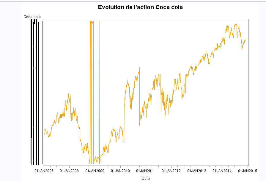
I want to make a graph to represent the evolution of the Coca Cola stock. I have tried doing it (see the picture in attachment) with the command below :
proc gplot Skalli.base_union ;
symbol1 interpol=join value=none color=orange ;
plot Coca_cola*Date ;
Title "Evolution de l'action Coca cola" ;
run ;
ods rtf close;
Quit ;
However in my graph I don't have the value on the y-axis (you will see a long black thing instead of the values of the stock)
How do I do to have the values on the y-axis ? I have the comments below in my journal :
WARNING: The gauche vertical axis labeled Yahoo could not be fit as specified. The axis values will overwrite.
WARNING: The number of minor tick marks requested, 0, will result in marks drawn less than a pixel wide. Minor
tick mark request will be ignored.
Thanking you in advance.

- Mark as New
- Bookmark
- Subscribe
- Mute
- RSS Feed
- Permalink
- Report Inappropriate Content
Hi:
Generally speaking, sometimes the SG procedures make better assumptions about axis labeling. See this paper and the stock example there that shows the use of ODS GRAPHICS PROC SGPLOT.
Cynthia
from: http://www2.sas.com/proceedings/forum2008/255-2008.pdf
proc sgplot data=sashelp.stocks;
yaxis grid;
series x=date y=close / group=stock;
run;
proc sgpanel data=sashelp.stocks;
panelby stock / columns=1;
rowaxis grid;
series x=date y=close;
run;
- Mark as New
- Bookmark
- Subscribe
- Mute
- RSS Feed
- Permalink
- Report Inappropriate Content
Thank you very much. However when I use the command SGPLOT I get a blank graph. Can you illustrate the commands you gave me with an example please. I don't understant every line of the command.
Also, I would like to know if you know how to calculate VaR (Value At Risk) on SAS and how to make copulas please.
Thanking you in advance and happy new year.
- Mark as New
- Bookmark
- Subscribe
- Mute
- RSS Feed
- Permalink
- Report Inappropriate Content
Try with ODS Graphics On,
If you still don't get a graph generated, contact SAS Tech Support.
ODS GRAPHICS ON;
proc sgplot data=sashelp.stocks;
yaxis grid;
series x=date y=close / group=stock;
run;
- Mark as New
- Bookmark
- Subscribe
- Mute
- RSS Feed
- Permalink
- Report Inappropriate Content
ODS GRAPHICS / width=xxx height=xxx ;
- Mark as New
- Bookmark
- Subscribe
- Mute
- RSS Feed
- Permalink
- Report Inappropriate Content
Here is an example using gplot to show how the price and volume of a stock changed over time...
Learn the difference between classical and Bayesian statistical approaches and see a few PROC examples to perform Bayesian analysis in this video.
Find more tutorials on the SAS Users YouTube channel.
SAS Training: Just a Click Away
Ready to level-up your skills? Choose your own adventure.


