- Home
- /
- Programming
- /
- SAS Procedures
- /
- Re: Changing X and Y axis value automatically Bubble chart
- RSS Feed
- Mark Topic as New
- Mark Topic as Read
- Float this Topic for Current User
- Bookmark
- Subscribe
- Mute
- Printer Friendly Page
- Mark as New
- Bookmark
- Subscribe
- Mute
- RSS Feed
- Permalink
- Report Inappropriate Content
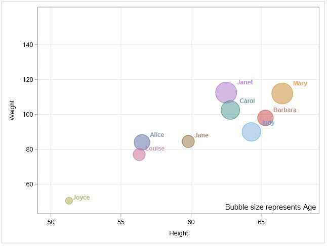
Is there a way to automatically asks SAS to pick the minimum and maximum value for y and x axis as shown below?
This will make the code flexible to handle any different data and zoom the view as the data range keeps changing.
Example
proc sgplot data=sashelp.class(where=(sex='F')) noautolegend;
bubble x=height y=weight size=age / group=name datalabel=name
transparency=0.4 datalabelattrs=(size=9 weight=bold);
inset "Bubble size represents Age" / position=bottomright textattrs=(size=11);
yaxis grid; **** How to take the min and max instead of just giving grid? something like this "yaxis min = min(grid) max = max(grid) offsetmin=0 offsetmax=0.1 display=(nolabel) grid;" *****;
xaxis grid;
run;
Accepted Solutions
- Mark as New
- Bookmark
- Subscribe
- Mute
- RSS Feed
- Permalink
- Report Inappropriate Content
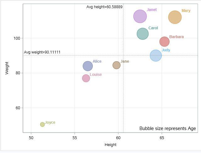
I like @ballardw's idea because I think that is probably more meaningful -- fitting a line to a model and providing a simple visual to show the distance of each point to that line.
However, if you just want true averages, a variation of what I shared earlier:
proc sql noprint;
 select avg(weight) into: avgW from sashelp.class(where=(sex='F')) ;
 select avg(height) into: avgH from sashelp.class(where=(sex='F')) ;
quit;

proc sgplot data=sashelp.class(where=(sex='F')) noautolegend;
   bubble x=height y=weight size=age / group=name datalabel=name
   transparency=0.4 datalabelattrs=(size=9 weight=bold);

   refline &avgW. / axis=y label="Avg weight=&avgW."
        labelloc=inside
        lineattrs=(pattern=dot thickness=2)
        labelpos=min;

   refline &avgH. / axis=x label="Avg height=&avgH."
        labelloc=inside
        lineattrs=(pattern=dot thickness=2)
        labelpos=max;

   inset "Bubble size represents Age" / position=bottomright textattrs=(size=11);
   yaxis grid ;
   xaxis grid;
run;

- Mark as New
- Bookmark
- Subscribe
- Mute
- RSS Feed
- Permalink
- Report Inappropriate Content
What values would min(grid) and max(grid) be?
- Mark as New
- Bookmark
- Subscribe
- Mute
- RSS Feed
- Permalink
- Report Inappropriate Content
xaxis min= min(height) max= max(height) offsetmin=0 offsetmax=0.1 display=(nolabel) grid;
It should pick the min and max values from x and y axis.
- Mark as New
- Bookmark
- Subscribe
- Mute
- RSS Feed
- Permalink
- Report Inappropriate Content
- Mark as New
- Bookmark
- Subscribe
- Mute
- RSS Feed
- Permalink
- Report Inappropriate Content
If you want to scale the axis for the full data set, while filtering what you plot (as in your example with sex='F'), you can store the min/max in macro variables and use as the MIN/MAX= values. Is that what you're after?
proc sql noprint;
 select min(weight) into: min from sashelp.class;
 select max(weight) into: max from sashelp.class;
quit;

proc sgplot data=sashelp.class(where=(sex='F')) noautolegend;
bubble x=height y=weight size=age / group=name datalabel=name
transparency=0.4 datalabelattrs=(size=9 weight=bold);
inset "Bubble size represents Age" / position=bottomright textattrs=(size=11);
yaxis grid min=&min. max=&max.;
xaxis grid;
run;- Mark as New
- Bookmark
- Subscribe
- Mute
- RSS Feed
- Permalink
- Report Inappropriate Content
This will be helpful.
Can we also plot a line chart for average weight and height in the same visual?
In that way we can say who is above and below the average.
Thanks,
+Sathyan
- Mark as New
- Bookmark
- Subscribe
- Mute
- RSS Feed
- Permalink
- Report Inappropriate Content
@skallamp1 wrote:
This will be helpful.
Can we also plot a line chart for average weight and height in the same visual?
In that way we can say who is above and below the average.
Thanks,
+Sathyan
Try adding a reg plot:
proc sgplot data=sashelp.class(where=(sex='F')) noautolegend;
   bubble x=height y=weight size=age / group=name datalabel=name
   transparency=0.4 datalabelattrs=(size=9 weight=bold);

   reg x=height y=weight;

   inset "Bubble size represents Age" / position=bottomright textattrs=(size=11);
   yaxis grid ;
   xaxis grid;
run;
Default is a linear regression which would be , given the data , the mean Y for X. Though how good the fit may be...
Which is why the Reg plot may include confidence limits for either the mean or the individual values.
- Mark as New
- Bookmark
- Subscribe
- Mute
- RSS Feed
- Permalink
- Report Inappropriate Content
I like @ballardw's idea because I think that is probably more meaningful -- fitting a line to a model and providing a simple visual to show the distance of each point to that line.
However, if you just want true averages, a variation of what I shared earlier:
proc sql noprint;
 select avg(weight) into: avgW from sashelp.class(where=(sex='F')) ;
 select avg(height) into: avgH from sashelp.class(where=(sex='F')) ;
quit;

proc sgplot data=sashelp.class(where=(sex='F')) noautolegend;
   bubble x=height y=weight size=age / group=name datalabel=name
   transparency=0.4 datalabelattrs=(size=9 weight=bold);

   refline &avgW. / axis=y label="Avg weight=&avgW."
        labelloc=inside
        lineattrs=(pattern=dot thickness=2)
        labelpos=min;

   refline &avgH. / axis=x label="Avg height=&avgH."
        labelloc=inside
        lineattrs=(pattern=dot thickness=2)
        labelpos=max;

   inset "Bubble size represents Age" / position=bottomright textattrs=(size=11);
   yaxis grid ;
   xaxis grid;
run;

Catch up on SAS Innovate 2026
Dive into keynotes, announcements and breakthroughs on demand.
Explore Now →Learn the difference between classical and Bayesian statistical approaches and see a few PROC examples to perform Bayesian analysis in this video.
Find more tutorials on the SAS Users YouTube channel.
SAS Training: Just a Click Away
Ready to level-up your skills? Choose your own adventure.


