- Home
- /
- Programming
- /
- Graphics
- /
- Re: Plot time-vary drug exposure
- RSS Feed
- Mark Topic as New
- Mark Topic as Read
- Float this Topic for Current User
- Bookmark
- Subscribe
- Mute
- Printer Friendly Page

- Mark as New
- Bookmark
- Subscribe
- Mute
- RSS Feed
- Permalink
- Report Inappropriate Content
Because both the dose and duration of drug vary between subjects and within subjects over time
I use the time-depedent Cox regression to analyze it
However, how do I explain the consistence of drug use, that a user always a user or sometimes discontinue
I consider use of figure to explain how the dose and duration vary within individual, like the figure show as below

For example of my data and full data in the attached file. How do the sas plot the figure? Thanks you very much
| ID | Prescribe data | Dispense duration | dose | date sequence | Header 6 |
|---|---|---|---|---|---|
| 1 | 2000.1.1. | 7 | 10 | 1 | |
1 | 2000.1.15 | 27 | 15 | 14 | |
| 1 | 2000.2.12 | 14 | 20 | 42 | |
| 1 | 2000.2.27 | 28 | 15 | 57 | |
| 1 | 2000.4.1 | 28 | 15 | 85 |
Accepted Solutions

- Mark as New
- Bookmark
- Subscribe
- Mute
- RSS Feed
- Permalink
- Report Inappropriate Content
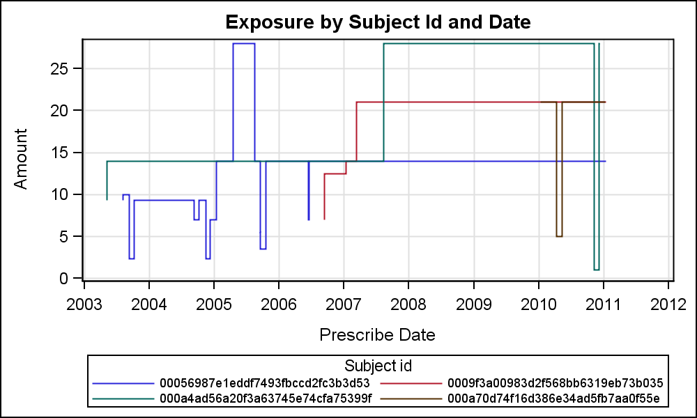
ods graphics / reset attrpriority=color width=5in height=3in imagename='ExposurePlot';
title "Exposure by Subject Id and Date";
proc sgplot data=exposure2;
label id='Subject id';
label prescribe_date='Prescribe Date';
label total_amt='Amount';
step x=prescribe_date y=total_amt / group=id justify=right;
keylegend / across=2 valueattrs=(size=7);
yaxis grid;
xaxis grid;
run;
- Mark as New
- Bookmark
- Subscribe
- Mute
- RSS Feed
- Permalink
- Report Inappropriate Content
I am guessing on what you are asking. Here is one solution using SAS 9.4 SGPANEL Procedure using your data. I removed duplicates. Code is shown below.
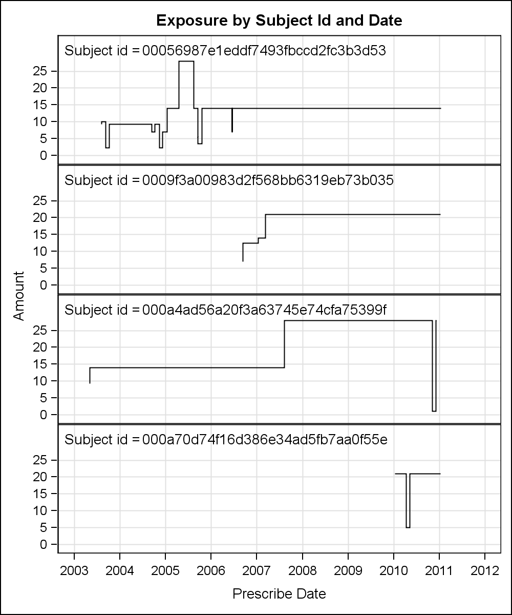
data exposure;
set zino.exposure;
format prescribe_date date9.;
run;
proc sort data=Exposure out=Exposure2 nodupkey;
by id prescribe_date;
run;
ods graphics / reset width=5in height=6in imagename='Exposure';
title "Exposure by Subject Id and Date";
proc sgpanel data=exposure2;
label id='Subject id = ';
label prescribe_date='Prescribe Date';
label total_amt='Amount';
panelby id / layout=rowlattice rows=4 columns=1 onepanel noheader;
step x=prescribe_date y=total_amt / justify=right;
inset id / position=topleft textattrs=(size=10);
rowaxis offsetmax=0.2 grid;
colaxis grid;
run;
- Mark as New
- Bookmark
- Subscribe
- Mute
- RSS Feed
- Permalink
- Report Inappropriate Content
Thank you very much, It is what I want. ![]()
Is it possible to put all individuals figure in one figure? :smileyconfused:
- Mark as New
- Bookmark
- Subscribe
- Mute
- RSS Feed
- Permalink
- Report Inappropriate Content
ods graphics / reset attrpriority=color width=5in height=3in imagename='ExposurePlot';
title "Exposure by Subject Id and Date";
proc sgplot data=exposure2;
label id='Subject id';
label prescribe_date='Prescribe Date';
label total_amt='Amount';
step x=prescribe_date y=total_amt / group=id justify=right;
keylegend / across=2 valueattrs=(size=7);
yaxis grid;
xaxis grid;
run;
SAS Innovate 2025: Call for Content
Are you ready for the spotlight? We're accepting content ideas for SAS Innovate 2025 to be held May 6-9 in Orlando, FL. The call is open until September 25. Read more here about why you should contribute and what is in it for you!
Learn how use the CAT functions in SAS to join values from multiple variables into a single value.

Find more tutorials on the SAS Users YouTube channel.
 Click image to register for webinar
Classroom Training Available!
Select SAS Training centers are offering in-person courses. View upcoming courses for:
-
3 replies
-
06-14-2015 12:53 AM
-
1972 views
-
3 likes
-
2 in conversation
-
