- Home
- /
- Programming
- /
- Graphics
- /
- Re: PROC SGPLOT Attrid and Format label Interactions
- RSS Feed
- Mark Topic as New
- Mark Topic as Read
- Float this Topic for Current User
- Bookmark
- Subscribe
- Mute
- Printer Friendly Page
- Mark as New
- Bookmark
- Subscribe
- Mute
- RSS Feed
- Permalink
- Report Inappropriate Content
I am trying to use the SGPLOT procedure to create a stacked horizontal bar chart with four categories and apply a color scheme using the attrid statement.
In order to get the four categories in the proper order (rather than alphabetical), each category was assigned a numeric variable (1-4) and a format statement is used to convert the numeric variable back into the category label.
The issue is that I can either get the format to work but the attrid statement won't work to assign the appropriate colors or the attrid statement works to assign the colors and I am left with (1,2,3,4) in my legend.
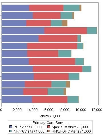
The first statement produces an output with the appropriate values for label but not the colors specified by the evh type
proc sgplot data=combined5 dattrmap=formatdw.evhstyle;
format value valfmt.;
hbar &sumvar. / response=pcs1 stat=sum
group=value groupdisplay=stack nooutline attrid=evh;
title "Primary Care Services by Type";
run;
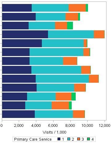
The second statement produces a graph with the appropriate colors but leaves (1,2,3,4) in the legend as the values used to order the stacked bars
proc sgplot data=combined5 dattrmap=formatdw.evhstyle;
hbar &sumvar. / response=pcs1 stat=sum
group=value groupdisplay=stack nooutline attrid=evh;
title "Primary Care Services by Type";
run;
Ideally, I'd like the bars stacked in the proper order, with the color scheme applied and the service types labeled in the legend. Thanks in advance for any help.
Accepted Solutions
- Mark as New
- Bookmark
- Subscribe
- Mute
- RSS Feed
- Permalink
- Report Inappropriate Content
Use the formatted group values in your dattrmap dataset, sort your data by your numeric variable, and use grouporder=data in the hbar statement.
- Mark as New
- Bookmark
- Subscribe
- Mute
- RSS Feed
- Permalink
- Report Inappropriate Content
I don't know the answer, and there is not enough code here for me to easily reconstruct what you are doing. However, I can say that one of the standard legend tricks is to make an invisible plot that has the legend you want and overlay it with a visible plot that makes the graph that you want (and don't show the legend for it).
Also, in either the latest release or the second latest, there is a legenditem statement that is very cool and lets you control precisely what is in the legend. If no one posts better ideas, you might try those.
- Mark as New
- Bookmark
- Subscribe
- Mute
- RSS Feed
- Permalink
- Report Inappropriate Content
- Mark as New
- Bookmark
- Subscribe
- Mute
- RSS Feed
- Permalink
- Report Inappropriate Content
Use the formatted group values in your dattrmap dataset, sort your data by your numeric variable, and use grouporder=data in the hbar statement.
SAS Innovate 2025: Call for Content
Are you ready for the spotlight? We're accepting content ideas for SAS Innovate 2025 to be held May 6-9 in Orlando, FL. The call is open until September 25. Read more here about why you should contribute and what is in it for you!
Learn how use the CAT functions in SAS to join values from multiple variables into a single value.
Find more tutorials on the SAS Users YouTube channel.
 Click image to register for webinar
Classroom Training Available!
Select SAS Training centers are offering in-person courses. View upcoming courses for:


