- Home
- /
- Programming
- /
- Graphics
- /
- Re: How to add one second vaxis using sas?
- RSS Feed
- Mark Topic as New
- Mark Topic as Read
- Float this Topic for Current User
- Bookmark
- Subscribe
- Mute
- Printer Friendly Page
- Mark as New
- Bookmark
- Subscribe
- Mute
- RSS Feed
- Permalink
- Report Inappropriate Content
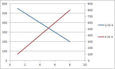
For example, I have one dataset as below. Because y and z have different dimensions, I have to use two vertical axis to represent y*x and z*x plots respectively. It is easy to do in excel (please see the attached figure), but how to do it using sas? Thanks!
data mydata;
input x y z;
datalines;
1 550 100
2 500 200
3 450 300
4 400 400
5 350 500
6 300 600
7 250 700
8 200 800
;
run;
symbol1 v=none INTERPOL=join c=blue width=5;
symbol2 v=none INTERPOL=join c=red width=5;
proc gplot data=mydata;
plot y*x
z*x/overlay;
run;
quit;

- Mark as New
- Bookmark
- Subscribe
- Mute
- RSS Feed
- Permalink
- Report Inappropriate Content
Change the proc to say:
proc gplot data=mydata;
plot y*x;
plot2 z*x;
run;
quit;
SAS Innovate 2025: Call for Content
Are you ready for the spotlight? We're accepting content ideas for SAS Innovate 2025 to be held May 6-9 in Orlando, FL. The call is open until September 25. Read more here about why you should contribute and what is in it for you!
Learn how use the CAT functions in SAS to join values from multiple variables into a single value.
Find more tutorials on the SAS Users YouTube channel.
 Click image to register for webinar
Classroom Training Available!
Select SAS Training centers are offering in-person courses. View upcoming courses for:


