- Home
- /
- Programming
- /
- Graphics
- /
- Re: Error with Proc Gsilde using Annotate Facility
- RSS Feed
- Mark Topic as New
- Mark Topic as Read
- Float this Topic for Current User
- Bookmark
- Subscribe
- Mute
- Printer Friendly Page

- Mark as New
- Bookmark
- Subscribe
- Mute
- RSS Feed
- Permalink
- Report Inappropriate Content
Hi everyone,
I am having error in using annotate facility with proc gsilde. Please help.
Thanks,
Amit
data:
| function | color | style | rotate | xsys | ysys | hsys | when | size | x | y |
| pie | green | psolid | 360 | 2 | 2 | 3 | a | 0.7 | 0.298793402 | -0.071374623 |
| pie | green | psolid | 360 | 2 | 2 | 3 | a | 0.7 | 0.972524828 | -0.878230289 |
| pie | green | psolid | 360 | 2 | 2 | 3 | a | 0.7 | 1.530872005 | -0.917012611 |
| pie | green | psolid | 360 | 2 | 2 | 3 | a | 0.7 | 0.298711887 | -0.073254838 |
| pie | green | psolid | 360 | 2 | 2 | 3 | a | 0.7 | 0.299087504 | -0.069009284 |
Error:
proc gslide annotate=testa;
20 run;
NOTE: ERROR DETECTED IN ANNOTATE= DATASET WORK.TESTA.
NOTE: PROBLEM IN OBSERVATION 2 -
DATA SYSTEM REQUESTED, BUT VALUE IS NOT ON GRAPH 'Y'
NOTE: PROBLEM IN OBSERVATION 3 -
DATA SYSTEM REQUESTED, BUT VALUE IS NOT ON GRAPH 'Y'
quit;
NOTE: There were 5 observations read from the data set WORK.TESTA.
NOTE: PROCEDURE GSLIDE used (Total process time):
real time 0.09 seconds
cpu time 0.10 seconds

- Mark as New
- Bookmark
- Subscribe
- Mute
- RSS Feed
- Permalink
- Report Inappropriate Content
I usually use xsys='3' ysys='3', and x/y coordinates in the range 0-100 with gslides.
I've used xsys='2' ysys='2' (data coordinate system) with gplot and gmap (which have 'data'), but never tried using it with gslide. How did you come up with your x/y coordinates, and what is the "data coordinate system" for a gslide?
- Mark as New
- Bookmark
- Subscribe
- Mute
- RSS Feed
- Permalink
- Report Inappropriate Content
Hi Robert ,
I am a big fan of your work. looking forward to using your book.
I am trying to visualize network data. THe x and y cordinates come from proc MDS. I am using code from paper " Visualizing Healthcare Provider Network using SAS tools" by John Zheng presented at PharmaSUG2011. He provides sample code for the annotate facility to visualize network of healthcare providers.
I dont know what you mean by "data cordinate system" for a gslide.
I appreciate all your help.
Regards,
Amit

- Mark as New
- Bookmark
- Subscribe
- Mute
- RSS Feed
- Permalink
- Report Inappropriate Content
hi ... re "coordinate systems" ... take a look at ...
and scroll down to coordinates (the attached illustration is from that page)
ps by all means, by Robert's book ...
Amazon.com: SAS/GRAPH: Beyond the Basics (9781607649892): Robert Allison Ph.D.: Books

- Mark as New
- Bookmark
- Subscribe
- Mute
- RSS Feed
- Permalink
- Report Inappropriate Content
Hi Mike/Rob,
Since I am using real data , the data cordinate system would be Absolute (2). Xsys and ysys also would be 2. Thats what the paper also does.
Thanks for your help.
Regards,
Amit
- Mark as New
- Bookmark
- Subscribe
- Mute
- RSS Feed
- Permalink
- Report Inappropriate Content
I think it would be easiest for you to use 'proc gplot' rather than 'proc gslide' (at least, to start with), using your annotate data set as both the data= and the annotate=, and using a symbol statement to make your gplot markers small (or invisible). And you can use your xsys and ysys='2' like this.
Something like ...
symbol1 value=point interpol=none color=gray;
proc gplot data=testa annotate=testa;
plot y*x=1;
run;
- Mark as New
- Bookmark
- Subscribe
- Mute
- RSS Feed
- Permalink
- Report Inappropriate Content
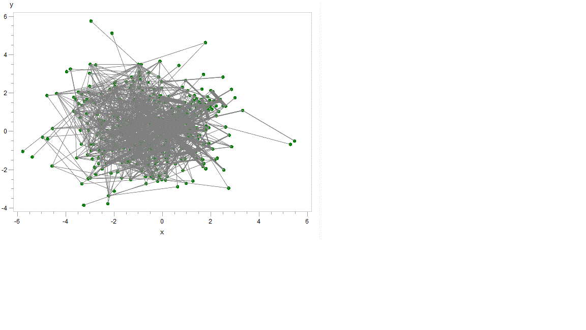
Hi Rob,
Thanks for the work around. It definitely helps.
I dont need the axis and also is there a way to expand the size of the plot area to space things out. I know i have too many points.
Thanks for your help.
Regards,
Amit
Results:
- Mark as New
- Bookmark
- Subscribe
- Mute
- RSS Feed
- Permalink
- Report Inappropriate Content
You can suppress the axes using something like this...
axis1 label=none major=none minor=none value=none style=0;
proc gplot data=testa annotate=testa;
plot y*x=1 / vaxis=axis1 haxis=axis1;
run;
You might need to make the entire plot larger, so that you can see more detail. Depending on how you're generating your output, you could use something like:
goptions xpixels=1000 ypixels=1000;
- Mark as New
- Bookmark
- Subscribe
- Mute
- RSS Feed
- Permalink
- Report Inappropriate Content
Thanks for your help.

Available on demand!
Missed SAS Innovate Las Vegas? Watch all the action for free! View the keynotes, general sessions and 22 breakouts on demand.
Learn how use the CAT functions in SAS to join values from multiple variables into a single value.

Find more tutorials on the SAS Users YouTube channel.
 Click image to register for webinar
Classroom Training Available!
Select SAS Training centers are offering in-person courses. View upcoming courses for:
-
8 replies
-
05-31-2012 10:51 AM
-
1526 views
-
3 likes
-
3 in conversation
-
