- Home
- /
- Analytics
- /
- Forecasting
- /
- Re: Time Series forecast plot
- RSS Feed
- Mark Topic as New
- Mark Topic as Read
- Float this Topic for Current User
- Bookmark
- Subscribe
- Mute
- Printer Friendly Page
- Mark as New
- Bookmark
- Subscribe
- Mute
- RSS Feed
- Permalink
- Report Inappropriate Content
Hello,
I have data made from two variables: adm_date and total_nr (example below):
adm_date total_nr
1 200
2 265
3 245
...
69 340
70 356
I want to do two things:
1. I want to use first 59 observations and forecast the rest.
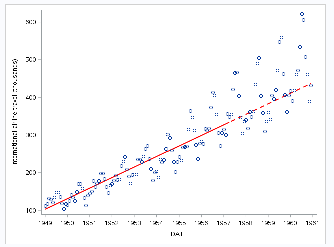
2. I want to plot regression line and real data in same graph, similar to example below (I do not need that grey block):

- Mark as New
- Bookmark
- Subscribe
- Mute
- RSS Feed
- Permalink
- Report Inappropriate Content
%let n=100;
data have;
 set sashelp.air;
 retain group 1;
 if _n_ gt &n then do;group=2;air=.;end;
run;

proc reg data=have outest=est(keep=date rename=(date=slope)) noprint;
model air=date;
output out=pred predicted=pred;
quit;


data want;
 merge sashelp.air pred(keep=date pred group rename=(date=_date));
run;

ods graphics / attrpriority=none;
proc sgplot data=want noautolegend;
styleattrs datalinepatterns=(solid dash);
series x=_date y=pred/group=group lineattrs=(color=red thickness=2);
scatter x=date y=air;
run;- Mark as New
- Bookmark
- Subscribe
- Mute
- RSS Feed
- Permalink
- Report Inappropriate Content
Thanks!
And maybe you know how i could add another regression line only for the time period I forecasted, but this time to use the real data points?
- Mark as New
- Bookmark
- Subscribe
- Mute
- RSS Feed
- Permalink
- Report Inappropriate Content
- Mark as New
- Bookmark
- Subscribe
- Mute
- RSS Feed
- Permalink
- Report Inappropriate Content
There are many was to do this (one already shown). This is yet another (see the back= and lead= options in the ESTIMATE and FORECAST statements):
proc ucm data=sashelp.air;
id date interval=month; *optional;
model air;
irregular;
level variance=0 noest;
slope variance=0 noest;
estimate back=20; *sasy;
forecast back=20 lead=20 plot=(decomp) outfor=for;
run;
This will produce a plot that is based on first 124 observations (out of 144). The plot has confidence bands around them. If you don't want them, you can use sgplot with the columns in the output data set, for, (s_level has the values of the fitted line). See the UCM doc for more info: http://support.sas.com/documentation/cdl/en/etsug/68148/HTML/default/viewer.htm#etsug_ucm_toc.htm
- Mark as New
- Bookmark
- Subscribe
- Mute
- RSS Feed
- Permalink
- Report Inappropriate Content
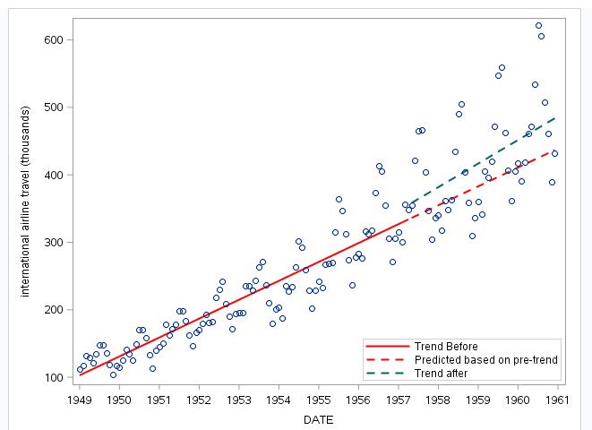
I am sorry if i am not clear, I would like to get a graph similar to (I want to see grapphically if there is any change due to policy implementation at specific time):

- Mark as New
- Bookmark
- Subscribe
- Mute
- RSS Feed
- Permalink
- Report Inappropriate Content
%let n=100;
data have;
 set sashelp.air;
 retain group 1;
 if _n_ gt &n then do;group=2;air=.;end;
run;
data have2;
 set sashelp.air;
 if _n_ gt &n ;
run;

proc reg data=have noprint;
model air=date;
output out=pred predicted=pred;
quit;
proc reg data=have2 noprint;
model air=date;
output out=pred2 predicted=pred;
quit;


data want;
 merge sashelp.air pred(keep=date pred group rename=(date=_date))
       pred2(keep=date pred rename=(date=_date2 pred=pred2));
run;

ods graphics / attrpriority=none;
proc sgplot data=want noautolegend;
styleattrs datalinepatterns=(solid dash);
series x=_date y=pred/group=group lineattrs=(color=red thickness=2);
series x=_date2 y=pred2/lineattrs=graphdata3(thickness=2 pattern=dash);
scatter x=date y=air;
run;- Mark as New
- Bookmark
- Subscribe
- Mute
- RSS Feed
- Permalink
- Report Inappropriate Content
Thanks!
What is the best way in this case to put legend in graph?
- Mark as New
- Bookmark
- Subscribe
- Mute
- RSS Feed
- Permalink
- Report Inappropriate Content
%let n=100;
data have;
 set sashelp.air;
 retain group 'Trend Before                            ';
 if _n_ gt &n then do;group='Predicted based on pre-trend';air=.;end;
run;
data have2;
 set sashelp.air;
 if _n_ gt &n ;
run;

proc reg data=have noprint;
model air=date;
output out=pred predicted=pred;
quit;
proc reg data=have2 noprint;
model air=date;
output out=pred2 predicted=pred;
quit;


data want;
 merge sashelp.air pred(keep=date pred group rename=(date=_date))
       pred2(keep=date pred rename=(date=_date2 pred=pred2));
run;

ods graphics / attrpriority=none;
proc sgplot data=want ;
styleattrs datalinepatterns=(solid dash);
series x=_date y=pred/group=group lineattrs=(color=red thickness=2)
 name='a' legendlabel=' ';
series x=_date2 y=pred2/lineattrs=graphdata3(thickness=2 pattern=dash)
name='b' legendlabel='Trend after';
scatter x=date y=air;
keylegend 'a' 'b'/ location=inside position=bottomright across=1;
run;- Ask the Expert: The AI Advantage: How SAS Customer Intelligence 360 Solves Real Marketing Challenges | 27-Jan-2026
- DCSUG presents SAS OnDemand for Academics: the Easy Way to Learn SAS For Free for Students, Educator | 27-Jan-2026
- Ask the Expert: How to Supercharge Enterprise Agentic Workflows With SAS Retrieval Agent Manager | 05-Feb-2026
- Ask the Expert - Génération de données synthétiques : innovation et confidentialité | 10-Feb-2026
- Ask the Expert: Implementing a Digital Twin for the Monopoly Board Game Using SAS® Viya® | 12-Feb-2026
- SAS CI360 Tips and Tricks: Quick Wins, Shortcuts and Hidden Features Every Marketer Should Know | 17-Feb-2026
- SAS Bowl LIX, Integrating SAS and Git | 18-Feb-2026


