This year's Juletip is all about SAS Visual Analytics, and I have some tips and tricks that I hope that you’ll love! 💚
Since Christmas is just around the corner, I thought why not dive into the holiday spirit?
So, I discovered some fascinating facts about Christmas in Norway, which I used in this Juletip!
And, I must say that I’m pretty pleased with how the result turned out:

Looking at the results, it was a surprise to see that Norway imports way more Christmas trees than we export! And who knew that we brought in so much Christmas decorations and tree lights? It’s also clear that Norwegians loves attending Christmas concerts at church. However, it’s no surprise that 2020 saw a dip due to COVID and that we’ve been attending a bit less since then. The number of well-behaved children eagerly anticipating Santa has remained pretty steady over the years, just like the import of clementines and mandarins.
But enough about the numbers and figures, let’s dive into a step-by-step guide on how to create this page.
The data comes from Statistics Norway, and here’s a peek at the Excel file that was uploaded to Visual Analytics:
| Facts |
2011 |
2014 |
2017 |
2020 |
2023 |
Mean |
| Imported Christmas trees |
284525 |
304769 |
272841 |
201341 |
165753 |
245846 |
| Exported Christmas trees |
19379 |
4726 |
2477 |
983 |
15 |
5516 |
| Maximum number of kind children in Norway - 0-17 years |
1114374 |
1125161 |
1131051 |
1118608 |
1112191 |
1120277 |
| Attending Christmas concerts at the church |
579213 |
563583 |
559807 |
117864 |
409691 |
446032 |
| Christmas church service |
2248 |
2261 |
2314 |
2282 |
2247 |
2270 |
| Import of clementines and mandarins |
26578 |
29138 |
31495 |
31981 |
27018 |
29242 |
| Import of Christmas decorations |
144177749 |
216755949 |
247105283 |
277178774 |
324854371 |
242014425 |
| Import of Christmas tree lighting |
25476858 |
67821657 |
60740687 |
60557219 |
79904913 |
58900267 |
1. The page set-up
The first step was to design the page layout by adding four Standard containers from the Objects in the left pane on to the canvas. This approach ensures that each object is evenly spaced, resulting in a clean and organized appearance. Additionally, using containers simplifies managing all the objects on the page.
2. The heading
In the first Standard container, an Image from the Objects in the left pane was added and a picture of Santa was uploaded. Next to the Image, a Text object was placed with the heading " Fun Facts About Christmas in Norway". To enhance the design:
- Go to Outline in the left pane and then select the first Standard container. Ensure that the container is highlighted in the canvas.
- In the right pane, open the Options and set Background style to green for this container.
- Double-click the text within the container to increase font size, and change the color to white for better contrast and visual appeal.
3. The key values
In the second Standard container, four Key Value were added from the Objects in the left pane. Next, Data Roles was selected in the right pane to define the variable "Mean" as the Measure. To highlight specific facts, the Filters in the right pane was used to display only the following desired facts:
- Imported Christmas trees
- Exported Christmas trees
- Import of Christmas tree lighting
- Import of Christmas decorations
Next, select the Options in the right pane and do the following for each Key Value:
- Create a new Custom title.
- Uncheck the Measure label box.
- Select the color green as the Measure value.
Each title was also customized by double-clicking to enlarge the font size, changing the color to green, making the text bold and centered. Finally, the second Standard container was selected in Outline at the left pane, and a green color was applied as the Border.
4. The List table with a little twist
In the third Standard container, a List Table was added from Objects, featuring the variable "Facts" and measures for five different years (2011, 2014, 2017, 2020, 2023). To display only the facts used as Key Value above, then Filters was applied in the right pane on the variable "Facts". Then select Options in the right pane:
- Change the Headings color to green, and increase the font size.
- Apply the same green color to the Cells, and increase their font size for better visibility.
An unique touch was added with symbols in the first column of the List Table, sourced from the "Segoe UI Emoji" font. These symbols can be accessed in MS Word by clicking the Insert tab and selecting Symbols from the right side of the toolbar:

In Visual Analytics, symbols from Word can easily be copied directly into a Calculated Item expression. To do this, select New Item in the Data in the left pane, and then Calculated Item. Next, create a new variable called Symbol:

Make sure to enclose the symbols in single quotes (‘’). The next step is to add the new variable Symbol to the List Table in Data Roles in the right pane, giving it a nice finished touch. Finally, the third Standard container was selected in Outline at the left pane, and a green color was applied as the Border.
5. More fun facts
In the last Standard container, three different objects were used to showcase more fun facts about Christmas in Norway:
The Custom Graph
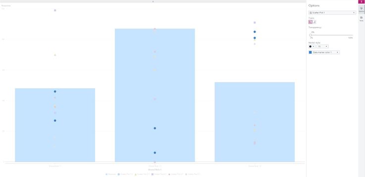
The first Object on the left side is a Custom Graph, which a customer had questions about for a while ago. To create this, use the Build Custom Graphs application and select New Custom Graph:
- Add a Bar Chart onto the canvas.
- Drag five Scatter plots on top of the Bar chart.
- Use the Options menu in the right pane to assign different symbols and colors to each Scatter Plot.
- Remember to save the new graph.
The new Custom Graph should appear as this:

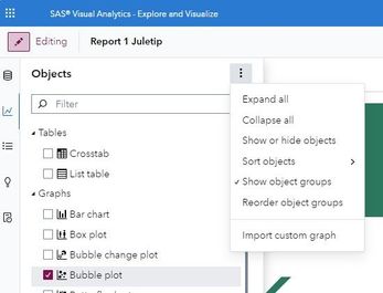
Once the Custom Graph is saved, it can be imported into Visual Analytics by clicking the three dots next to Objects in the left pane:

Then, select Import custom graph and locate the saved graph. Add the new graph from Objects in the left pane to the last Standard container:
- Define the variable "Mean" as the Response in Data Roles at the right pane.
- Select the different years as variables for the Scatter Plots.
- Assign "Facts" as the Shared Role.
- To maintain focus, apply Filters on the variable "Facts" to display only "Attending Christmas concerts at the church".
- In the Options menu on the right, change the Bar Chart color to green and add Segment labels.
The Pie chart
Beside the Custom Graph, add a simple Pie Chart. Define "Year" as the Category variable and "Maximum number of children in Norway (0-17 years)" as the Measure variable beneath Data Roles. In the Options menu on the right, make adjustments such as:
- Select a Custom title, and double-click the title to change the color to green.
- Change the colors on the Pie chart as you desire.
- Select a different Chart style.
- Add the Category Labels and Actual Values.
- Removing the Pie label for a cleaner look.
The Bar Chart
To create the Bar Chart, a transposed version of the Excel file needs to be imported and that results in slightly different variable names. Afterward, a Bar Chart from the Objects menu was placed beside the Pie Chart on the right. Go to Data Roles in the right pane and define "Year" as the Category variable and "Import of clementines and mandarins" as the Measure variable. In the Options menu, some adjustments were made:
- The Bar Chart color was set to green.
- Segment labels were added.
- The Segments labels color was set to white, and their font size was increased for better visibility.
Lastly, select the fourth Standard container in the Outline at the left pane, and apply a green border.
That concludes this year's Juletip!
I hope it provided you with some fresh ideas for visualizations in SAS Visual Analytics.
Wishing you a joyful Christmas with your friends and family! 🎄🎄🎄
Look at the SAS users program for Nordics, the UK and Ireland FANS! Network meetings and Events, Ask the Expert webinars, Nordic Newsletter, and SAS Analytics Explorers.
www.sas.com/fans | #SASFANS #sasnordicusers


