This tip shows how to create the above timeline using SAS text mining and visualization tools.
Text Mining
First, I created a simple flow in SAS® Enterprise Miner to import the source text and identify the predominant themes (topics) of the book. (Note: these nodes require a SAS® Text Miner license.)

Text Import Node
I imported the text from http://cervantes.uah.es/quijote/httoc.htm. In node settings, I set Language=Spanish and Text Size = 32K.
After the text was imported from this site, I excluded the prologues (documents 1 through 15) from my local (imported) source and reran the Text Import node. This was to ensure that themes would only be derived from the chapters of the book.
Text Parsing Node
The Text Parsing node parsed the text into parts of speech (Language = Spanish, Multi-word terms=SASHELP.SPAN.MULTI).
Text Topic Node
I used the Text Topic Node to extract 25 topics then I interpreted the topics based on the terms that they included. For example, topic #7 ("dolorida, malambruno, trifaldi, dueña, clavileño") involves Don Quijote and Sancho’s flight on the “magical” wooden horse Clavileño sent to them by the magical giant Malambruno; topic #17 ("montesinos, primo, cueva, soga, ruidera") has to do with Don Quijote’s descent into the cave of Montesinos.
The Text Topic node exports a dataset that includes relevance scores for each document, or chapter. I saved this dataset for the next step.
Visualization
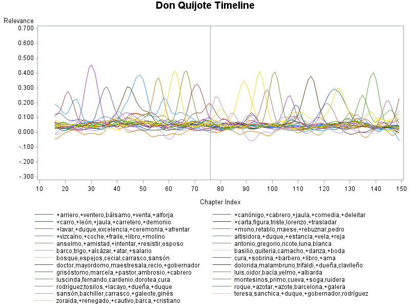
I used the JMP® Graph Builder to explore and visualize the relevance of each topic across chapters.
My first attempt, which plotted all 25 topics, looked interesting. In particular, the smoothers seemed to reveal themes that ebbed and flowed.
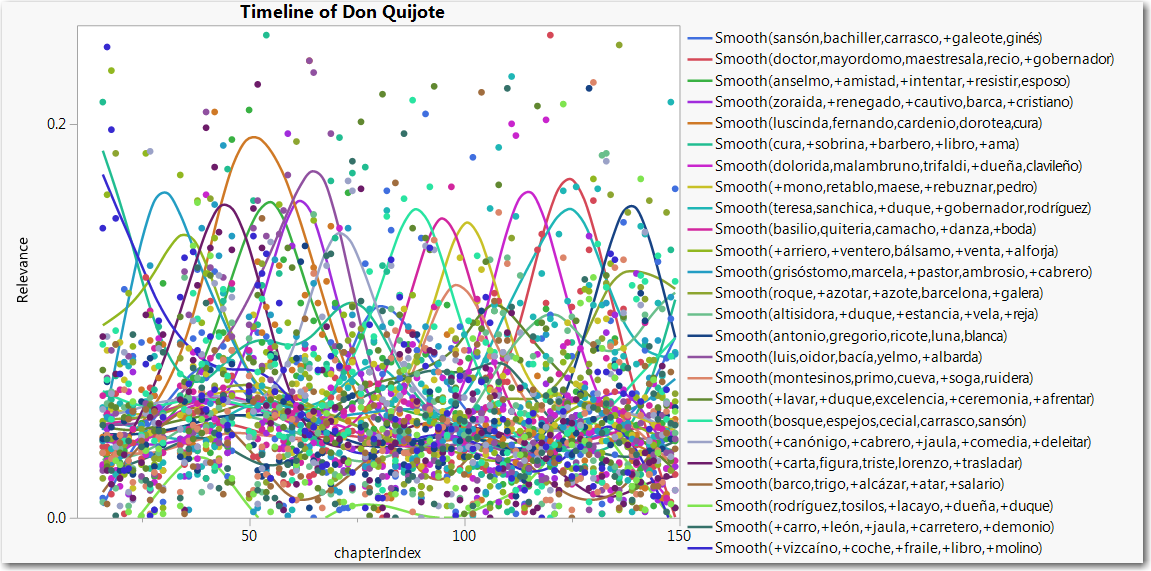
All themes: points and smoothers
But since my first attempt looked very busy, I tried eliminating the data points and displaying only the smoothers. That really decluttered the plot and helped to make the peaks stand out:
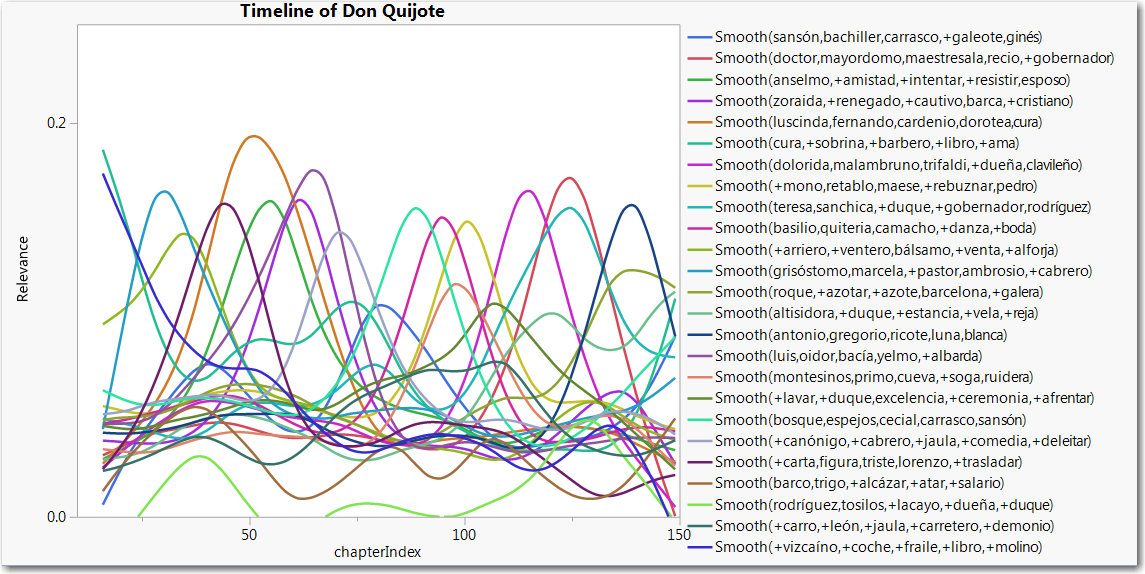
All Themes: smoothers only
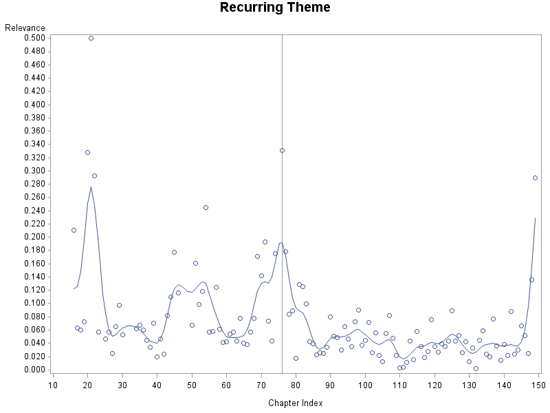
I also explored the topics individually and noticed that different themes have different trajectories. For example, here is an example of a recurring theme, characterized by multiple peaks:
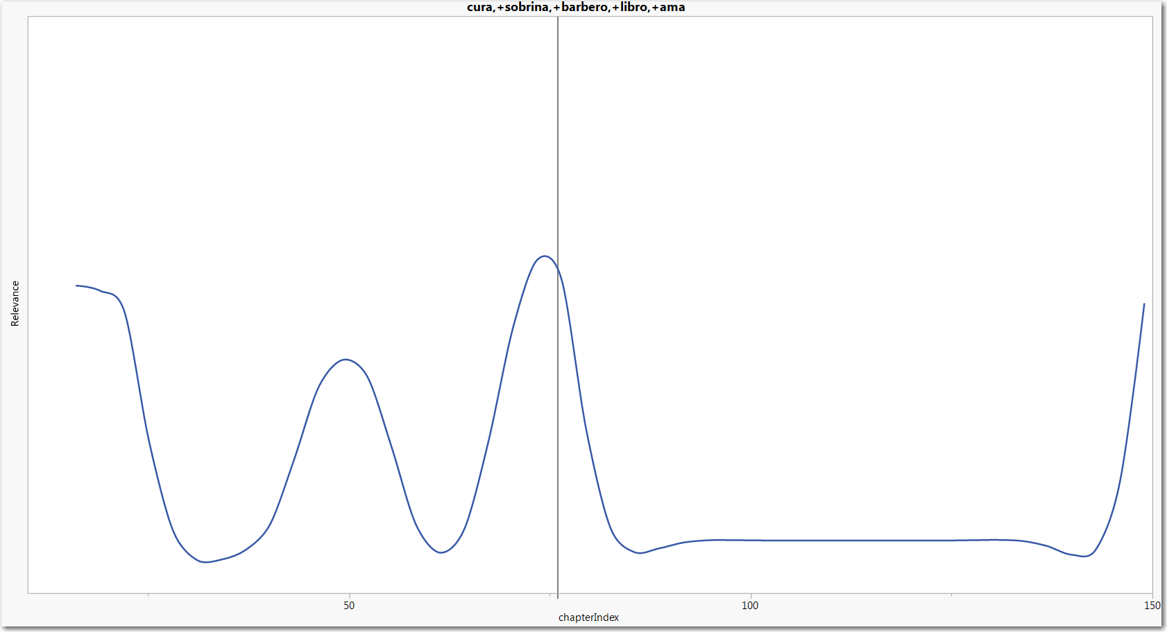
Recurring theme
This topic has to do with Don Quijote’s closest friends and loved ones (the priest, the barber, his niece and his housekeeper), who are key figures in the story when Don Quijote prepares for his adventures and returns home to convalesce. The peak in the middle of the first book reflects the priest and barbers' fetching of Don Quijote from his penance in the Sierra Morena.
By the way, the JMP Graph Builder lets you interactively adjust the smoothing parameter (lambda). In particular, I found that smaller values, which imply less smoothing, tend to reveal some interesting peaks.
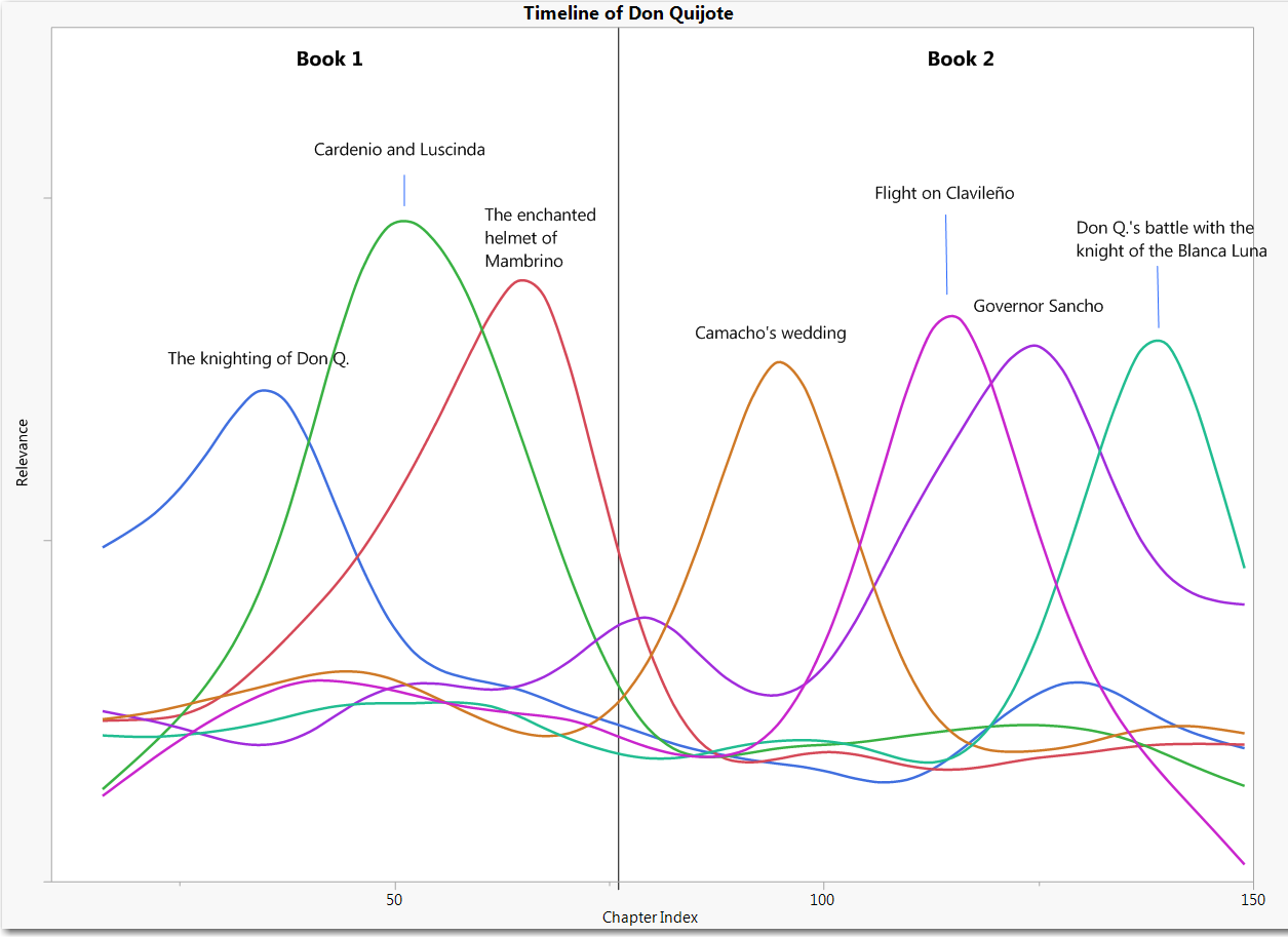
For the final version of the thematic timeline (the one shown at the beginning of this tip) I included seven key themes with well-separated peaks. I also used the drawing tools in JMP to annotate each peak and added a vertical reference line to indicate where the first volume ends and the second begins. My final version is obviously selective, but it still shows the order and scope of key episodes. In the end, it was good enough for my purpose, which was illustrative.
I really like JMP's quick and powerful interactive graphics, but of course there are other ways to plot timelines as smooth curves. Here are some examples using SAS Base (Proc GPlot):
All Themes: smoothers only
Conclusion
I've shown how to create a thematic timeline from a collection of time-ordered documents. I have used the term “timeline” loosely, because this analysis was based on chapter order, not on actual chronological time.
While visualizing the themes was easy and pretty fun, thematic timelines have real-world business applications. Timelines based on customer surveys or blog posts can help identify trends in customer sentiment and reveal evolving product usage patterns. They can also illustrate the evolution of research interests over time. See SAS® Since 1976: An Application of Text Mining to Reveal Trends.

