- Home
- /
- SAS Communities Library
- /
- SAS VA: Use Custom Categories to create user-defined categories for da...
- RSS Feed
- Mark as New
- Mark as Read
- Bookmark
- Subscribe
- Printer Friendly Page
- Report Inappropriate Content
SAS VA: Use Custom Categories to create user-defined categories for dates, measures, or categories
- Article History
- RSS Feed
- Mark as New
- Mark as Read
- Bookmark
- Subscribe
- Printer Friendly Page
- Report Inappropriate Content
A Custom Category is exactly as the name implies, it’s a category you can create based off an existing data item, in other words, it is an existing category that you can customize. Per SAS Documentation: "You can create a custom category based on either a category or measure data item. A custom category data item is always a category data item with an alphanumeric value. When you create a custom category from a measure, you can use intervals or specific values to group the data."
You can create Custom Categories to define groups of the existing data item, where you are essentially creating your own hierarchy levels. By doing this, it adds the to the possibilities and richness of your report objects. Custom Categories can also be used to assist in mapping data between different data sources for filtering, linked selection, and report linking.
Custom Category for Date
Here is an example of creating a Custom Category for a date data item. You can use the + New data item menu from the Data pane and select Custom category. Or you can right-click on the date data item and select New custom category...
Select any image to see a larger version.
Mobile users: To view the images, select the "Full" version at the bottom of the page.
If you are using the + New data item menu, you will have to select the data item you wish to base the Custom Category off of. On the other hand, if you right-clicked on the date data item, this selection will automatically be made for you.
Here are the steps to create your new Custom Category:
- Next, use the + to add new Value Groups and label them. These will be the values of your new Custom Category.
- Drag the raw data values into the Value Groups you created.
- Be sure to scroll down to the bottom of the window and configure how to handle the remaining values.
Here is an example report of looking at both the original values of the date data item and the newly created Custom Category. Once you’ve created the Custom Category is behaves like any other categorical data item in the VA report. Here you can see in the Crosstab object, I created a hierarchy and used the new Facilities Opened Custom Category as the first level. I’ve also included just one of the many visual objects, a Bar chart in this example, that uses the new Custom Category to enhance the understanding of how many Distinct Facilities have been opened in each decade.
Custom Category for Measure
The above example shows how to create a Custom Category using distinct values. In this measure data item example, I will show how to use intervals. I will be using the Order Sales Cost data item which has an aggregation of average.
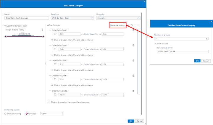
If you are using a SAS VA version of LTS 2021.2 or later, then you will be prompted with a new automatic Generate Groups window. This feature allows you to generate the groups automatically or select 5, 10, or 15 different Value Groups. You can also specify a prefix for each Value Group. If you have an older version of SAS VA, then you will be directly linked to the New Custom Category window and you will have to manually specify the intervals for each Value Group.
In this example, I right-clicked on Order Sales Cost and selected for 5 Value Groups with a prefix of “Order Sales Cost”.
Here we can see those automatically generated Value Groups. One thing to note, is that the automatic value groups are equally divided given the range of values.
If for instance, you want to pick a different number of Value Groups than presented in the first window, you can use the Generate groups link and manually enter in the number of Value Groups you like. In this example, I want to change it from 5 to 3 Value Groups.
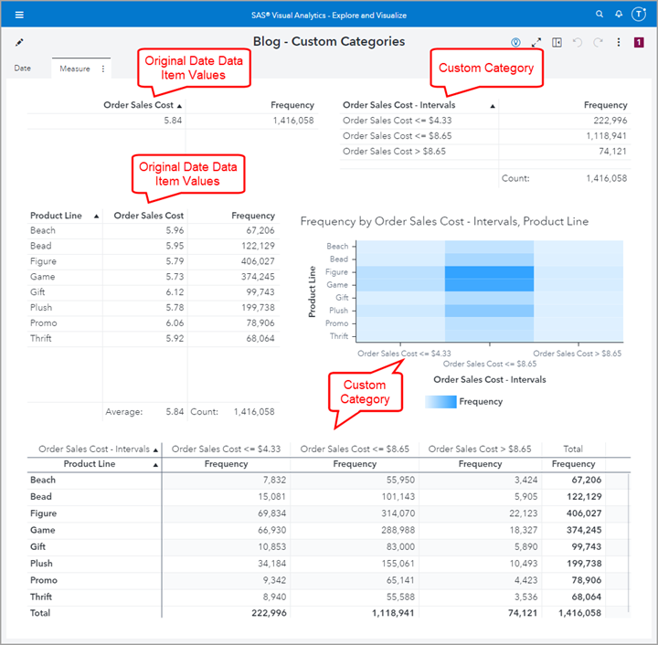
We can see here in the left screenshot, that there are 3 generated Value Groups. I want to make use of the Remaining Values condition so I simply took the low range of the third interval and used that in my Remain Values label and deleted the third Value Group.
Here are some examples of how the Custom Category can be used. Notice the List Table, Heatmap, and Crosstab objects and how these custom category values can add additional insights to the report.
Custom Category for Categories and Map Data
In this example, I will show you how to use Custom Categories for mapping data between two data sources. I also used this example in my article SAS VA: Automatic Actions Part 1 – Easy exploration for multiple data sources.
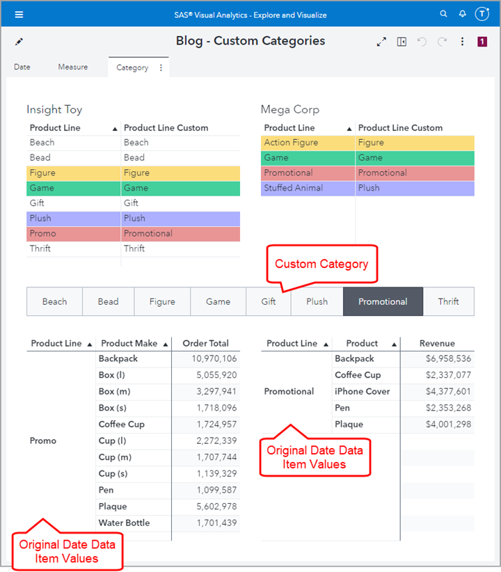
I will use the Product Line data item from the Insight Toy and Mega Corp data sources. As you can see here from the Data pane screenshot, the cardinality of Product Line is not the same. Not only are the number of distinct values different for Product Line, but the intersection of data values are also slightly different. This is why we will create a Custom Category named Product Line Custom to create data values that match so that we can Map Data between these two data sources.
Here are the Product Line Custom data values for each data source. You can see from the Display Rule I added there are four overlapping data values that I will use to Map Data.
To Map Data, from the Data pane, use the data menu and select Map data….
Next you will need to check the box to Enable data mapping between these two data sources. Then use the drop-down to select Product Line Custom for each data source.
Now we can add a Button Bar Control Object and add Actions to filter the bottom two Crosstab Objects. I decided to use the Insight Toy’s Custom Category - Product Line Custom since it has the superset of data values. You can also see that for the individual Crosstab objects I decided to use the original data item, that way the actual values in each data source is a true representation of the data source and I only used the Custom Category to Map Data between the data sources.
Summary
There are lots of uses for Custom Categories: creating hierarchy levels, group numerical data, to mapping data between data sources. I cover additional tips and tricks in these other helpful articles:
- SAS VA: Automatic Actions Part 1 – Easy exploration for multiple data sources: Article | YouTube
- SAS Visual Analytics 8.1: Configuring prompts with different source data: Article | YouTube
- Tips for working with multiple data sources in SAS Visual Analytics: Article | YouTube
- SAS Visual Analytics Report Examples using Container Objects: Article | YouTube
Find more articles from SAS Global Enablement and Learning here.
SAS AI and Machine Learning Courses
The rapid growth of AI technologies is driving an AI skills gap and demand for AI talent. Ready to grow your AI literacy? SAS offers free ways to get started for beginners, business leaders, and analytics professionals of all skill levels. Your future self will thank you.
- Find more articles tagged with:
- GEL


