- Home
- /
- SAS Communities Library
- /
- SAS VA: Automatic Actions Part 3 – Find related data fast
- RSS Feed
- Mark as New
- Mark as Read
- Bookmark
- Subscribe
- Printer Friendly Page
- Report Inappropriate Content
SAS VA: Automatic Actions Part 3 – Find related data fast
- Article History
- RSS Feed
- Mark as New
- Mark as Read
- Bookmark
- Subscribe
- Printer Friendly Page
- Report Inappropriate Content
In Part 3 of this series, I cover the Automatic Action: Linked Selection. The Linked Selection Action highlights, or “selects”, the same data simultaneously for all of the objects on the page that support manual linked selections. For the full details see the SAS Documentation: About Automatic Linked Selection Page Actions.
For the entire series see the below articles:
- SAS VA: Automatic Actions Part 1 – Easy exploration for multiple data sources
- SAS VA: Automatic Actions Part 2 – Dive into multidimensional or hierarchical data easily
- SAS VA: Automatic Actions Part 3 – Find related data fast (this article!)
The key to using Linked Selection is using related data and data items, but not the exact same Role assignments. Let SAS Visual Analytics do all the work to simultaneously highlight the selected data points. It’s important for report viewers to understand that the selected/highlighted data may represent the entire value or part of the value of the selected row, cell, data point, bubble, tile, etc.
Here are some of the key tips I will cover for Linked Selections:
- Automatic Actions are applied at the Page level in the report.
- All objects which support actions will be automatically included in the selected Automatic Action.
- Map Data for different data sources. Include all of the columns you want to be linked.
- Create Custom Categories to assist with Mapping Data for different data sources.
- Hold the Ctrl key to select multiple values.
- Use color meaningfully. Since objects are not filtered but values are selected/highlighted it is important to coordinate colors for data values with purpose.
Enable Automatic Actions: Linked Selection
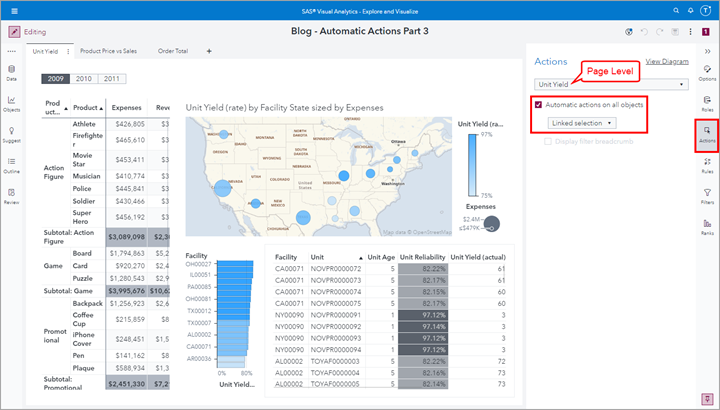
Like the other two Automatic Actions: One-way filter and Two-way filter, this feature has to be set at the Page level of the report. From the Actions pane, use the drop-down list to select the Page name, then select the check box to enable Automatic actions on all objects and select Linked selection.
Select any image to see a larger version.
Mobile users: To view the images, select the "Full" version at the bottom of the page.
Mega Corp Example: Unit Yield
In this example using the Mega Corp data, I use the Unit Yield (rate) data item to be the accented color on the report page.
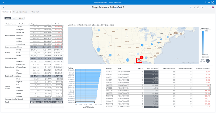
The Geo Bubble object uses Expenses as the Bubble Size and Unit Yield (rate) as the Color. We can see that the three other objects on the page display related data items. For example, the Crosstab object displays Product Line, Product, Expenses, Revenue and Profit. The Bar Chart object displays Facility by Unit Yield (rate) and the List Table displays several other data items.
Select a single bubble in the Geo Bubble
In this first screenshot, I clicked on the Facility State “Louisiana” and we can see how the other three objects have selected data items because of the Automatic Linked Selection Action definition. It is easy to understand the selected bar in the Bar Chart as the selected rows in the List Table as these data items easily map back to the Facility State “Louisiana”.
The Crosstab’s selected rows are, in this case, only showing which Product Lines and corresponding Products are manufactured in “Louisiana”. We cannot assume that these values for Expenses, Revenue and Profit are entirely coming from “Louisiana” but are part of the whole. You could create and add a hierarchy including Facility State and Facility if you wanted to drill into the detail, but for this screenshot I wanted to keep it simple.
Select row in the Crosstab
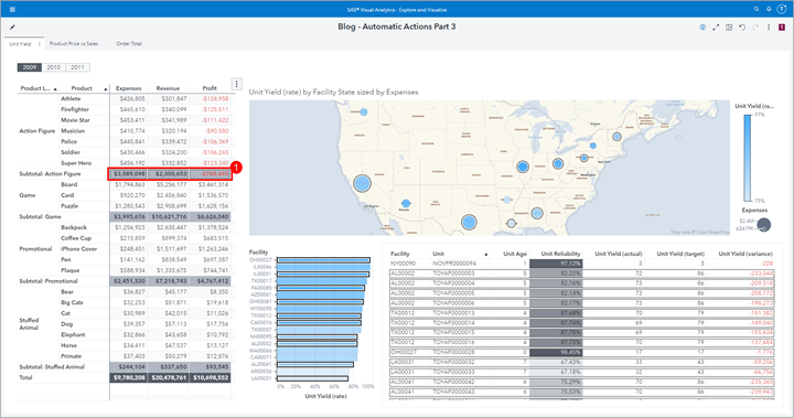
In this example, I selected the subtotal row in the Crosstab object for the “Action Figure” Product Line. Here we can see that the selected bubbles in the Geo Bubble object indicate where these Products are manufactured but other Products are also manufactured in these locations. In the Bar Chart we can see the individual Facilities selected as well as in the List Table object. Notice the different sort of the List Table object. You can easily perform a different sort depending on the value selected to see the selected/highlighted rows easier to help understand the values.
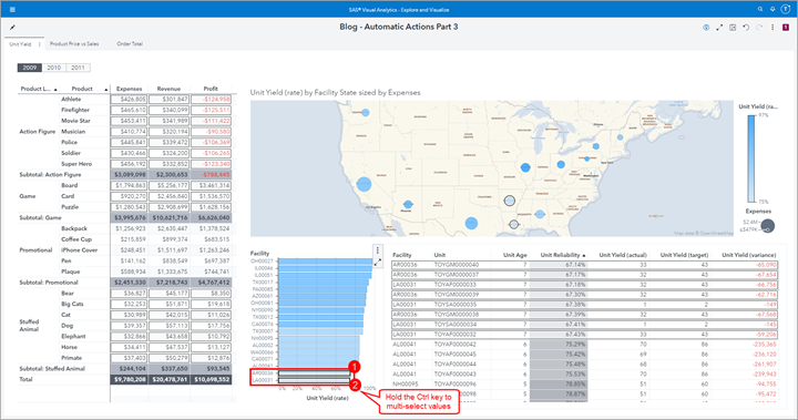
Select bars in the Bar Chart In this example, I selected two bars in the Bar Chart Object by holding the Ctrl key. We can see the selected values in the other objects and by now you should be able to understand a one-to-one mapping versus a contribution to the selected/highlighted value.
Two Mapped Data Sources: Mega Corp and Insight Toy Example
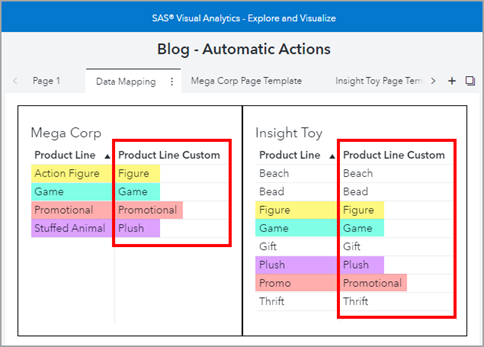
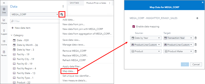
In this example, two different data sources are used on the same report page and have been mapped using multiple data items. One data mapping will use a Custom Category named Product Line Custom so that data values that I want matched will be mapped to each other.
For a step-by-step guide on how to configure Data Mapping, see the first article in this series: SAS VA: Automatic Actions Part 1 – Easy exploration for multiple data sources and the sections: Data Sources Used, Use Custom Categories for Data Mapping and Define Data mapping.
In this report, here is the active data mapping
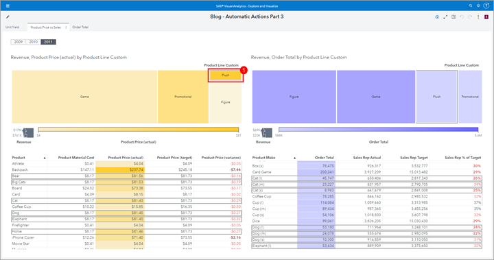
Select tile in the Treemap
Notice how I used color to coordinate the data sources so that you can quickly and easily identify which report objects are sourced by the same data. In this screenshot, I have selected one of the tiles and we can see how that across both data sources the values are selected/highlighted for further analysis.
Here we can see that the tiles represent Product Line but the List Table below is the next level down in the hierarchy: Product or Product Make, depending on the data source. When the tile is selected, all of the Products or Product Makes that fall into the Product Line are highlighted.
Select rows in the List Table
In this second screenshot, I have selected three rows in the List Table with the yellow color. First, I sorted on the column I was interested in, then I held the Ctrl key and selected the first three rows. We can see how the linked selections are highlighted in the purple objects but notice that I only have two matching rows from the other data source. The report user will also need to realize that the selected List Table rows only represent a portion of the highlighted tiles.
Insight Toy Example: Order Total
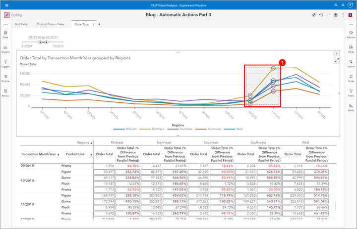
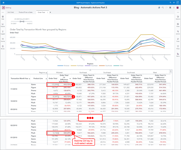
In this last example, I use the Insight Toy data source to plot Order Total over time in a Line Chart. In the below Crosstab object, I use a Quick Calculation of Percent Difference from Previous Parallel Period to easily spot significant change. Like I mentioned earlier, you can always create hierarchies and add them to the Roles of these objects so that you can dive deeper into your analysis.
Select values in the Line Chart
In this screenshot, I used my mouse in the graph to selected two time periods. We can see the linked selection down below in the Crosstab object. In this case, because of the Role assignments, the selected data values map one-to-many in the Crosstab below since the Region values have the additional detail of Product Line.
Select rows in the Crosstab
In this screenshot, I sorted the Crosstab by the Region Midwest’s Order Total (% Difference from Previous Parallel Period) and selected all of the values with over 400% change. To select multiple values, hold the Ctrl key and then select the values. We can see how the linked selection values are highlighted in the Line Chart. We know that these values contribute to the value on the Line Chart but do not represent the full value.
Summary
Now you have seen the last of the Automatic Actions: Linked Selection. This is another great way to view data and visualize how your data is linked. It is important to understand the part to whole relationships that the values selected have with the values linked.
Key tips to remember for Linked Selections:
- Automatic Actions are applied at the Page level in the report.
- All objects which support actions will be automatically included in the selected Automatic Action.
- Map Data for different data sources. Include all of the columns you want to be linked.
- Create Custom Categories to assist with Mapping Data for different data sources.
- Hold the Ctrl key to select multiple values.
- Use color meaningfully. Since objects are not filtered but values selected/highlighted it is important to coordinate colors for data values with purpose.
For the entire series see the below articles:
- SAS VA: Automatic Actions Part 1 – Easy exploration for multiple data sources
- SAS VA: Automatic Actions Part 2 – Dive into multidimensional or hierarchical data easily
- SAS VA: Automatic Actions Part 3 – Find related data fast (this article!)
Find more articles from SAS Global Enablement and Learning here.
Catch up on SAS Innovate 2026
Dive into keynotes, announcements and breakthroughs on demand.
Explore Now →SAS AI and Machine Learning Courses
The rapid growth of AI technologies is driving an AI skills gap and demand for AI talent. Ready to grow your AI literacy? SAS offers free ways to get started for beginners, business leaders, and analytics professionals of all skill levels. Your future self will thank you.
- Find more articles tagged with:
- GEL
