- Home
- /
- SAS Communities Library
- /
- SAS Custom Task Tuesday: How to create the Three-panel Visualization t...
- RSS Feed
- Mark as New
- Mark as Read
- Bookmark
- Subscribe
- Printer Friendly Page
- Report Inappropriate Content
SAS Custom Task Tuesday: How to create the Three-panel Visualization task
- Article History
- RSS Feed
- Mark as New
- Mark as Read
- Bookmark
- Subscribe
- Printer Friendly Page
- Report Inappropriate Content
In this article, I'll take you through the steps of creating a really useful univariate visualization. It's inspired (okay...copied) from this blog by @Rick_SAS: A three-panel visualization of a distribution. With Rick's permission, I adapted his code into a SAS Enterprise Guide custom task for use in my SAS course. But in this article, we're going to create a SAS Studio version of it -- which turns out to be really easy to do.
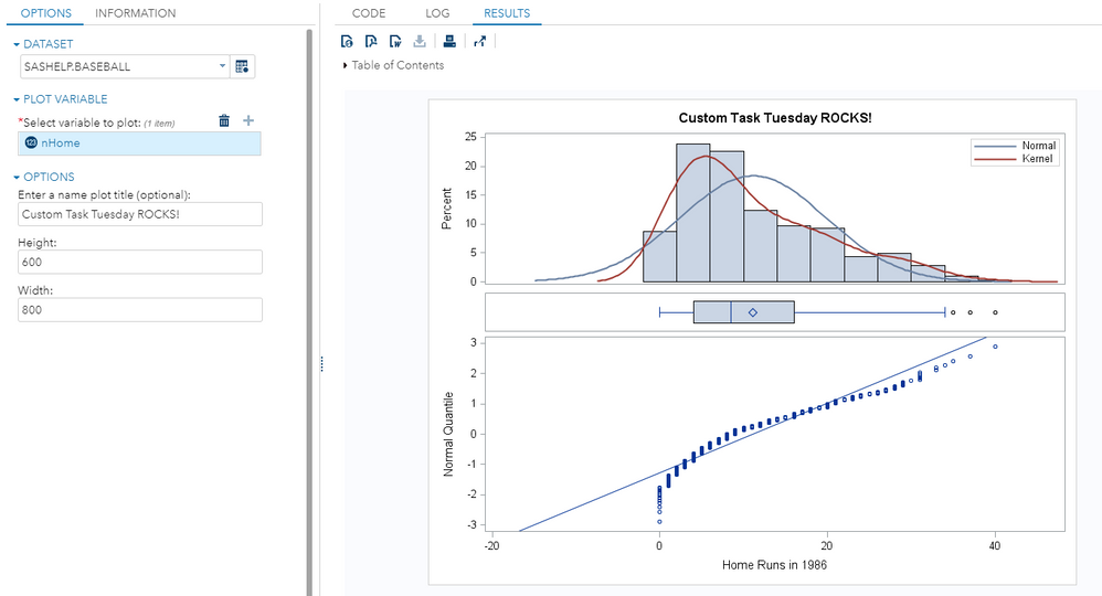
Here's what the task looks like when run. Interested? Then read on to see how to build it. Or you can download/use it as is. The code is on GitHub.
Step 1: Getting Started
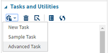
In SAS Studio, under the Task and Utilities section, open a “New Task” as well as the “Sample Task.” We will copy and paste the necessary Velocity Template code from the Sample Task to our task.
Step 2: Naming and Saving the Task
At the top of the VTL code for your New Task, you will need to fill in the Name and Description portions to reflect the information shown below:
Name: Three-panel Visualization
Description: A three-panel visualization for univariate data.
After you’ve done that, you should save this task to your My Tasks folder, so you don’t lose it. Click the
Step 3: Fill in Metadata Portion
This task is simple -- just a few controls for the options. The main two pieces of information that we need to collect are: the name of the data set we're working with, and the name of the numeric variable that we want to plot. I've also added a couple of nice-to-have options that an end-user might want to tweak: an optional title for the plot, and the dimensions (in pixels) for the resulting graph image.
Here's the full Metadata portion of the task:
<Metadata>
<DataSources>
  <DataSource name="DATASOURCE">
  <Roles>
   <Role maxVars="1" minVars="1" name="PLOTVAR" order="true" type="N">Select variable to plot:</Role>
  </Roles>
  </DataSource>
</DataSources>
<Options>
 <Option inputType="string" name="DATATAB">OPTIONS</Option>
 <Option inputType="string" name="DATAGROUP">DATASET</Option>
 <Option inputType="string" name="ROLESGROUP1">PLOT VARIABLE</Option>
 <Option inputType="string" name="GROUPTEXT">OPTIONS</Option>
 <Option defaultValue="" missingMessage="Missing title"
   inputType="inputtext" name="textTITLE"
   required="false">Enter a name plot title (optional):</Option>
 <Option defaultValue="600" inputType="numbertext"
   invalidMessage="Invalid value. Enter a number between 100 and 10000." maxValue="10000" minValue="100"
   missingMessage="Enter a height between 100 and 10000." name="Height"
   promptMessage="Enter a height between 100 and 10000."
   rangeMessage="This height value is out of range. Enter a number between 100 and 10000.">Height:</Option>
 <Option defaultValue="800" inputType="numbertext"
   invalidMessage="Invalid value. Enter a number between 100 and 10000." maxValue="10000" minValue="100"
   missingMessage="Enter a Width between 100 and 10000." name="Width"
   promptMessage="Enter a Width between 100 and 10000."
   rangeMessage="This Width value is out of range. Enter a number between 100 and 10000.">Width:</Option>
</Options>
</Metadata>
You might notice that much of the metadata definition is dedicated to specifying valid ranges for the values, and informational/error messages when values are not complete or out of range. These details aren't necessary for a functional task, but they are important for making the task more usable, especially by novice users.
Step 4: Fill in UI Portion
It's a simple task with just a few options, so the UI section of the task is pretty small. In the UI section we're simply "laying out" the controls and options that we specified in the Metadata portion. That's the secret to a good task: spend your time designing a good metadata layer, and the UI layer comes easily.
The full UI portion is below:
<UI>
 <Container option="DATATAB">
 <Group open="true" option="DATAGROUP">
   <DataItem data="DATASOURCE"/>
 </Group>
 <Group open="true" option="ROLESGROUP1">
   <RoleItem role="PLOTVAR"/>
 </Group>
 <Group open="true" option="GROUPTEXT">
  <OptionItem option="textTITLE"/>
  <OptionItem option="Height"/>
  <OptionItem option="Width"/>
 </Group>
 </Container>
</UI>
Step 5: Fill in Code Template Portion
The Code Template is what makes the velocity code work with your SAS code. Most of this code is copied exactly from Rick's original blog example. The only piece I had to customize comes at the end, where we need to work in the few option values that the task collects from the end user. These come through as Velocity template "macro" variables -- not to be confused with SAS macro variables, although they are conceptually similar!. In fact, we are using a SAS macro routine to encapsulate the program logic, which makes it very simple to plug in Velocity macro variables into the parameters for the SAS macro call.
Below is the full Code Template Portion:
<CodeTemplate>
 <![CDATA[

/* define 'threepanel' template that displays a histogram, box plot, and Q-Q plot */

/* Use WORK as a place to update templates, since SASUSER is often read-only */
ods path (prepend) work.templat update;
proc template;
define statgraph threepanel /store=work.templat;
dynamic _X _QUANTILE _Title _mu _sigma;
begingraph;
 entrytitle halign=center _Title;
 layout lattice / rowdatarange=data columndatarange=union
 columns=1 rowgutter=5 rowweights=(0.4 0.10 0.5);
 layout overlay;
 histogram _X / name='histogram' binaxis=false;
 densityplot _X / name='Normal' normal();
 densityplot _X / name='Kernel' kernel() lineattrs=GraphData2(thickness=2 );
 discretelegend 'Normal' 'Kernel' / border=true halign=right valign=top location=inside across=1;
 endlayout;
 layout overlay;
 boxplot y=_X / boxwidth=0.8 orient=horizontal;
 endlayout;
 layout overlay;
 scatterplot x=_X y=_QUANTILE;
 lineparm x=_mu y=0.0 slope=eval(1./_sigma) / extend=true clip=true;
 endlayout;
 columnaxes;
 columnaxis;
 endcolumnaxes;
 endlayout;
endgraph;
end;
run;
ods path (prepend) work.templat read;

/* Macro to create a three-panel display that shows the
 distribution of data and compares the distribution to a normal
 distribution. The arguments are
 DSName = name of SAS data set
 Var = name of variable in the data set.
 The macro calls the SGRENDER procedure to produce a plot
 that is defined by the 'threepanel' template. The plot includes
 1) A histogram with a normal and kernel density overlay
 2) A box plot
 3) A normal Q-Q plot

 Example calling sequence:
 ods graphics on;
 %ThreePanel(sashelp.cars, MPG_City, Distribution of MPG_City)
 %ThreePanel(sashelp.iris, SepalLength, Distribution of SepalLength)

 For details, see
 http://blogs.sas.com/content/iml/three-panel-visualization/
*/
%macro ThreePanel(DSName, Var, PlotTitle);
 ods graphics on;

 %local mu sigma;

 /* 1. sort copy of data */
 proc sort data=&DSName out=_MyData(keep=&Var);
  by &Var;
 run;

 /* 2. Use PROC UNIVARIATE to create Q-Q plot
       and parameter estimates */
 ods exclude all;
 proc univariate data=_MyData;
  var &Var;
  histogram &Var / normal; /* create ParameterEstimates table */
  qqplot &Var / normal;
  ods output ParameterEstimates=_PE QQPlot=_QQ(keep=Quantile Data rename=(Data=&Var));
 run;
 ods exclude none;

 /* 3. Merge quantiles with data */
 data _MyData;
  merge _MyData _QQ;
  label Quantile = "Normal Quantile";
 run;

 /* 4. Get parameter estimates into macro vars */
 data _null_;
  set _PE;
  if Symbol="Mu" then call symputx("mu", Estimate);
  if Symbol="Sigma" then call symputx("sigma", Estimate);
 run;

 proc sgrender data=_MyData template=threepanel;
 dynamic _X="&Var" _QUANTILE="Quantile" _mu="&mu" _sigma="&sigma"
 _title="&PlotTitle";
 run;
%mend;

ods graphics / height=$Height width=$Width;
%ThreePanel(
  $DATASOURCE,
  #if( $PLOTVAR.size() > 0 )
   #foreach( $item in $PLOTVAR )
     $item,
   #end
  #end
 #if($textTITLE != "")
   $textTITLE
 #else
  Three panel plot of
  #if( $PLOTVAR.size() > 0 )
    #foreach( $item in $PLOTVAR )
    $item
   #end
  #end
 #end
);
 ]]>
</CodeTemplate>
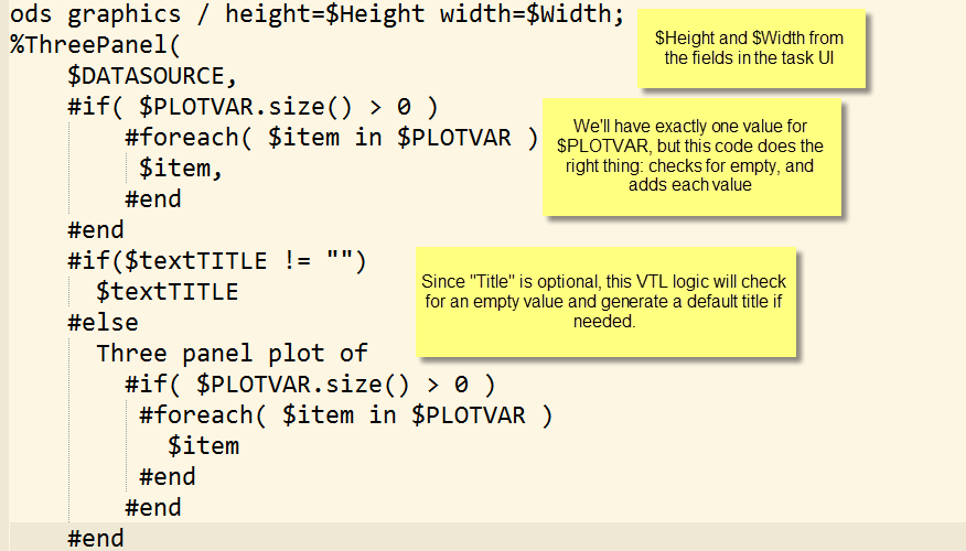
Here's an annotated picture of the VTL logic portion of this code. (Click to enlarge for a closer look.)
Step 6: Run the Task
You’re finished! You created a cool plot to visualize a distribution! Click the 


Join the conversation on Twitter! Use the hashtag #CustomTaskTuesday and tweet @OliviaJWright with your Custom Task comments and questions! For this task in particular, you can also hit up me: @cjdinger.
SAS Studio Task GitHub
This task is available in the growing collection of custom tasks that we're sharing on GitHub. In fact, it's really easy to point your instance of SAS Studio (even SAS University Edition) to the entire collection and use these tasks immediately, as-is. Check out the instructions on the GitHub site for Accessing the SAS Studio Repository.
- Mark as Read
- Mark as New
- Bookmark
- Permalink
- Report Inappropriate Content
Fabulous to see one of my favourite data visualizations is now available as a SAS Studio Task. I imagine it will be very popular and I look forward to sharing it too... and will do so next week when I present at QUEST, Ten Treasure Trove Tips to Takeaway for SAS Professionals. YEAH!!!
- Mark as Read
- Mark as New
- Bookmark
- Permalink
- Report Inappropriate Content
Thanks for sharing, a very nice job, most useful and also a detailed intro for VTL coding with SAS Studio tasks. The annotated picture explaining the syntax details is very helpful. 🙂
- Mark as Read
- Mark as New
- Bookmark
- Permalink
- Report Inappropriate Content
Chris, this is wonderful! 🙂 I appreciate you spreading the #CustomTaskTuesday love!
Catch up on SAS Innovate 2026
Nearly 200 sessions are now available on demand with the SAS Innovate Digital Pass.
Explore Now →SAS AI and Machine Learning Courses
The rapid growth of AI technologies is driving an AI skills gap and demand for AI talent. Ready to grow your AI literacy? SAS offers free ways to get started for beginners, business leaders, and analytics professionals of all skill levels. Your future self will thank you.
- Find more articles tagged with:
- Custom Task Tuesday


