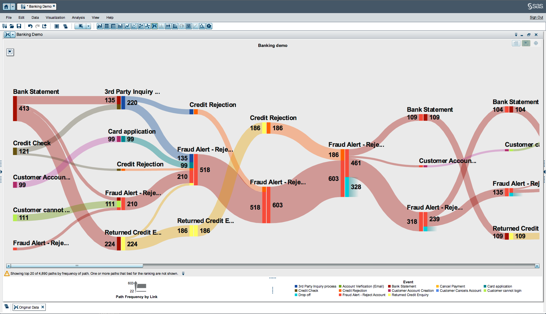
See flow patterns and recognize trends through a system with path analysis in SAS Visual Analytics 7.1. Using Sankey Diagrams (example below), you can perform web path analysis to see where customers enter your web site, where they navigate, and where they exit. You can also understand the paths that shipments take as they flow through distribution centers.
From analytic visualizations like these, you can identify successful flow patterns and isolate flows that failed to deliver the desired action – using the latter as evidence to pinpoint ways to improve the system.
Sample Sankey Diagram:
Find out about more SAS Visual Analytics 7.1 features and watch for future updates on this community.

