- Home
- /
- SAS Communities Library
- /
- How to place 4 measures on the same SAS Visual Analytics graph
- RSS Feed
- Mark as New
- Mark as Read
- Bookmark
- Subscribe
- Printer Friendly Page
- Report Inappropriate Content
How to place 4 measures on the same SAS Visual Analytics graph
- Article History
- RSS Feed
- Mark as New
- Mark as Read
- Bookmark
- Subscribe
- Printer Friendly Page
- Report Inappropriate Content
Visualizing multiple metrics on the same graph is something of great value. There are many ways to see how one measure relates to another in SAS Visual Analytics’ stock graph objects. Examples of two measures on the same chart include the “Dual Axis Bar Chart,” “Dual Axis Line Chart,” and “Dual Axis Bar-Line Chart” objects. An example of having three measures on one plot is the very popular “Bubble Plot.”
While these are all great examples, there are times when the report designer needs to “up the ante” and create a graph object that displays four measures simultaneously. This task can be difficult, because it is not easy to include this many measures while not confusing the report consumer.
Fortunately, there’s a great example of how to achieve this using PROC SGPLOT. As part of the SAS Visual Analytics Community custom graph sharing initiative I’ll tell you about how to create this graph in this post.
In this example, a regular butterfly plot is customized to have ‘bars within the bars’ to add two extra measures to the graph. Pretty nifty!
The next question is, how can we replicate this in SAS Visual Analytics? It’s fairly easy once you start using the VA Graph Builder from the right panel in VA Home (look for Custom Graph) or from the object tab in the left panel in VA Designer.
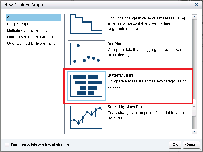
In Visual Analytics Release 7.1 there is a Butterfly Chart available in the “New Custom Graph” gallery. From this gallery that is on the initial page, scroll down and select the “Butterfly Chart” graph.
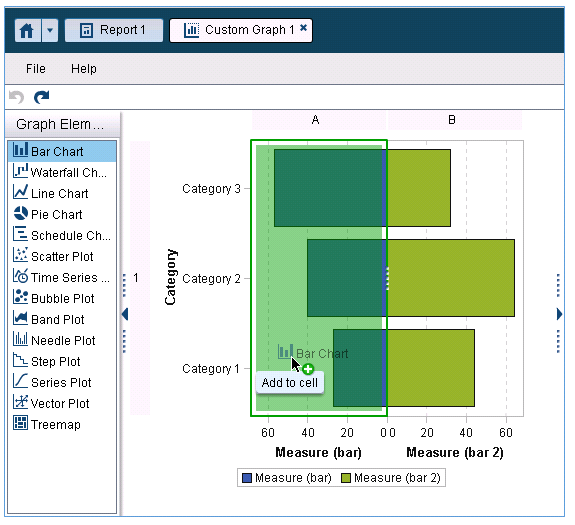
You now have the basis for your new plot. The first step to creating the ‘bars within bars’ effect is to drag a new bar chart from the “Graph Elements” panel on the left to the bar chart on the left of the butterfly.
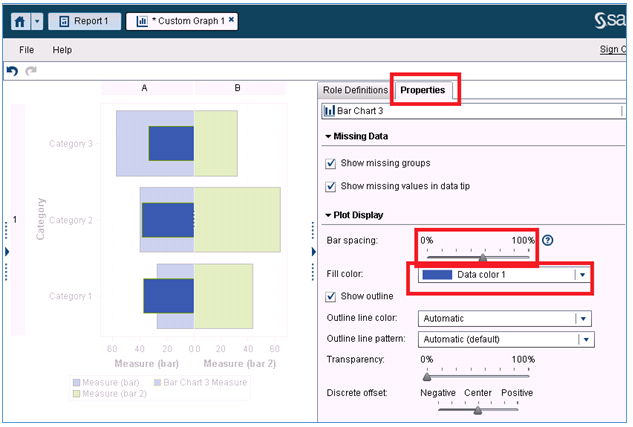
Now that we have overlaid the new bar chart onto the left bar chart, we will need to make its bars narrower so they will fit inside the bars on the original bar chart. This is achieved by selecting the ‘Properties’ tab on the right. Scroll down and change the “Bar Spacing” slider to a value of 0.55. This will achieve the desired “bar inside bar” look.
Also, since we want to have the colors of the two overlaid bar charts be identical, we will need to edit a second option. This is the “Fill Color” drop down. Change this to match the bar color of the bars on the original bar chart. In this case, the bar colors are “Data Color 1.” Both correctly-set options are shown below:
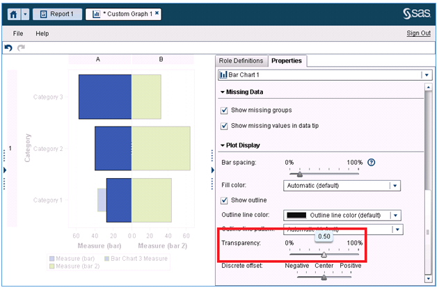
The final step to make our bar chart look like the PROC SGPLOT example is to increase the transparency of the original bar chart. In order to do this, first select the “Bar Chart 1” graph object from the top dropdown of the “Properties” panel. Once “Bar Chart 1” is selected, change the value on the “Transparency” slider to ‘0.50.’ This will create the ‘light’ look for the back bars on the plot.
You now have completely replicated half of the example from the PROC SGPLOT example! Duplicate the same steps for the bar chart on the right, and you will have recreated the entire plot!
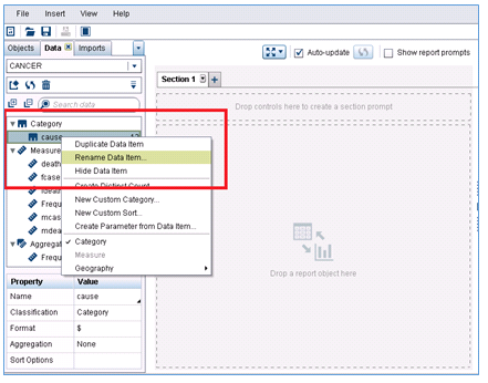
The final step is to use your graph in a report. Use the code from the example at http://support.sas.com/kb/35/051.html (under the 'Full Code' tab) to create the data for the plot. Be sure this data is available in SAS Visual Analytics Designer and to rename the data items that come with the data as shown below:
Rename the data items as:
- cause – Cause
- deaths – Deaths
- fcases – New Cases (Female)
- fdeaths – Deaths (Female)
- mcases – New Cases (Male)
- mdeaths –Deaths (Male)
Also change for format for all these measures to be Comma in the measure properties.
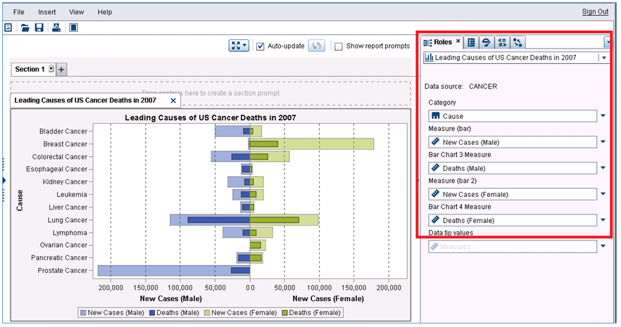
Place your newly created custom graph on the report canvas and map the data to the graph as shown in the “Roles” tab on the right of the screenshot below:
And you’ve done it! You’ve replicated the plot from support.sas.com in SAS Visual Analytics! The added benefit of course is having the dynamic capabilities of SAS Visual Analytics enabled on your graph.
How to make the example work for you:
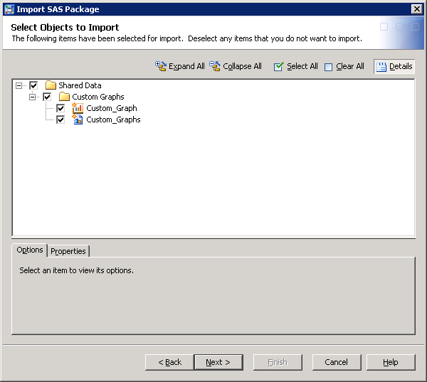
This example was created in SAS Visual Analytics 7.1. Attached is a SAS package file containing the custom graph template and sample report. Again, use the code in http://support.sas.com/kb/35/051.html create the sample data to feed the visualization. Load this same data into memory on your Visual Analytics instance and you will be able to import this package if you have access to the SAS Management Console 7.2. Please refer to these instructions.
If you are unable to load the data from the example into memory, you can alternatively import the CANVER.csv file that is packaged with this example.
If you do not have access, contact your SAS Visual Analytics Administrator. Be sure to select the report and the custom graph.
Think you’ll give this a try? Tell us about your project, and share you own custom graph examples on the community!
- Mark as Read
- Mark as New
- Bookmark
- Permalink
- Report Inappropriate Content
This is amazing! Never knew that cool trick to add the bars inside the butterfly chart.
- Mark as Read
- Mark as New
- Bookmark
- Permalink
- Report Inappropriate Content
Great, so glad you found this helpful!
- Mark as Read
- Mark as New
- Bookmark
- Permalink
- Report Inappropriate Content
Hi this looks great. I know this can be creaded by codes as well .So before i try to build the code, may i ask you if you have the code for it ?
- Mark as Read
- Mark as New
- Bookmark
- Permalink
- Report Inappropriate Content
Hello!
I'm not sure I understand what code you are looking for. If you mean the code to build the example data, it can be found in the original SG Plot example: (http://support.sas.com/kb/35/051.html) under the "Full Code" tab.
However, if this is not the code you are looking for, please let me know!
- Mark as Read
- Mark as New
- Bookmark
- Permalink
- Report Inappropriate Content
Hi Mike ,
Thanks i was looking for this .
Regards
kanchan
SAS AI and Machine Learning Courses
The rapid growth of AI technologies is driving an AI skills gap and demand for AI talent. Ready to grow your AI literacy? SAS offers free ways to get started for beginners, business leaders, and analytics professionals of all skill levels. Your future self will thank you.
- Find more articles tagged with:
- sas_visual_analytics_custom_object
