- Home
- /
- SAS Communities Library
- /
- How to make your animated time-series bar chart values "stick" in SAS ...
- RSS Feed
- Mark as New
- Mark as Read
- Bookmark
- Subscribe
- Printer Friendly Page
- Report Inappropriate Content
How to make your animated time-series bar chart values "stick" in SAS Visual Analytics
- Article History
- RSS Feed
- Mark as New
- Mark as Read
- Bookmark
- Subscribe
- Printer Friendly Page
- Report Inappropriate Content
Have you ever tried to enhance a report in SAS Visual Analytics by adding an animation? But when you hit play, the graph doesn't animate like you expected? This has been an issue I've run into from time to time when attempting to add animations to a time-series bar chart.
For example, let's imagine that we work for a retail store and we had a store-wide sale last 4th of July that lasted from June 25th though July 13th. During the sale, we collected sale data. Here are a few lines of it:
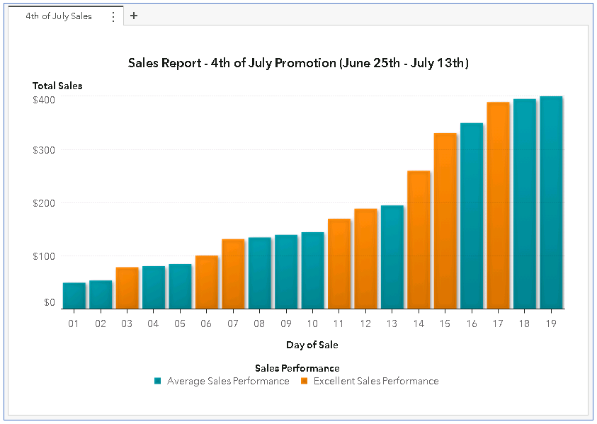
Looks like we had a very impressive sale! So we add the data to SAS Visual Analytics and make the following time-series bar chart:
Problem: the bar chart doesn't animate correctly
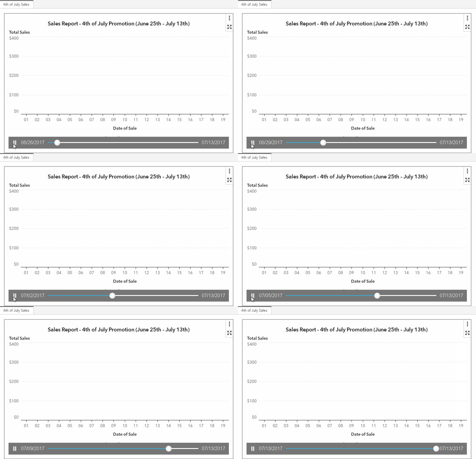
By looking at the data, we can see that we have a sas-date variable called "Date". So we know that we should be able to create an animation from this. Therefore, we add "Date" to the "Animation" Role for the bar chart. But when we play the animation, it doesn't look quite right:
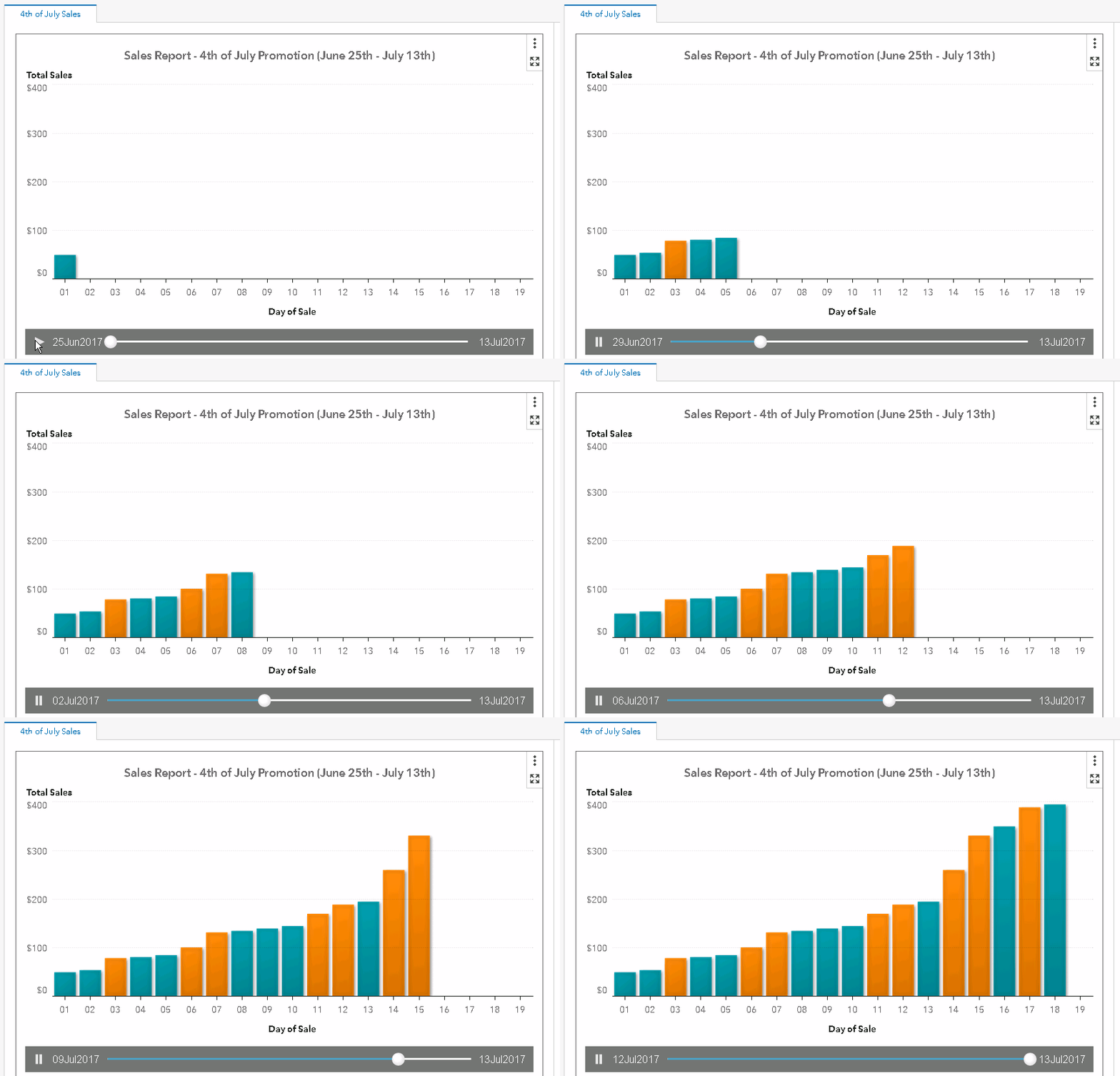
The bars in the bar chart appear and then suddenly disappear as the plot animates through the date values. What we WANT to happen is something like this:
To investigate, let's go back and review our source data:
The reason the bars are disappearing is because there's only one "Day of Sale" and "Total Sales" value for each of the dates. So when the animation slider is on July 15th, it displays the bar chart value for "Day 01 - Total Sales: $50". And when the animation slider advances to July 16th, the "Day 02 - Total Sales: $54" value is displayed, but the "Day 01 - Total Sales: $50" value is no longer present. So the Day 01, bar disappears as soon as the Day 02 bar appears.
How can we get the bar chart to behave like we want? We want past date bar values to remain on the plot as the chart animates through the dates. Well, as it turns out it's actually quite simple! All we need to do is dust off our SAS programming skills!
Solution: use a data trick!
To make the bar chart's values 'stick' as the animation slider advances, we'll need a data structure that looks like this:
Even though this data structure might look a little strange, it's what is needed to prevent the bars from disappearing. Notice how there are repeated records for each "Day of Sale." Those repeated records contain all the dates the sale was taking place in the new variable "Animation_Date." This new variable, "Animation_Date," is what can be used in the bar chart's animate role. In the example above, when the play button is pressed and the animation slider advances though the variable Animation_Date (from the July 25th through July 27th, in this case), the value of "Day 01 - Total Sales: $50" is retained though the entire animation!
How do we get SAS to create this special data structure? It's actually quite simple. It just requires a do-loop and where-clause step.
- Loop the data set so each observation has every day of the sale. Also we'll rename the do-loop's variable "i" to "Animation_Date":
data loop_dates;
   set Fourth_of_July_Sale;
       do i='25Jun2017'd to '13jul2017'd;
       output;
   end;
   format i date9.;
   rename i=Animation_Date;
run;
2. Keep only the values where "Animation_Date" is less than or equal to the original "Date" value:
data Fourth_of_July_Sale_Animated;
   set loop_dates;
   where date le Animation_Date;
run;
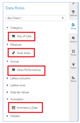
Now that our new data structure has been built by the do-loop and where clause, we can feed our new data set into VA and assign the following roles:
Category: Day of Sale
Measure: Total Sales
Group: Sales Performance
Animation: Animation_Date
We now have a time-series bar chart that animates as expected! The animation slider advances and the past sales values are retained:

How to make the example work for you
This example was created in SAS Visual Analytics 8.2. Attached to this post is
- The original dataset - fourth_of_july_sale.sas7bdat
- The code to 'loop though the dates' and create the animation-ready dataset - Fourth_of_July_Sale_Animated.sas
- The completed animation-ready dataset - fourth_of_july_sale_animated.sas7bdat
- A JSON file containing the completed report - Fourth_of_July_Sale.json
Import the data on your SAS Visual Analytics instance. Import the report via the "Import via GUI" section of these instructions.
- Mark as Read
- Mark as New
- Bookmark
- Permalink
- Report Inappropriate Content
I just now found this, thank you! Can you do run this same type of loop when there are breaks in the dates (from the dataset)? I have a dataset with a 50 year range but the vast majority of those dates not in the dataset. The loop from this range is creating a dataset with an animated_date column, but creating millions of records as a result (from a 3000 record original dataset). Any tips (And I hope I explained that correctly).
- Mark as Read
- Mark as New
- Bookmark
- Permalink
- Report Inappropriate Content
Hello Michael,
Glad you have found this article useful!
It sounds like you are struggling with the fact that the example from the article generates “Animated_Date” values for ALL dates from the start to end dates in the original dataset.
Another way to do this would be to create a comma separated character list of only the dates that exist in the original “Fourth_of_July_Sale” dataset, then feed that list into the do loop that is run in the “loop_dates” dataset. This would result in generating “Animated_Date” values for ONLY the values that are in the source data.
Staying with the example from the article, you would want to replace the data step that creates the “loop_dates” data with the following code:
/*get a distinct list of dates*/
proc sql;
create table dateList
as select distinct date from Fourth_of_July_Sale;
quit;

/*transpose the distinct list of dates*/
proc transpose data=dateList out=dateList;
var date;
run;

/*convert the transposed list into a single string with a separator*/
data getList;
set dateList;
drop _NAME_;
result=catx(',',of col:);
run;

/*save the output string to the macro variable "dateList"*/
data _NULL_;
set getList;
call symput('dateList',result);
run;

/* loop though the dates and output the record from each loop */
/* using only the dates that existed in the original data */
data loop_dates;
set Fourth_of_July_Sale;
do i=&dateList;
output;
end;
format i date9.;
rename i=Animation_Date;
run;
Hope this modified example helps in re-creating the graph with your data!
Thanks!
- Mike
Catch up on SAS Innovate 2026
Dive into keynotes, announcements and breakthroughs on demand.
Explore Now →SAS AI and Machine Learning Courses
The rapid growth of AI technologies is driving an AI skills gap and demand for AI talent. Ready to grow your AI literacy? SAS offers free ways to get started for beginners, business leaders, and analytics professionals of all skill levels. Your future self will thank you.


