- Home
- /
- SAS Communities Library
- /
- How to make sure SAS Visual Analytics end users understand report inte...
- RSS Feed
- Mark as New
- Mark as Read
- Bookmark
- Subscribe
- Printer Friendly Page
- Report Inappropriate Content
How to make sure SAS Visual Analytics end users understand report interactions
- Article History
- RSS Feed
- Mark as New
- Mark as Read
- Bookmark
- Subscribe
- Printer Friendly Page
- Report Inappropriate Content
SAS Visual Analytics allows users to easily create visualizations that can be shared with other users. The goal is to quickly disseminate visual information to your end user community to help them make better and faster decisions. Sometimes your audience knows exactly what the report is saying and how to interact with it. Other times your users may be inexperienced and not have a full grasp of the data items or know the subtleties of the report. This is where a simple “help” or “click here for more information” link is useful.
To illustrate, I have included a screen shot of a sample report. In this example, each object visually represents different aspects of the data. When a user clicks on a section of the pie chart, the other three objects are subsets based on that selection.
Figure 1. Sample Report
The report designer has added a “click here for more information” hyperlink as a text object in the upper right portion of the report. When a user clicks on that link, a page pops up and gives more context to the report (e.g. background, terminology, data elements). But what about the interactions? How does selecting one object impact another?
From the SAS Visual Analytics User Guide:
“Interactions are used to direct a report viewer’s attention to specific results in a report. Interactions allow data to be subset to reduce the amount of data, and enables users to understand it within a particular context.”
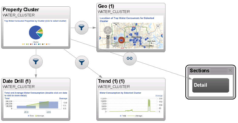
Interactions are easy to apply to a given report. They are created in the report designer by simply connecting two objects together with a drag and drop of a mouse. The screen capture below shows the properties of the Interactions tab a report designer would see when they create interactions. The icons have specific meaning such as data filtering, data brushing, linking, etc.
As a designer, this works great! No coding and no complex setup. Just connect the objects together and see the results visually. So a first thought may be to have the “click here for more information” link to this image to help a user understand the interactions. However, as straight forward as this view may be for a designer, the filter and linking icons may not be completely obvious to a casual user. The end user may also benefit from understanding the report context (as mentioned above). So how best to deliver this information to the end user?
Figure 2. Interactions tab - Report Designer
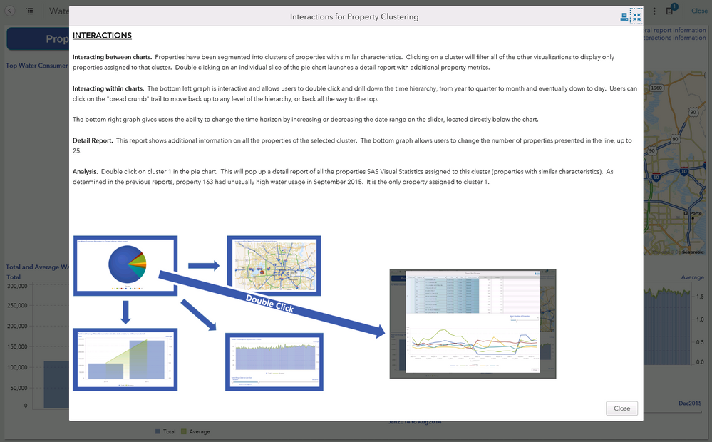
A simple solution is to create an information page with report context AND a visual representation of the interactions. When a user clicks on the “click here for more information” hyperlink, the following page pops up.
Figure 3. Sample Information Screen
This example was created with an Info Window, which is a special type of report section that is visible only when linking from another object in the report. [Note: to create an Info Window, first insert a new report section, click on the small triangle next to the section tab and choose the option "Display as Info Window". You will now be able to link to this new Info Window from a report object, text or image]
The top section of this Info Window is a single text object, and the bottom section is an image object. The image in this example was created by combining multiple screenshots and shapes and saving as a single image. You could also insert multiple images into the Info Window and get the same result.
This Info Window quickly gives the end user context of the report as well as a quick visual representation of any and all interactions within the report. The end result: a simple and straight forward way for an end user to gain a more complete understanding of the report.
This is just one example of using Info Windows and how they are a great way of disseminating context-sensitive information to end users. I hope this gives report designers something to consider when designing reports. Happy visualizing!
- Mark as Read
- Mark as New
- Bookmark
- Permalink
- Report Inappropriate Content
Useful tip to show information flow! Would be nice for the visual to be autogenerated as part of the report properties. Could this be considered for a future release?
- Mark as Read
- Mark as New
- Bookmark
- Permalink
- Report Inappropriate Content
I definitely agree with MichelleH ![]()
- Mark as Read
- Mark as New
- Bookmark
- Permalink
- Report Inappropriate Content
I agree - this has been the biggest point of confusion for report viewers.
- Mark as Read
- Mark as New
- Bookmark
- Permalink
- Report Inappropriate Content
- Mark as Read
- Mark as New
- Bookmark
- Permalink
- Report Inappropriate Content
Thanks @BeverlyBrown for suggesting to create an idea in the SASWare Ballot for this. I have done so at https://communities.sas.com/t5/SASware-Ballot-Ideas/Autogenerate-a-reports-information-flow-so-SAS-V...
Please cast your vote and/or comment there.
Thanks,
Michelle
SAS AI and Machine Learning Courses
The rapid growth of AI technologies is driving an AI skills gap and demand for AI talent. Ready to grow your AI literacy? SAS offers free ways to get started for beginners, business leaders, and analytics professionals of all skill levels. Your future self will thank you.
- Find more articles tagged with:
- Info Window
- Report Interactions
- Tips and Tricks


